---
title: "Assignment 5: Space-Time Prediction of Bike Share Demand: Philadelphia Indego"
author:
- "Lingxuan Gao"
- "Jinyang Xu"
date: "`r Sys.Date()`"
format:
html:
code-fold: true
code-tools: true
toc: true
toc-depth: 3
toc-location: left
theme: cosmo
embed-resources: true
editor: visual
execute:
warning: false
message: false
---
# Introduction
## The Rebalancing Challenge in Philadelphia
Philadelphia's Indego bike share system faces the same operational challenge as every bike share system: **rebalancing bikes to meet anticipated demand**.
In this lab. we build predictive models that forecast bike share demand across **space** (different stations) and **time** (different hours) to help solve this operational problem.
------------------------------------------------------------------------
# Setup
```{r setup, include=FALSE}
knitr::opts_chunk$set(
echo = TRUE,
warning = FALSE,
message = FALSE,
cache = TRUE
)
Sys.setlocale("LC_TIME", "English")
```
## Load Libraries
```{r load_libraries}
# Core tidyverse
library(tidyverse)
library(lubridate)

# Spatial data
library(sf)
library(tigris)

# Census data
library(tidycensus)

# Weather data
library(riem)  # For Philadelphia weather from ASOS stations

# Visualization
library(viridis)
library(gridExtra)
library(knitr)
library(kableExtra)
# Get rid of scientific notation. We gotta look good!
options(scipen = 999)
```
## Define Themes
```{r themes}
plotTheme <- theme(
  plot.title = element_text(size = 14, face = "bold"),
  plot.subtitle = element_text(size = 10),
  plot.caption = element_text(size = 8),
  axis.text.x = element_text(size = 10, angle = 45, hjust = 1),
  axis.text.y = element_text(size = 10),
  axis.title = element_text(size = 11, face = "bold"),
  panel.background = element_blank(),
  panel.grid.major = element_line(colour = "#D0D0D0", size = 0.2),
  panel.grid.minor = element_blank(),
  axis.ticks = element_blank(),
  legend.position = "right"
)

mapTheme <- theme(
  plot.title = element_text(size = 14, face = "bold"),
  plot.subtitle = element_text(size = 10),
  plot.caption = element_text(size = 8),
  axis.line = element_blank(),
  axis.text = element_blank(),
  axis.ticks = element_blank(),
  axis.title = element_blank(),
  panel.background = element_blank(),
  panel.border = element_blank(),
  panel.grid.major = element_line(colour = 'transparent'),
  panel.grid.minor = element_blank(),
  legend.position = "right",
  plot.margin = margin(1, 1, 1, 1, 'cm'),
  legend.key.height = unit(1, "cm"),
  legend.key.width = unit(0.2, "cm")
)

palette5 <- c("#eff3ff", "#bdd7e7", "#6baed6", "#3182bd", "#08519c")
```
# Part 1: Replicate with Q3 2024 & Compare to Q1 2025
## Data Import & Preparation
In this lab, we will use the Indego data (Q3 2024), because we want to explore the pattern's diffenrence between summer and winter.
### Download data for Q3 2024
```{r load_indego}
# Read Q3 2024 data
indego_q3 <- read_csv("data/indego-trips-2024-q3.csv")
```
### Examine the Data Structure
```{r explore_data}
# How many trips?
cat("Total trips in Q3 2024:", nrow(indego_q3), "\n")
# Date range
cat("Date range:",
    min(mdy_hm(indego_q3$start_time)), "to",
    max(mdy_hm(indego_q3$start_time)), "\n")
as.POSIXct(1719792120, origin = "1970-01-01", tz = "America/New_York")
as.POSIXct(1727740740, origin = "1970-01-01", tz = "America/New_York")
# How many unique stations?
cat("Unique start stations:", length(unique(indego_q3$start_station)), "\n")
# Trip types
table(indego_q3$trip_route_category)
# Passholder types
table(indego_q3$passholder_type)
# Bike types
table(indego_q3$bike_type)
```
### Create Time Bins
We need to aggregate trips into hourly intervals for our panel data structure.
```{r create_time_bins}
indego_q3 <- indego_q3 %>%
  mutate(
    # Parse datetime
    start_datetime = mdy_hm(start_time),
    end_datetime = mdy_hm(end_time),

    # Create hourly bins
    interval60 = floor_date(start_datetime, unit = "hour"),

    # Extract time features
    week = week(interval60),
    month = month(interval60, label = TRUE),
    dotw = wday(interval60, label = TRUE),
    hour = hour(interval60),
    date = as.Date(interval60),

    # Create useful indicators
    weekend = ifelse(dotw %in% c("Sat", "Sun"), 1, 0),
    rush_hour = ifelse(hour %in% c(7, 8, 9, 16, 17, 18), 1, 0)
  )

# Look at temporal features
head(indego_q3 %>% select(start_datetime, interval60, week, dotw, hour, weekend))
```
------------------------------------------------------------------------
## Exploratory Analysis
We aggregated individual trip records by date to obtain total daily ridership, then used ggplot2 to plot a time-series line chart with a smoothed trend line to visualize how Indego bike-share demand changed over the third quarter of 2024.
### Trips Over Time
```{r trips_over_time}
# Daily trip counts
daily_trips <- indego_q3 %>%
  group_by(date) %>%
  summarize(trips = n())

ggplot(daily_trips, aes(x = date, y = trips)) +
  geom_line(color = "#3182bd", linewidth = 1) +
  geom_smooth(se = FALSE, color = "red", linetype = "dashed") +
  labs(
    title = "Indego Daily Ridership - Q3 2024",
    subtitle = "Winter demand patterns in Philadelphia",
    x = "Date",
    y = "Daily Trips",
    caption = "Source: Indego bike share"
  ) +
  plotTheme
```
**Interpretation**:
The first pattern is the **weekly heartbeat**. Those sharp peaks and valleys repeat with metronomic regularity. Indego always dips on the same days each week, typically weekends, because commuting demand relaxes
Then there’s the **gentle seasonal slope** underneath that weekly pulse. Early July starts relatively high, and then the baseline slowly drifts downward into early August (Maybe because of the summer vocation). Mid-August shows a little recovery, followed by a September lift since the fall semester began. Before the season’s first chilly whisper pushes ridership down again heading into October.
### Hourly Patterns
```{r hourly_patterns}
# Average trips by hour and day type
hourly_patterns <- indego_q3 %>%
  group_by(hour, weekend) %>%
  summarize(avg_trips = n() / n_distinct(date)) %>%
  mutate(day_type = ifelse(weekend == 1, "Weekend", "Weekday"))

ggplot(hourly_patterns, aes(x = hour, y = avg_trips, color = day_type)) +
  geom_line(linewidth = 1.2) +
  scale_color_manual(values = c("Weekday" = "#08519c", "Weekend" = "#6baed6")) +
  labs(
    title = "Average Hourly Ridership Patterns",
    subtitle = "Clear commute patterns on weekdays",
    x = "Hour of Day",
    y = "Average Trips per Hour",
    color = "Day Type"
  ) +
  plotTheme
```
**Interpretation**: On weekdays, the peaks are tied to commuting: A morning spike around 8–9 AM, when the city jolts awake and people pedal to work. A bigger afternoon/evening spike around 5–6 PM, the classic homebound surge. The slope up to these points is steep, like a heartbeat aligned with office life. On weekends, the rhythm relaxes. There’s no sharp, early-morning people are not rushing anywhere. Ridership climbs more slowly through the morning toward a broad mid-day plateau, roughly 11 AM to 3 PM, and then drifts downward without the evening spike seen on weekdays.
So the pattern suggests that weekday trips are purposeful and synchronized with the workday, while weekend trips stretch out across the middle of the day in a more leisurely wave.
### Top Stations
```{r top_stations}
# Most popular origin stations
top_stations <- indego_q3 %>%
  count(start_station, start_lat, start_lon, name = "trips") %>%
  arrange(desc(trips)) %>%
  head(20)

kable(top_stations,
      caption = "Top 20 Indego Stations by Trip Origins",
      format.args = list(big.mark = ",")) %>%
  kable_styling(bootstrap_options = c("striped", "hover"))
```
------------------------------------------------------------------------
## Get Philadelphia Spatial Context
### Load Philadelphia Census Data
We'll get census tract data to add demographic context to our stations.
```{r load_census}
# Get Philadelphia census tracts
philly_census <- get_acs(
  geography = "tract",
  variables = c(
    "B01003_001",  # Total population
    "B19013_001",  # Median household income
    "B08301_001",  # Total commuters
    "B08301_010",  # Commute by transit
    "B02001_002",  # White alone
    "B25077_001"   # Median home value
  ),
  state = "PA",
  county = "Philadelphia",
  year = 2022,
  geometry = TRUE,
  output = "wide",
  progress_bar = FALSE
) %>%
  rename(
    Total_Pop = B01003_001E,
    Med_Inc = B19013_001E,
    Total_Commuters = B08301_001E,
    Transit_Commuters = B08301_010E,
    White_Pop = B02001_002E,
    Med_Home_Value = B25077_001E
  ) %>%
  mutate(
    Percent_Taking_Transit = (Transit_Commuters / Total_Commuters) * 100,
    Percent_White = (White_Pop / Total_Pop) * 100
  ) %>%
  st_transform(crs = 4326)  # WGS84 for lat/lon matching

# Check the data
glimpse(philly_census)
```
### Map Philadelphia Context
Our code builds a contextual map by shading each Philadelphia census tract according to its median household income. Then it overlays red points representing Indego trip start locations. The figure shows that most bike-share activity clusters in central and lower-income neighborhoods, while higher-income outer areas have fewer stations and fewer trip origins.
```{r map_philly}
# Map median income
ggplot() +
  geom_sf(data = philly_census, aes(fill = Med_Inc), color = NA) +
  scale_fill_viridis(
    option = "viridis",
    name = "Median\nIncome",
    labels = scales::dollar
  ) +
  labs(
    title = "Philadelphia Median Household Income by Census Tract",
    subtitle = "Context for understanding bike share demand patterns"
  ) +
  # Stations
  geom_point(
    data = indego_q3,
    aes(x = start_lon, y = start_lat),
    color = "red", size = 0.25, alpha = 0.6
  ) +
  mapTheme
```
### Join Census Data to Stations
We'll spatially join census characteristics to each bike station.
```{r join_census_to_stations}
# Create sf object for stations
stations_sf <- indego_q3 %>%
  distinct(start_station, start_lat, start_lon) %>%
  filter(!is.na(start_lat), !is.na(start_lon)) %>%
  st_as_sf(coords = c("start_lon", "start_lat"), crs = 4326)

# Spatial join to get census tract for each station
stations_census <- st_join(stations_sf, philly_census, left = TRUE) %>%
  st_drop_geometry()

# Look at the result - investigate whether all of the stations joined to census data -- according to the map above there are stations in non-residential tracts.

stations_for_map <- indego_q3 %>%
  distinct(start_station, start_lat, start_lon) %>%
  filter(!is.na(start_lat), !is.na(start_lon)) %>%
  left_join(
    stations_census %>% select(start_station, Med_Inc),
    by = "start_station"
  ) %>%
  mutate(has_census = !is.na(Med_Inc))

# Add back to trip data
indego_q3_census <- indego_q3 %>%
  left_join(
    stations_census %>%
      select(start_station, Med_Inc, Percent_Taking_Transit,
             Percent_White, Total_Pop),
    by = "start_station"
  )


# Prepare data for visualization
stations_for_map <- indego_q3 %>%
  distinct(start_station, start_lat, start_lon) %>%
  filter(!is.na(start_lat), !is.na(start_lon)) %>%
  left_join(
    stations_census %>% select(start_station, Med_Inc),
    by = "start_station"
  ) %>%
  mutate(has_census = !is.na(Med_Inc))

# Create the map showing problem stations
ggplot() +
  geom_sf(data = philly_census, aes(fill = Med_Inc), color = "white", size = 0.1) +
  scale_fill_viridis(
    option = "viridis",
    name = "Median\nIncome",
    labels = scales::dollar,
    na.value = "grey90"
  ) +
  # Stations with census data (small grey dots)
  geom_point(
    data = stations_for_map %>% filter(has_census),
    aes(x = start_lon, y = start_lat),
    color = "grey30", size = 1, alpha = 0.6
  ) +
  # Stations WITHOUT census data (red X marks the spot)
  geom_point(
    data = stations_for_map %>% filter(!has_census),
    aes(x = start_lon, y = start_lat),
    color = "red", size = 1, shape = 4, stroke = 1.5
  ) +
  labs(
    title = "Philadelphia Median Household Income by Census Tract",
    subtitle = "Indego stations shown (RED = no census data match)",
    caption = "Red X marks indicate stations that didn't join to census tracts"
  ) +
  mapTheme
```
### Dealing with missing data
In this step, we are going to remove the non-residential bike share stations.
```{r}
# Identify which stations to keep
valid_stations <- stations_census %>%
  filter(!is.na(Med_Inc)) %>%
  pull(start_station)

# Filter trip data to valid stations only
indego_q3_census <- indego_q3 %>%
  filter(start_station %in% valid_stations) %>%
  left_join(
    stations_census %>%
      select(start_station, Med_Inc, Percent_Taking_Transit,
             Percent_White, Total_Pop),
    by = "start_station"
  )
```
## Get Weather Data
Weather significantly affects bike share demand. We get hourly weather for Philadelphia in this part.
```{r get_weather}
# Get weather from Philadelphia International Airport (KPHL)
# This covers Q3 2024: July 1 - September 31
weather_data <- riem_measures(
  station = "PHL",  # Philadelphia International Airport
  date_start = "2024-07-01",
  date_end = "2024-09-30"
)

# Process weather data
weather_processed <- weather_data %>%
  mutate(
    interval60 = floor_date(valid, unit = "hour"),
    Temperature = tmpf,  # Temperature in Fahrenheit
    Precipitation = ifelse(is.na(p01i), 0, p01i),  # Hourly precip in inches
    Wind_Speed = sknt  # Wind speed in knots
  ) %>%
  select(interval60, Temperature, Precipitation, Wind_Speed) %>%
  distinct()

# Check for missing hours and interpolate if needed
weather_complete <- weather_processed %>%
  complete(interval60 = seq(min(interval60), max(interval60), by = "hour")) %>%
  fill(Temperature, Precipitation, Wind_Speed, .direction = "down")

# Look at the weather
summary(weather_complete %>% select(Temperature, Precipitation, Wind_Speed))
```
### Visualize Weather Patterns
```{r visualize_weather}
ggplot(weather_complete, aes(x = interval60, y = Temperature)) +
  geom_line(color = "#3182bd", alpha = 0.7) +
  geom_smooth(se = FALSE, color = "red") +
  labs(
    title = "Philadelphia Temperature - Q3 2024",
    subtitle = "Summer to early autumn transition",
    x = "Date",
    y = "Temperature (°F)"
  ) +
  plotTheme
```
**Interpretation**: The pattern is a classic seasonal transition: hot, volatile summer days gradually giving way to cooler, steadier early-fall conditions.
## Create Space-Time Panel
### Aggregate Trips to Station-Hour Level
```{r aggregate_trips}
# Count trips by station-hour
trips_panel <- indego_q3_census %>%
  group_by(interval60, start_station, start_lat, start_lon,
           Med_Inc, Percent_Taking_Transit, Percent_White, Total_Pop) %>%
  summarize(Trip_Count = n()) %>%
  ungroup()

# How many station-hour observations?
nrow(trips_panel)
# How many unique stations?
length(unique(trips_panel$start_station))
# How many unique hours?
length(unique(trips_panel$interval60))
```
### Create Complete Panel Structure
Not every station has trips every hour. We need a **complete panel** where every station-hour combination exists (even if Trip_Count = 0).
```{r complete_panel}
# Calculate expected panel size
n_stations <- length(unique(trips_panel$start_station))
n_hours <- length(unique(trips_panel$interval60))
expected_rows <- n_stations * n_hours

cat("Expected panel rows:", format(expected_rows, big.mark = ","), "\n")
cat("Current rows:", format(nrow(trips_panel), big.mark = ","), "\n")
cat("Missing rows:", format(expected_rows - nrow(trips_panel), big.mark = ","), "\n")
# Create complete panel
study_panel <- expand.grid(
  interval60 = unique(trips_panel$interval60),
  start_station = unique(trips_panel$start_station)
) %>%
  # Join trip counts
  left_join(trips_panel, by = c("interval60", "start_station")) %>%
  # Replace NA trip counts with 0
  mutate(Trip_Count = replace_na(Trip_Count, 0))

# Fill in station attributes (they're the same for all hours)
station_attributes <- trips_panel %>%
  group_by(start_station) %>%
  summarize(
    start_lat = first(start_lat),
    start_lon = first(start_lon),
    Med_Inc = first(Med_Inc),
    Percent_Taking_Transit = first(Percent_Taking_Transit),
    Percent_White = first(Percent_White),
    Total_Pop = first(Total_Pop)
  )

study_panel <- study_panel %>%
  left_join(station_attributes, by = "start_station")

# Verify we have complete panel
cat("Complete panel rows:", format(nrow(study_panel), big.mark = ","), "\n")
```
### Add Time Features
```{r add_time_features}
study_panel <- study_panel %>%
  mutate(
    week = week(interval60),
    month = month(interval60, label = TRUE),
    dotw = wday(interval60, label = TRUE),
    hour = hour(interval60),
    date = as.Date(interval60),
    weekend = ifelse(dotw %in% c("Sat", "Sun"), 1, 0),
    rush_hour = ifelse(hour %in% c(7, 8, 9, 16, 17, 18), 1, 0)
  )

# Create day of week factor with treatment (dummy) coding
study_panel <- study_panel %>%
  mutate(dotw_simple = factor(dotw, levels = c("Mon", "Tue", "Wed", "Thu", "Fri", "Sat", "Sun")))

# Set contrasts to treatment coding (dummy variables)
contrasts(study_panel$dotw_simple) <- contr.treatment(7)
```
### Join Weather Data
```{r join_weather}
study_panel <- study_panel %>%
  left_join(weather_complete, by = "interval60")

# Check for missing values
summary(study_panel %>% select(Trip_Count, Temperature, Precipitation))
```
------------------------------------------------------------------------
## Create Temporal Lag Variables
The key innovation for space-time prediction: **past demand predicts future demand**.
**Why Lags?**
If there were 15 bike trips from Station A at 8:00 AM, there will probably be \~15 trips at 9:00 AM. We can use this temporal persistence to improve predictions.
```{r create_lags}
# Sort by station and time
study_panel <- study_panel %>%
  arrange(start_station, interval60)

# Create lag variables WITHIN each station
study_panel <- study_panel %>%
  group_by(start_station) %>%
  mutate(
    lag1Hour = lag(Trip_Count, 1),
    lag2Hours = lag(Trip_Count, 2),
    lag3Hours = lag(Trip_Count, 3),
    lag12Hours = lag(Trip_Count, 12),
    lag1day = lag(Trip_Count, 24),
    lag1week = lag(Trip_Count, 24*7)
  ) %>%
  ungroup()

# Remove rows with NA lags (first 24 hours for each station)
study_panel_complete <- study_panel %>%
  filter(!is.na(lag1day))

cat("Rows after removing NA lags:", format(nrow(study_panel_complete), big.mark = ","), "\n")
```
### Visualize Lag Correlations
```{r lag_correlations}
# Sample one station to visualize
example_station <- study_panel_complete %>%
  filter(start_station == first(start_station)) %>%
  head(168)  # One week

# Plot actual vs lagged demand
ggplot(example_station, aes(x = interval60)) +
  geom_line(aes(y = Trip_Count, color = "Current"), linewidth = 1) +
  geom_line(aes(y = lag1Hour, color = "1 Hour Ago"), linewidth = 1, alpha = 0.7) +
  geom_line(aes(y = lag1day, color = "24 Hours Ago"), linewidth = 1, alpha = 0.7) +
  scale_color_manual(values = c(
    "Current" = "#08519c",
    "1 Hour Ago" = "#3182bd",
    "24 Hours Ago" = "#6baed6"
  )) +
  labs(
    title = "Temporal Lag Patterns at One Station",
    subtitle = "Past demand predicts future demand",
    x = "Date-Time",
    y = "Trip Count",
    color = "Time Period"
  ) +
  plotTheme
```
------------------------------------------------------------------------
## Temporal Train/Test Split
The code performs a clean temporal split for forecasting. It first separates the dataset into early weeks and later weeks, identifies stations that appear in both periods, and keeps only those consistent stations. Then it creates a training set using weeks 27–36 and a testing set using weeks 37–40, ensuring the model is trained on past data and evaluated on future data.
```{r temporal_split}
# Split by week
# Q3 has weeks 27-40 (Jul-Sep)
# Train on weeks 27-36 (Jan 1 - early September)
# Test on weeks 37-40 (rest of September)

# Which stations have trips in BOTH early and late periods?
early_stations <- study_panel_complete %>%
  filter(week < 37) %>%
  filter(Trip_Count > 0) %>%
  distinct(start_station) %>%
  pull(start_station)

late_stations <- study_panel_complete %>%
  filter(week >= 37) %>%
  filter(Trip_Count > 0) %>%
  distinct(start_station) %>%
  pull(start_station)

# Keep only stations that appear in BOTH periods
common_stations <- intersect(early_stations, late_stations)

# Filter panel to only common stations
study_panel_complete <- study_panel_complete %>%
  filter(start_station %in% common_stations)

# NOW create train/test split
train <- study_panel_complete %>%
  filter(week < 37)

test <- study_panel_complete %>%
  filter(week >= 37)

cat("Training observations:", format(nrow(train), big.mark = ","), "\n")
cat("Testing observations:", format(nrow(test), big.mark = ","), "\n")
cat("Training date range:", min(train$date), "to", max(train$date), "\n")
cat("Testing date range:", min(test$date), "to", max(test$date), "\n")
```
------------------------------------------------------------------------
## Build Predictive Models
We'll build 5 models with increasing complexity to see what improves predictions.
This is a model evaluation function that can generate data
```{r}
# model evaluation function
model_metrics_lm <- function(model, test_data, response_var = "Trip_Count") {
  model_name <- deparse(substitute(model))

  if (inherits(model, "glm") && family(model)$family == "poisson") {
    type       <- "Poisson"
    y_train    <- model$y
    yhat_train <- predict(model, type = "response")

    sse <- sum((y_train - yhat_train)^2)
    sst <- sum((y_train - mean(y_train))^2)
    r2  <- 1 - sse / sst

    n <- length(y_train)
    p <- length(coef(model))
    adjr2 <- 1 - (1 - r2) * (n - 1) / (n - p - 1)

  } else if (inherits(model, "lm")) {
    type       <- "OLS"
    s          <- summary(model)
    r2         <- s$r.squared
    adjr2      <- s$adj.r.squared
    y_train    <- model$model[[response_var]]
    yhat_train <- fitted(model)

  } else {
    stop("Only supports lm and glm(poisson).")
  }

  mae_train <- mean(abs(y_train - yhat_train))

  if (inherits(model, "glm") && family(model)$family == "poisson") {
    yhat_test <- predict(model, newdata = test_data, type = "response")
  } else {
    yhat_test <- predict(model, newdata = test_data)
  }
  y_test <- test_data[[response_var]]
  cc <- complete.cases(y_test, yhat_test)
  mae_test <- mean(abs(y_test[cc] - yhat_test[cc]))

  cat("Model:", model_name, "\n")
  cat("  Type:              ", type, "\n")
  cat("  R-squared (train): ", round(r2, 4), "\n")
  cat("  Adj R-squared:     ", round(adjr2, 4), "\n")
  cat("  MAE (train):       ", round(mae_train, 4), "\n")
  cat("  MAE (test):        ", round(mae_test, 4), "\n\n")
}
```
### Model 1: Baseline (Time + Weather)
This model captures daily and weekly cycles, weather effects.
```{r model1}
# Now run the model
model1 <- lm(
  Trip_Count ~ as.factor(hour) + dotw_simple + Temperature + Precipitation,
  data = train
)
```
```{r}
model_metrics_lm(model1, test_data = test)
```
**Interpretation**: The model shows that trip counts vary strongly by hour of day. Compared to the baseline hour (midnight), coefficients rise sharply in the morning and peak around the late afternoon, matching the commuter pattern observed earlier. Day-of-week effects are smaller but still significant: mid-week days tend to have slightly higher ridership, while weekends show lower counts. Weather matters too—higher temperatures slightly reduce trips, and precipitation has a larger negative effect. Although all predictors are statistically significant (given the huge sample size), the model explains only about 11% of the variation, meaning most hour-to-hour fluctuations are driven by other unmeasured factors such as station-specific conditions or random demand swings.
### Model 2: Add Temporal Lags
```{r model2}
model2 <- lm(
  Trip_Count ~ as.factor(hour) + dotw_simple + Temperature + Precipitation +
    lag1Hour + lag3Hours + lag1day,
  data = train
)
```
```{r}
model_metrics_lm(model2, test_data = test)
```
**Interpretation**: The model still captures the usual hourly and day-of-week ridership patterns, but the major change comes from adding the lagged demand terms. The one-hour lag has the strongest effect—stations that were busy an hour ago are much more likely to be busy now. The three-hour lag and the previous-day same-hour lag also contribute meaningful predictive power. Weather remains significant but plays a smaller role. Overall model fit improves substantially: R² rises from about 0.11 to about 0.33, and residual error drops, showing that including recent past demand explains much more of the variation. This confirms that short-term station activity is strongly tied to its own immediate history.
### Model 3: Add Demographics
This model captures neighborhood effects on demand
```{r model3}
model3 <- lm(
  Trip_Count ~ as.factor(hour) + dotw_simple + Temperature + Precipitation +
    lag1Hour + lag3Hours + lag1day +
    Med_Inc.y + Percent_Taking_Transit.y + Percent_White.y,
  data = train
)
```
```{r}
model_metrics_lm(model3, test_data = test)
```
**Interpretation**: The R square means the model explains about 34% of hourly variation in bike demand.Adding demographics raises R² slightly compared to Model 2, they help, but only modestly.Temporal lags dominate the model, while demographics show systematic spatial patterns. All three demographic variables are all significant, and it shows that demographics matter, but compared to temporal lags and hour-of-day, their effect sizes are small.
### Model 4: Add Station Fixed Effects
```{r model4}
model4 <- lm(
  Trip_Count ~ as.factor(hour) + dotw_simple + Temperature + Precipitation +
    lag1Hour + lag3Hours + lag1day +
    Med_Inc.y + Percent_Taking_Transit.y + Percent_White.y +
    as.factor(start_station),
  data = train
)
```
```{r}
model_metrics_lm(model4, test_data = test)
```
**Interpretation**: Model 4 adds a dummy variable for every station, letting the model control for unobserved station-specific factors. It shows that station-specific factors are strong drivers of bike-share demand. Adding fixed effects significantly boosts the model’s ability to explain past variation, but the improvement does not reliably boost predictive accuracy. Even though R² increases, the model’s MAE does not improve much. Because station fixed effects are great for explaining historical data, but they don’t generalize as well when predicting new periods.
### Model 5: Add Rush Hour Interaction
```{r model5}
model5 <- lm(
  Trip_Count ~ as.factor(hour) + dotw_simple + Temperature + Precipitation +
    lag1Hour + lag3Hours + lag1day + rush_hour + as.factor(month) +
    Med_Inc.y + Percent_Taking_Transit.y + Percent_White.y +
    as.factor(start_station) +
    rush_hour * weekend,  # Rush hour effects different on weekends
  data = train
)
```
```{r}
model_metrics_lm(model5, test_data = test)
```
**Interpretation**: Model 5 introduces an interaction between rush hour and weekends, allowing the model to differentiate the strong weekday commuting peaks from the much softer weekend patterns. It also adds month effects to capture seasonal shifts across July, August, and September. Even though Model 5 has the highest R², it performs worse on the test set. This indicates that Model 5 is overfit: it explains historical variation better but loses forecasting accuracy. Model 4 remains the best balance of simplicity and predictive accuracy.
------------------------------------------------------------------------
## Model Evaluation
### Calculate Predictions and MAE
```{r calculate_mae}
# Get predictions on test set
test <- test %>%
  mutate(
    pred1 = predict(model1, newdata = test),
    pred2 = predict(model2, newdata = test),
    pred3 = predict(model3, newdata = test),
    pred4 = predict(model4, newdata = test),
    pred5 = predict(model5, newdata = test)
  )

# Calculate MAE for each model
mae_results1 <- data.frame(
  Model = c(
    "1. Time + Weather",
    "2. + Temporal Lags",
    "3. + Demographics",
    "4. + Station FE",
    "5. + Rush Hour Interaction"
  ),
  MAE = c(
    mean(abs(test$Trip_Count - test$pred1), na.rm = TRUE),
    mean(abs(test$Trip_Count - test$pred2), na.rm = TRUE),
    mean(abs(test$Trip_Count - test$pred3), na.rm = TRUE),
    mean(abs(test$Trip_Count - test$pred4), na.rm = TRUE),
    mean(abs(test$Trip_Count - test$pred5), na.rm = TRUE)
  )
)

kable(mae_results1,
      digits = 4,
      caption = "Mean Absolute Error by Model (Test Set)",
      col.names = c("Model", "MAE (trips)")) %>%
  kable_styling(bootstrap_options = c("striped", "hover"))
```
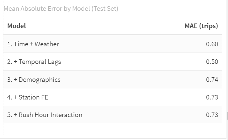
**Interpretation**: 1. Temporal lags are the most important predictive feature.
Model 2 gives the biggest drop in MAE, showing that short-term demand patterns drive accuracy.
2. Demographics help explain variation but don’t improve prediction.
3. Station fixed effects give a small but meaningful improvement.
They adjust for inherent differences between stations.
4. Extra complexity (Model 5) does not yield better predictions.
The model is already near its predictive ceiling.
5. Best predictive models are Model 2 (simplest) and Model 4 (slightly better).
### Visualize Model Comparison
```{r compare_models}
ggplot(mae_results1, aes(x = reorder(Model, -MAE), y = MAE)) +
  geom_col(fill = "#3182bd",alpha = 0.8) +
  geom_text(aes(label = round(MAE, 4)), vjust = -0.5) +
  labs(
    title = "Model Performance Comparison",
    subtitle = "Lower MAE = Better Predictions",
    x = "Model",
    y = "Mean Absolute Error (trips)"
  ) +
  scale_y_continuous(
    expand = expansion(mult = c(0, 0.1))
  ) +
  plotTheme +
  theme(axis.text.x = element_text(angle = 45, hjust = 1))
```
## Compare results to Q1 2025:
{width="100%"}
### 1. How do the MAE values compare across quarters?
Q1 2025 MAE values are generally lower than those we reported for Q3 2024.
So predictions in Q1 are simply easier.
### 2. Why might they differ?
Winter(Q1) has smoother, more predictable demand: Riders may behave more consistently in colder months. There are fewer tourists. Weather is cold but stable—more consistently low temperatures, fewer big swings.
Summer(Q3) is noisy and harder to predict: Weather-driven volatility: heat waves, thunderstorms, humidity. More variation in leisure rides, weekend trips, and irregular patterns. Tourism and events add bursts of unpredictable activity.
So the model in Q3 faces more randomness, and MAE naturally rises.
### 3. Are temporal patterns different (summer vs. winter)?
Yes. In winter, ridership follows a tighter, more predictable rhythm. The daily totals rise gradually from January into March without the big, volatile spikes that appear in summer. Hourly patterns also become cleaner: weekday mornings and evenings show sharp commuter peaks, while weekends stay much flatter with only a modest mid-day bump. By contrast, summer brings stronger mid-day activity, higher weekend volume, and much more weather-driven noise. Winter demand is steadier and more commute-oriented, whereas summer mixes commuting with a large amount of leisure riding, creating far more variation.
### 4. Which features are most important in your quarter?
Temporal lags. The results show a large performance jump when lag variables (1 hour, 3 hours, 1 day) are added. Summer ridership changes quickly with events, weather shifts, and bursts of leisure activity.
# Part 2: Error Analysis
## Space-Time Error Analysis
Observed vs. Predicted
Let's use our best model (Model 4) for error analysis.
```{r obs_vs_pred}
test <- test %>%
  mutate(
    error = Trip_Count - pred4,
    abs_error = abs(error),
    time_of_day = case_when(
      hour < 7 ~ "Overnight",
      hour >= 7 & hour < 10 ~ "AM Rush",
      hour >= 10 & hour < 15 ~ "Mid-Day",
      hour >= 15 & hour <= 18 ~ "PM Rush",
      hour > 18 ~ "Evening"
    )
  )

# Scatter plot by time and day type
ggplot(test, aes(x = Trip_Count, y = pred4)) +
  geom_point(alpha = 0.2, color = "#3182bd") +
  geom_abline(slope = 1, intercept = 0, color = "red", linewidth = 1) +
  geom_smooth(method = "lm", se = FALSE, color = "darkgreen") +
  facet_grid(weekend ~ time_of_day) +
  labs(
    title = "Observed vs. Predicted Bike Trips",
    subtitle = "Model 4 performance by time period",
    x = "Observed Trips",
    y = "Predicted Trips",
    caption = "Red line = perfect predictions; Green line = actual model fit"
  ) +
  plotTheme
```
**Interpretation**: Where the model performs well: It does best in low-to-moderate demand conditions, especially overnight and during mid-day. Those periods have fewer big swings and smaller trip counts, so the model can track the pattern closely. On weekends—when demand is generally smoother—the points cluster tightly and the green line stays close to the red line. The model doesn’t dramatically over- or under-shoot in these calmer periods.
Where the model struggles: It struggles during high-demand commuter windows, especially the AM and PM rush hours. In these panels, the cloud of points stretches upward far past the green line, showing that the model systematically under-predicts the busiest moments. Sharp surges in demand are hard to anticipate with simple temporal lags, so the model tends to flatten out the peaks. There is also more scatter on weekday rush hours than on weekends, reflecting the added variability of work-day travel.
In conclusion, **the model handles routine, low-volume times well, but it misses the sudden spikes that define heavy commuting periods.**
## Spatial Error Patterns
In this part, we are exploring whether prediction errors are clustered in certain parts of Philadelphia.
```{r spatial_errors}
# 1. Calculate MAE by stations
station_errors <- test %>%
  filter(!is.na(pred4)) %>%
  group_by(start_station, start_lat.y, start_lon.y) %>%
  summarize(
    MAE = mean(abs(Trip_Count - pred2), na.rm = TRUE),
    avg_demand = mean(Trip_Count, na.rm = TRUE),
    .groups = "drop"
  ) %>%
  filter(!is.na(start_lat.y), !is.na(start_lon.y))

# 2. Map 1:Prediction Errors
p1 <- ggplot() +
  geom_sf(data = philly_census, fill = "grey95", color = "white", size = 0.1) +
  geom_point(
    data = station_errors,
    aes(x = start_lon.y, y = start_lat.y, color = MAE),
    size = 0.5, alpha = 0.7
  ) +
  scale_color_viridis(
    option = "plasma",
    name = "MAE (trips)",
    direction = -1,
    breaks = c(0.5, 1.0, 1.5),
    labels = c("0.5", "1.0", "1.5")
  ) +
  labs(title = "Prediction Errors") +
  mapTheme +
  theme(
    legend.position = "bottom",
    legend.title = element_text(size = 10, face = "bold"),
    legend.text = element_text(size = 9),
    plot.title = element_text(size = 14, face = "bold", hjust = 0.5)
  ) +
  guides(color = guide_colorbar(
    barwidth = 12, barheight = 1,
    title.position = "top", title.hjust = 0.5
  ))

# 3. Map 2:Average Demand
p2 <- ggplot() +
  geom_sf(data = philly_census, fill = "grey95", color = "white", size = 0.1) +
  geom_point(
    data = station_errors,
    aes(x = start_lon.y, y = start_lat.y, color = avg_demand),
    size = 0.5, alpha = 0.7
  ) +
  scale_color_viridis(
    option = "viridis",
    name = "Avg Demand (trips/hour)",
    direction = -1,
    breaks = c(0.5, 1.0, 1.5, 2.0, 2.5),
    labels = c("0.5", "1.0", "1.5", "2.0", "2.5")
  ) +
  labs(title = "Average Demand") +
  mapTheme +
  theme(
    legend.position = "bottom",
    legend.title = element_text(size = 10, face = "bold"),
    legend.text = element_text(size = 9),
    plot.title = element_text(size = 14, face = "bold", hjust = 0.5)
  ) +
  guides(color = guide_colorbar(
    barwidth = 12, barheight = 1,
    title.position = "top", title.hjust = 0.5
  ))

# 4. Combine two maps
grid.arrange(p1, p2, ncol = 2)
```
**Interpretation**: Errors form a dense cluster in and around Center City, extending slightly into University City and parts of South Philly. The neighborhoods in center city have the highest errors.Because these stations often sit near job centers, transit hubs, parks, and retail corridors — all places with unpredictable surges. In short, The model struggles where human behavior is least predictable and demand is most dynamic.
## Temporal Error Patterns
When are we most wrong?
```{r temporal_errors}
# MAE by time of day and day type
temporal_errors <- test %>%
  group_by(time_of_day, weekend) %>%
  summarize(
    MAE = mean(abs_error, na.rm = TRUE),
    .groups = "drop"
  ) %>%
  mutate(day_type = ifelse(weekend == 1, "Weekend", "Weekday"))

ggplot(temporal_errors, aes(x = time_of_day, y = MAE, fill = day_type)) +
  geom_col(position = "dodge") +
  scale_fill_manual(values = c("Weekday" = "#08519c", "Weekend" = "#6baed6")) +
  labs(
    title = "Prediction Errors by Time Period",
    subtitle = "When is the model struggling most?",
    x = "Time of Day",
    y = "Mean Absolute Error (trips)",
    fill = "Day Type"
  ) +
  plotTheme +
  theme(axis.text.x = element_text(angle = 45, hjust = 1))
```
**Interpretation**: When are errors highest? Errors peak during the commute periods: PM Rush and AM Rush. These periods have the most unpredictable spikes in demand.
## Errors and Demographics
Are prediction errors related to neighborhood characteristics?
```{r errors_demographics}
# Join demographic data to station errors
station_errors_demo <- station_errors %>%
  left_join(
    station_attributes %>% select(start_station, Med_Inc, Percent_Taking_Transit, Percent_White),
    by = "start_station"
  ) %>%
  filter(!is.na(Med_Inc))

# Create plots
p1 <- ggplot(station_errors_demo, aes(x = Med_Inc, y = MAE)) +
  geom_point(alpha = 0.5, color = "#3182bd") +
  geom_smooth(method = "lm", se = FALSE, color = "red") +
  scale_x_continuous(labels = scales::dollar) +
  labs(title = "Errors vs. Median Income", x = "Median Income", y = "MAE") +
  plotTheme

p2 <- ggplot(station_errors_demo, aes(x = Percent_Taking_Transit, y = MAE)) +
  geom_point(alpha = 0.5, color = "#3182bd") +
  geom_smooth(method = "lm", se = FALSE, color = "red") +
  labs(title = "Errors vs. Transit Usage", x = "% Taking Transit", y = "MAE") +
  plotTheme

p3 <- ggplot(station_errors_demo, aes(x = Percent_White, y = MAE)) +
  geom_point(alpha = 0.5, color = "#3182bd") +
  geom_smooth(method = "lm", se = FALSE, color = "red") +
  labs(title = "Errors vs. Race", x = "% White", y = "MAE") +
  plotTheme

grid.arrange(p1, p2, p3, ncol = 2)
```
**Interpretation**: Prediction errors slightly related to neighborhood characteristics?
1. Higher-income neighborhoods show slightly higher errors. The trend line slopes upward: as median income increases, MAE tends to rise a bit. This likely reflects busier, more mixed-use areas where demand is less predictable.
2. Neighborhoods with high transit use show lower errors. Stations located in areas with more transit riders tend to have lower MAE. Transit-heavy areas typically have more stable, commute-driven travel patterns that are easier for the model to predict.
3. Stations in whiter neighborhoods show slightly higher errors. The relationship is mild, but the upward slope suggests that stations in predominantly white, higher-income areas may see more inconsistent demand—often driven by leisure or irregular trip purposes.
# Part 3 : Feature Engineering & Model Improvement
## Feature Selection and Engineering
From the error analysis above, we noticed that stations with large prediction errors are concentrated in Center City. From the data structure, we also know that the distribution of Trip_Count is highly skewed. There are many observations with 0 or 1 trip and a few observations with very large counts. The large number of 0 or 1 counts makes the model under-predict for high values. The extreme large counts make the model over-predict for low values. This creates a structural bias that we cannot fully remove.
To address this, we want to add variables that can detect and partially adjust for this pattern. Distance to Center City is a natural candidate. It can help the model sense the spatial structure behind these errors. However, the station dummy variables may already capture most of the distance differences. Therefore, the distance variable needs to be transformed or used in interaction terms to avoid collinearity with the station fixed effects.
When we examine the trip-count-over-time plots, we also see spikes that appear irregularly. These spikes may reflect special events that disrupt the usual demand pattern. They do not happen often, but they can create extreme values and break the roughly linear relationship that the model tries to learn. This can have a strong impact on model performance. Federal holidays are one potential source of such events. The current model does not include enough variables to detect these effects.
Based on these observations, we decide to add two new variables:
1.Holiday indicator
```{r}
library(lubridate)

study_panel_complete <- study_panel_complete %>%
  mutate(
    # Convert datetime column to Date
    date = as.Date(interval60),

    # Weekday with Monday = 1, Tuesday = 2, ..., Sunday = 7
    wday_mon = wday(date, week_start = 1),

    # US Federal Holidays (rule-based, works for any year)

    # New Year's Day: January 1st
    holiday_newyear = month(date) == 1  & mday(date) == 1,

    # Martin Luther King Jr. Day: 3rd Monday in January
    holiday_mlk = month(date) == 1 &
                  wday_mon == 1 &
                  mday(date) >= 15 & mday(date) <= 21,

    # Presidents’ Day: 3rd Monday in February
    holiday_pres = month(date) == 2 &
                   wday_mon == 1 &
                   mday(date) >= 15 & mday(date) <= 21,

    # Memorial Day: last Monday in May (Monday on or after the 25th)
    holiday_memorial = month(date) == 5 &
                       wday_mon == 1 &
                       mday(date) >= 25,

    # Independence Day: July 4th
    holiday_july4 = month(date) == 7 & mday(date) == 4,

    # Labor Day: 1st Monday in September (Monday between 1st and 7th)
    holiday_labor = month(date) == 9 &
                    wday_mon == 1 &
                    mday(date) <= 7,

    # Thanksgiving: 4th Thursday in November
    holiday_thanks = month(date) == 11 &
                     wday_mon == 4 &              # Thursday
                     mday(date) >= 22 & mday(date) <= 28,

    # Christmas Day: December 25th
    holiday_xmas = month(date) == 12 & mday(date) == 25,

    # Combined holiday indicator: 1 if any of the above holidays, 0 otherwise
    holiday_any = as.integer(
      holiday_newyear | holiday_mlk | holiday_pres |
      holiday_memorial | holiday_july4 | holiday_labor |
      holiday_thanks | holiday_xmas
    )
  )
```
2.Distance to Center City
```{r}
# 1. City Hall point
philly_cbd_3857 <- st_sfc(
  st_point(c(-75.1636, 39.9526)),   # lon, lat
  crs = 4326
) %>%
  st_transform(3857)

# project the dataframe to the same CRS 3857 (to calculate distance in meter)
stations_dist <- stations_sf %>%
  st_transform(3857) %>%
  mutate(
    dist_center_m = as.numeric(st_distance(geometry, philly_cbd_3857))
  ) %>%
  st_drop_geometry() %>%
  select(start_station, dist_center_m) %>%
  distinct()

study_panel_complete <- study_panel_complete %>%
  left_join(stations_dist, by = "start_station")


study_panel_complete <- study_panel_complete %>%
  mutate(
    Rain_any   = as.integer(Precipitation > 0),
    Heavy_rain = as.integer(Precipitation >= 0.3)
  )

# let's make a little change in the intersection by using "weekday*rush_hour"
study_panel_complete <- study_panel_complete %>%
  mutate(
    weekday = ifelse(dotw %in% c("Mon", "Tue", "Wed", "Thu", "Fri"), 1, 0)
  )

#split the train adn test data
train <- study_panel_complete %>%
  filter(week < 37)

test <- study_panel_complete %>%
  filter(week >= 37)
```
## Model Improvement
### Model 6: Adjust variables in model 4
In this model, we refine some existing variables and use the result as the second baseline for later improved models.
First, based on the summary of Model 4, we noticed that the Precipitation variable did not perform well. However, rain conditions should be an important factor for bike demand. The original variable is very small in magnitude because the total amount of rain is spread across 24 hours. To better capture the effect of rain, we transform it into two dummy variables that indicate whether it is rainy and whether it is raining heavily.
Second, we believe the weekend indicator is important because the demand pattern on weekends is different from weekdays. In the previous model, it did not work well because the interaction term `weekend:rush_hour` is highly collinear with `as.factor(hour)`. To keep the weekend/weekday effect in the model, we replace this term with the interaction `as.factor(hour):weekend`.
```{r}
model6 <- lm(
  Trip_Count ~ as.factor(hour)* weekend + dotw_simple +
    Temperature +
    Rain_any + Heavy_rain +
    lag1Hour + lag3Hours + lag1day  +
    as.factor(month) +
    Med_Inc.y + Percent_Taking_Transit.y + Percent_White.y +
    as.factor(start_station),  # Rush hour effects different on weekends
  data = train
)
```
```{r}
model_metrics_lm(model6, test_data = test)
```
**Interpretation**: Model 6 serves as our second baseline model after refining several key predictors.
On weekdays, the model shows strong morning and evening peaks that are consistent with commuting.\
On weekends, the peaks flatten and shift toward the middle of the day.\
The new rain dummies behave as expected: both rainy and heavy-rain hours are associated with lower trip counts compared with dry conditions.\
Demographics and station fixed effects mainly shift the overall level of demand at each station, while the refined weather and weekend terms improve the shape of the predicted time profile without a large change in overall MAE.
### Model 7: Add Holiday Indicator and Distance to center city Interation
This model is based on Model 6 and adds two new components: a holiday indicator and an interaction between distance to Center City and rush hour. As discussed above, the interaction term is not only used to capture the relationship between distance and peak-hour demand, but also to reduce collinearity with the station fixed effects. Adding these two variables may help the model better detect structural patterns in the data and improve overall performance.
```{r}
model7 <- lm(
  Trip_Count ~ as.factor(hour)* weekday +
    dotw_simple +
    Temperature +
    Rain_any + Heavy_rain +
    lag1Hour + lag3Hours + lag1day  +
    as.factor(month) +
    Med_Inc.y + Percent_Taking_Transit.y + Percent_White.y +
    dist_center_m*rush_hour  +                              # interaction
    holiday_any +                                           # holiday indicator
    as.factor(start_station),
  data = train
)
```
```{r}
model_metrics_lm(model7, test_data = test)
```
**Interpretation**: Model 7 builds on Model 6 by adding two variables that are motivated directly by our error analysis and knowledge of Philadelphia’s spatial and temporal structure: a holiday indicator and an interaction between distance to Center City and rush hour. The idea is that holidays and downtown peak periods are exactly when we observed the largest systematic errors in previous models. These additions slightly improve performance: the test MAE decreases from 0.6783 in Model 6 to 0.6762 in Model 7, and (R\^2) rises only marginally from 0.3702 to 0.3751. This shows that, even after trying to encode what we learned about the error patterns, urban form, and time-of-day effects into new variables, most of the predictive power still comes from the core ingredients introduced earlier (time of day, temporal lags, and station fixed effects). The remaining errors are likely driven by noise and unobserved factors—such as special events or local disruptions—that are difficult to capture with simple linear terms.
### Model 8: Try a poisson model for count data (base on model 7)
In addition to the linear regression models, we also estimate a Poisson regression with a log link to better reflect the count nature of the bike trip data. For this specification, we keep the same set of predictors as in Model 7 and only change the estimation method from OLS to Poisson. This allows us to directly compare the two approaches under an identical model structure. The Poisson model serves as a robustness check: it tests whether the main effects of time-of-day, weekend, weather, lagged demand, distance to Center City, and holidays remain consistent when we use a count model that is more appropriate for non-negative integer outcomes.
```{r}
# Poisson model with log link
poisson_model7 <- glm(
  Trip_Count ~
    as.factor(hour) * weekday +
    dotw_simple +
    Temperature + Rain_any + Heavy_rain +
    lag1Hour + lag3Hours + lag1day +
    as.factor(month) +
    Med_Inc.y + Percent_Taking_Transit.y + Percent_White.y +
    dist_center_m*rush_hour +
    holiday_any +
    as.factor(start_station),
  family = poisson(link = "log"),
  data = train
)
```
```{r}
model_metrics_lm(poisson_model7, test_data = test)
```
**Interpretation**: Finally, we re-estimate Model 7 using a Poisson regression with a log link while keeping exactly the same set of predictors. This change in estimation method leads to a modest but clear improvement in predictive performance: the test MAE decreases from 0.6762 in the OLS version of Model 7 to 0.6461 in the Poisson model, and the (R\^2) on the training set increases slightly from 0.3751 to 0.3828. The Poisson specification fits the count nature of bike trips better and reduces some of the systematic under- and over-prediction we saw in the linear model, but the gain is not dramatic, which suggests that most remaining errors are due to noise and unobserved shocks rather than the choice between OLS and Poisson.
## Overall Model Evaluation
```{r}
# Get predictions on test set

test <- test %>%
  mutate(
    pred1 = predict(model1, newdata = test),
    pred2 = predict(model2, newdata = test),
    pred3 = predict(model3, newdata = test),
    pred4 = predict(model4, newdata = test),
    pred5 = predict(model5, newdata = test),
    pred6 = predict(model6, newdata = test),
    pred7 = predict(model7, newdata = test),
    pred8 = predict(poisson_model7, newdata = test, type = "response")
  )

# Calculate MAE for each model
mae_results2 <- data.frame(

  Model = paste0(
    "Model ", 1:8
  ),
  Description = c(
    "1. Time + Weather",
    "2. + Temporal Lags",
    "3. + Demographics",
    "4. + Station FE",
    "5. + Rush Hour Interaction",
    "6. Adjust variables (Base on M4)",
    "7. + Holiday Indicator and Distance Interaction",
    "8. Poisson using variables in model 7"
  ),
  MAE = c(
    mean(abs(test$Trip_Count - test$pred1), na.rm = TRUE),
    mean(abs(test$Trip_Count - test$pred2), na.rm = TRUE),
    mean(abs(test$Trip_Count - test$pred3), na.rm = TRUE),
    mean(abs(test$Trip_Count - test$pred4), na.rm = TRUE),
    mean(abs(test$Trip_Count - test$pred5), na.rm = TRUE),
    mean(abs(test$Trip_Count - test$pred6), na.rm = TRUE),
    mean(abs(test$Trip_Count - test$pred7), na.rm = TRUE),
    mean(abs(test$Trip_Count - test$pred8), na.rm = TRUE)
  )
) %>%
  mutate(
    improvement_from_baseline = round((MAE[1] - MAE) / MAE[1] * 100, 1),
    improvement_from_lags = round((MAE[6] - MAE) / MAE[2] * 100, 1)
  )

kable(mae_results2,
      digits = 4,
      caption = "Mean Absolute Error by Model (Test Set)",
      col.names = c("Model", "Description", "MAE (trips)", "% Better than M1", "% Better than M6")) %>%
  kable_styling(bootstrap_options = c("striped", "hover"))
```
**Interpretation**: From Model 3 to Model 7, we keep adding more variables and refining the specification, but the improvement over Model 2 is quite limited. After including temporal lags in Model 2, the MAE already drops from 0.83 to about 0.69 trips, and this remains the dominant gain. Models 3–5 add demographics, station fixed effects, and a rush-hour interaction, and Models 6–7 further adjust weather, weekend, distance, and holiday variables. However, the MAE stays in a very narrow range around 0.68–0.676, which is only a small improvement compared to Model 2.
This pattern suggests that once we control for time-of-day and recent demand history, most additional predictors only provide marginal extra information for short-term station-level demand. Demographics and station dummies mainly shift overall levels rather than change hour-to-hour variation, and the added interaction terms capture more subtle structure but do not drastically reduce prediction error on the test set.
In contrast, Model 8 changes the estimation method rather than the predictor set. It applies a Poisson regression using the same variables as Model 7. This shift to a count model leads to a more noticeable improvement: the MAE decreases to 0.6461 trips, which is substantially better than the OLS models with the same predictors. This indicates that better matching the distributional form of the outcome (non-negative counts) can yield additional gains even when the set of explanatory variables is already rich.
### Visualize Model Comparison
```{r}
ggplot(mae_results2, aes(x = reorder(Model, -MAE), y = MAE)) +
  geom_col(fill = "#3182bd",alpha = 0.8) +
  geom_text(aes(label = round(MAE, 4)), vjust = -0.5) +
  labs(
    title = "Model Performance Comparison",
    subtitle = "Lower MAE = Better Predictions",
    x = "Model",
    y = "Mean Absolute Error (trips)"
  ) +
  scale_y_continuous(
    expand = expansion(mult = c(0, 0.1))
  ) +
  plotTheme +
  theme(axis.text.x = element_text(angle = 45, hjust = 1))
```
# Part 4: Critical Reflection
1. **Operational implications:**
Our best model (Poisson, Model 8) has a test-set MAE of about 0.65 trips per station–hour. At this resolution a typical error is well under one bike, which is reasonably good given how noisy and skewed bike-share demand is. In practice Indego would often aggregate predictions over several hours and across groups of stations, so some of these small errors would cancel out and the effective error at the operational level would be even smaller.
Prediction errors become operationally problematic mainly when they are systematic in high-demand contexts. In our results the largest errors tend to occur at busy Center City stations during peak hours and around special days such as holidays or events. Under-predicting in those situations can leave key stations empty or full exactly when demand is highest, while over-predicting at low-demand stations mostly has minor consequences.
I would not use this model as a fully automated rebalancing system, but I would recommend it as a decision-support tool. It is best used on aggregated time windows and station clusters, to flag where demand is likely to be high relative to current inventory, while human operators retain control. As long as staff treat the forecasts as guidance rather than exact numbers, remain cautious around holidays or special events, and periodically monitor and retrain the model, the current performance is good enough to provide useful support for Indego’s rebalancing decisions.
2. **Equity considerations:**
From an equity perspective, the key question is whether our prediction errors are larger or more systematic in certain kinds of neighborhoods. In our error maps, the most obvious clusters of high error appear in Center City and other high-demand stations, which are generally higher-income and whiter areas, so the model does not obviously underperform only in disadvantaged neighborhoods. However, even small absolute errors in lower-income or majority-nonwhite areas can matter more, because there are fewer nearby alternatives if a station is empty or full. If rebalancing decisions rely heavily on these forecasts, any systematic under-prediction in these communities could translate into more frequent stock-outs and longer walking distances, which would reinforce existing disparities in bike access.
To reduce this risk, the system should include explicit safeguards. First, errors and service levels should be monitored by neighborhood characteristics such as income, race, and transit dependence, not only in aggregate. Second, rebalancing rules can include minimum service standards for equity-priority zones, so that these stations are never deprioritized solely because predicted demand is low or uncertain. Third, planners should periodically audit the model for bias, adjust the specification if one group is consistently under-served, and involve community stakeholders when defining which areas are “must-serve” regardless of forecasted demand. Used with these safeguards, the forecasting system is less likely to worsen existing disparities and can even help identify where additional investment in stations or rebalancing capacity is needed.
3. **Model limitations:**
Our model still misses several important patterns. It struggles with sharp spikes caused by special events, construction, or one-off disruptions, which do not follow the typical weekday/weekend and seasonal structure learned from the data. It also assumes that the relationship between predictors and demand is stable over time and largely linear on the log scale, even though real-world behavior can change with new infrastructure, pricing, or cultural shifts. In deployment, station capacity constraints, operational decisions (like temporary closures or rebalancing itself), and policy changes would all feed back into observed demand in ways the current model does not explicitly represent. With more time and data, I would incorporate richer features (such as real-time event data, land use and network connectivity, or app usage patterns), explore more flexible models such as gradient boosting or random forests with careful regularization, and estimate separate models for different station types or clusters. I would also set up an ongoing evaluation pipeline to monitor performance over time, detect drift, and retrain or recalibrate the model as Indego’s system and user behavior evolve.


