# Load necessary librarieslibrary(tidyverse)library(sf)library(tidycensus)library(knitr)library(tigris)options(tigris_use_cache =TRUE, tigris_class ="sf")library(MASS)library(dplyr)library(scales)library(ggplot2)library(patchwork)library(caret)library(tibble)library(gt)library(lm.beta)library(broom)# Add this near the top of your .qmd after loading librariesoptions(tigris_use_cache =TRUE)options(tigris_progress =FALSE) # Suppress tigris progress bars
# Transform to sf object opa_sf <-st_as_sf(opa_selected, wkt ="shape", crs =2272) %>%st_transform(4326)
Load secondary data
Code
# Load Census data for Philadelphia tractsphilly_census <-get_acs(geography ="tract",variables =c(total_pop ="B01003_001",black ="B02001_003",ba_degree ="B15003_022",total_edu ="B15003_001",median_income ="B19013_001",labor_force ="B23025_003",unemployed ="B23025_005" ),year =2023,state ="PA",county ="Philadelphia",geometry =TRUE) %>% dplyr::select(GEOID, variable, estimate, geometry) %>%# ← 用 dplyr:: tidyr::pivot_wider(names_from = variable, values_from = estimate) %>% dplyr::mutate(ba_rate =100* ba_degree / total_edu,unemployment_rate =100* unemployed / labor_force,black_share =100* black/total_pop ) %>%st_transform(st_crs(opa_sf))# Spatial join of OPA data with Census dataopa_census <-st_join(opa_sf, philly_census, join = st_within) %>%filter(!is.na(median_income))#garage dummyopa_census <- opa_census %>%mutate(has_garage =if_else(!is.na(garage_spaces) & garage_spaces >0, 1L, 0L) )
Summary tables (before/ after)
Code
# Original data dimensionsopa_dims <-tibble(dataset ="opa (raw CSV)",rows =nrow(opa),columns =ncol(opa))# cleaned data dimensionsopa_filter_dims <-tibble(dataset ="opa (filtered)",rows =nrow(opa_clean),columns =ncol(opa_clean))opa_selected_dims <-tibble(dataset ="opa (cleaned & selected)",rows =nrow(opa_selected),columns =ncol(opa_selected))# data dimensions (within census tracts)opa_census_dims <-tibble(dataset ="opa (spatial joined)",rows =nrow(opa_census),columns =ncol(opa_census))# create summary tablesummary_table <-bind_rows(opa_dims, opa_filter_dims,opa_selected_dims, opa_census_dims)summary_table %>%kable(caption ="Summary of OPA data before and after cleaning")
Summary of OPA data before and after cleaning
dataset
rows
columns
opa (raw CSV)
583776
79
opa (filtered)
42383
79
opa (cleaned & selected)
25860
23
opa (spatial joined)
25585
35
Code
# load the neighborhood data by wardwards <-st_read("data/Political_Wards.geojson", quiet =TRUE) %>%st_transform(st_crs(opa_census))
Narrative Explaining Decisions
During the data preparation phase, several cleaning and filtering steps were performed to ensure the reliability of the Philadelphia property sales dataset.
Filtering and selecting relevant variables
Only single-family residential properties were retained to maintain consistency in property type. Sales were limited to 2023–2024 to focus on the most recent housing market conditions.A subset of relevant columns—such as property characteristics, sale price, and geographic information—was retained to reduce processing time and support exploratory analysis.
Removing obvious errors and handling missing values
Extremely low sale prices—often suspected to be due to inheritance transfers—were excluded to avoid biasing the model. Properties with a reported construction year of “0” were also removed, as these are unrealistic. Similarly, properties with nonpositive living area were excluded, since living area must be greater than zero.
Transforming to spatial format and calculating additional attributes
The cleaned dataset was then converted to an sf (spatial features) object to enable spatial analysis. An additional variable, house age, was calculated based on the difference between the sale year and the year built, allowing for further filtering of unrealistic building ages and facilitating later modeling steps.
Integrating census and spatial amenity data
Census tract–level socioeconomic data were obtained via the tidycensus package and spatially joined to the property dataset using st_within(). This ensured that only properties located within the official boundaries of Philadelphia were retained. Additional contextual datasets from OpenDataPhilly (e.g., parks, schools, and public facilities)—were also prepared in phase 3 for subsequent analysis to examine how neighborhood characteristics may influence property prices.
Final dataset summary
Through this cleaning and integration process, the dataset was reduced from 583,776 initial records to 42,383 after initial filtering, and then to 25,860 after further refinement. Following the spatial join with census tract data, the final analytical dataset contained 25,585 valid property records with complete socioeconomic and spatial information.
Phase 2: Exploratory Data Analysis
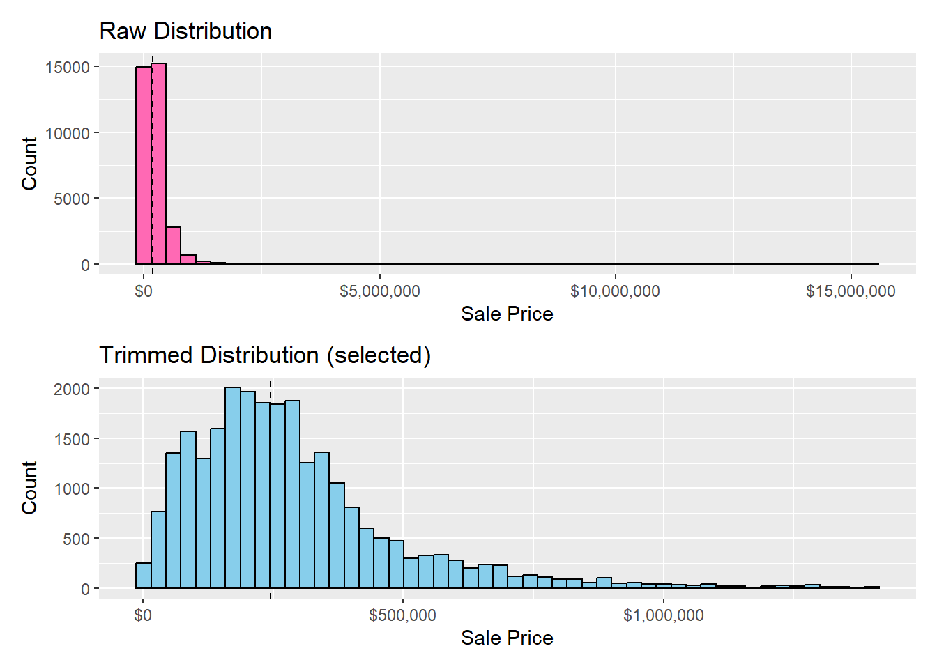
1. Distribution of sale prices (histogram)
Code
p_raw <-ggplot(opa_var, aes(x = sale_price)) +geom_histogram(bins =50, fill ="hotpink", color ="black") +geom_vline(aes(xintercept =median(sale_price)), linetype ="dashed") +labs(title ="Raw Distribution",x ="Sale Price", y ="Count") +scale_x_continuous(labels = scales::label_dollar())p_cut <- opa_census %>%ggplot(aes(x = sale_price)) +geom_histogram(bins =50, fill ="skyblue", color ="black") +geom_vline(aes(xintercept =median(sale_price)), linetype ="dashed") +labs(title ="Trimmed Distribution (selected)",x ="Sale Price", y ="Count") +scale_x_continuous(labels = scales::label_dollar())p_raw/p_cut
Interpretation
The first histogram shows the raw distribution of property sale prices in Philadelphia (2023–2024). Despite using 50 bins, the distribution remains highly right-skewed, with the vast majority of transactions concentrated below roughly $1.5 million and a small number of luxury properties extending far beyond that range. To address this heavy right tail, we trimmed observations above the 98th percentile of sale prices. This cutoff removes extreme luxury transactions that disproportionately influence the scale, while still preserving over 98% of the housing market.
The second histogram presents this trimmed distribution, excluding the top 2% of sales. After removing these extreme outliers, the shape becomes much clearer and more interpretable—revealing a unimodal, approximately log-normal pattern centered around the city’s median sale price.
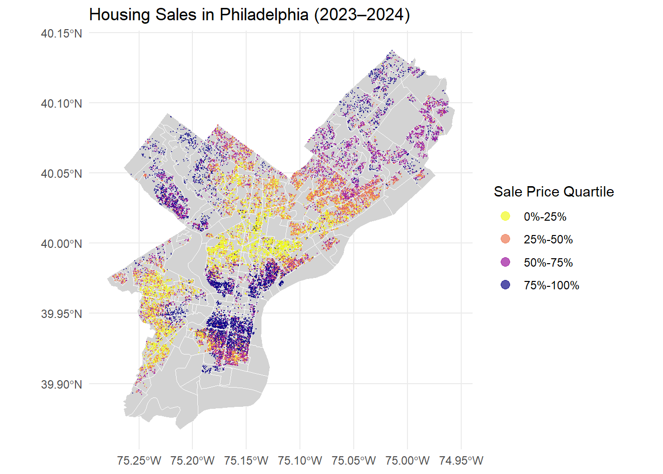
The map shows a highly unequal distribution of housing prices across Philadelphia, clearly defined by geography.
Highest Prices (Deep Purple: 75%-100%) are heavily clustered in the Northwest (affluent neighborhoods like Chestnut Hill) and the Central/Southeast Core (downtown luxury homes).
Lowest Prices (Bright Yellow: 0%-25%) dominate the Southwest portion of the city and parts of the far North/Northeast, indicating the most affordable markets.
Mid-Range Prices cover the majority of South Philadelphia and other areas surrounding the high-value core.
In short, wealth is concentrated in the Northwest and Center City, while affordability is highest in the Southwest.
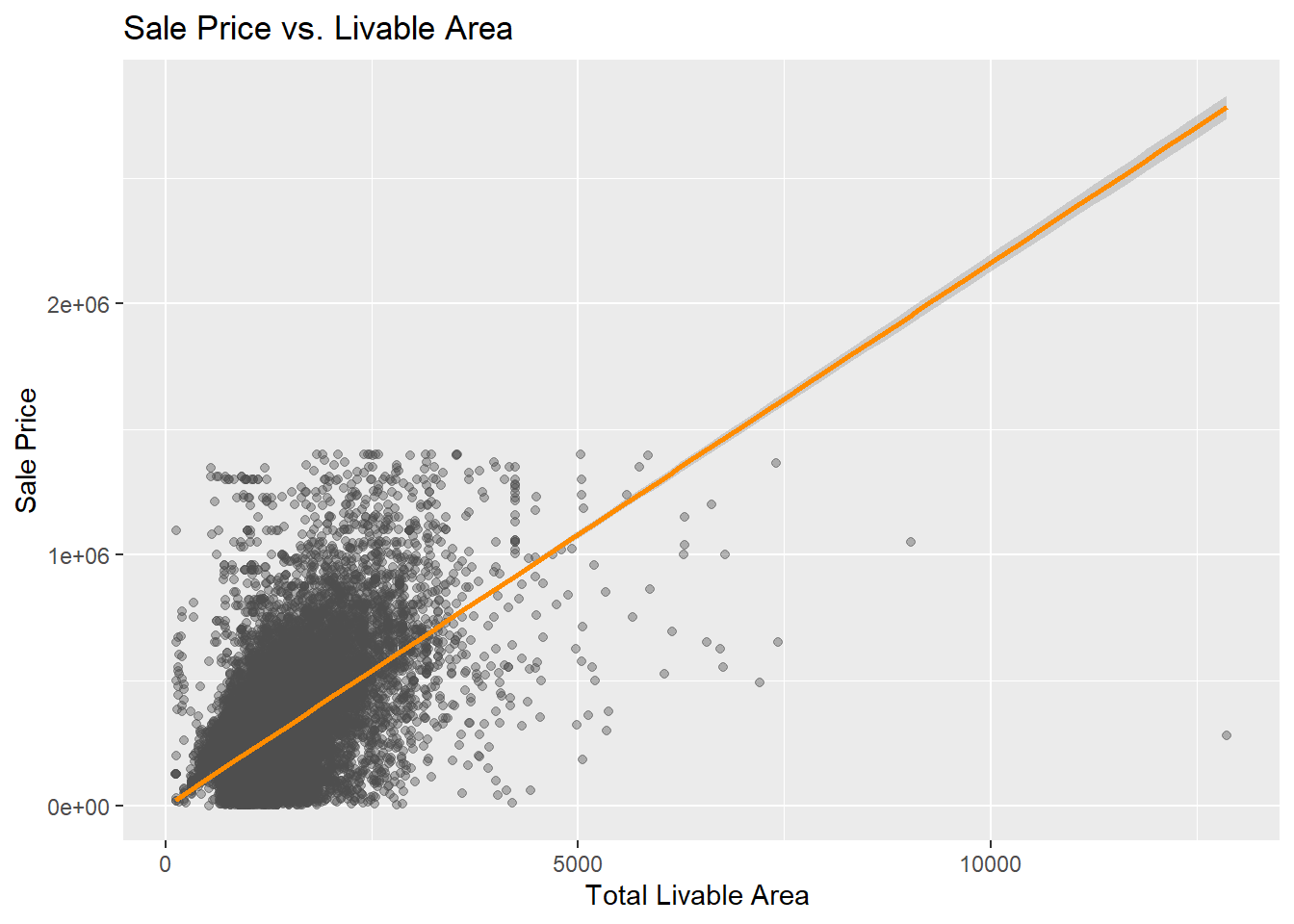
3. Price vs. structural features (scatter plots)
Code
ggplot(opa_census, aes(x = total_livable_area, y = sale_price)) +geom_point(alpha =0.4, color="grey30") +geom_smooth(method ="lm", color ="darkorange") +labs(title ="Sale Price vs. Livable Area",x ="Total Livable Area ", y ="Sale Price")
Interpretation
The scatter plot above shows the relationship between total livable area and sale price for residential properties in Philadelphia (2023–2024).
As expected, larger homes generally sell for higher prices. However, there is also substantial variation among properties of similar size, reflecting the influence of location, building condition, and neighborhood characteristics.
Overall, this visualization confirms that livable area is positively associated with sale price, though it is not the only factor shaping property values across the city.
4. Price vs. spatial features (scatter plots)
Code
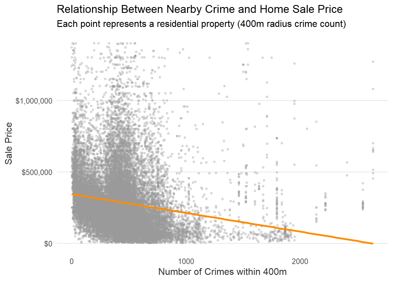
crime <-read_csv("data/crime.csv") %>%filter(!is.na(lat) &!is.na(lng)) crime_sf <-st_as_sf(crime, coords =c("lng", "lat"), crs =4326) %>%st_transform(st_crs(opa_census)) radius_cri <-400opa_census$crime_count <-lengths(st_is_within_distance(opa_census, crime_sf, dist = radius_cri)) ggplot(opa_census %>%st_drop_geometry(),aes(x = crime_count, y = sale_price)) +geom_point(alpha =0.3, color ="grey60", size =1) +geom_smooth(method ="lm", color ="darkorange", linewidth =1.2, se =FALSE) +scale_y_continuous(labels =label_dollar()) +labs(title ="Relationship Between Nearby Crime and Home Sale Price",subtitle ="Each point represents a residential property (400m radius crime count)",x ="Number of Crimes within 400m",y ="Sale Price" ) +theme_minimal(base_size =12) +theme(panel.grid.minor =element_blank(),panel.grid.major.x =element_blank(),axis.text =element_text(color ="grey30"),axis.title =element_text(color ="grey20") )
Code
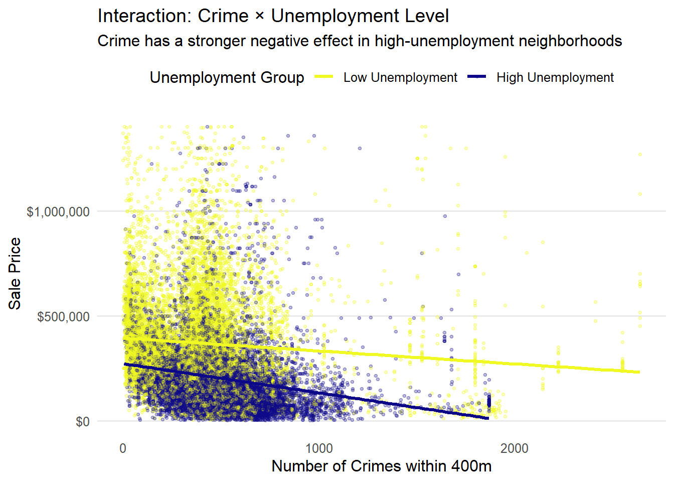
opa_interact <- opa_census %>%st_drop_geometry() %>%mutate(unemp_group =ntile(unemployment_rate, 2),unemp_group =factor(unemp_group,labels =c("Low Unemployment", "High Unemployment")) )ggplot(opa_interact, aes(x = crime_count, y = sale_price, color = unemp_group)) +geom_point(alpha =0.25, size =0.8) +geom_smooth(method ="lm", se =FALSE, linewidth =1.2) +scale_y_continuous(labels =label_dollar()) +scale_color_viridis_d(option ="plasma", direction =-1) +labs(title ="Interaction: Crime × Unemployment Level",subtitle ="Crime has a stronger negative effect in high-unemployment neighborhoods",x ="Number of Crimes within 400m",y ="Sale Price",color ="Unemployment Group" ) +theme_minimal(base_size =12) +theme(legend.position ="top",panel.grid.minor =element_blank(),panel.grid.major.x =element_blank() )
Interpretation
The first chart shows a pattern in which housing prices fall as nearby crime incidents increase. The second chart shows a situation where high-unemployment areas experience steeper price declines, which means that economic disadvantage amplifies the effect of crime on housing markets.
5. One creative visualization
Code
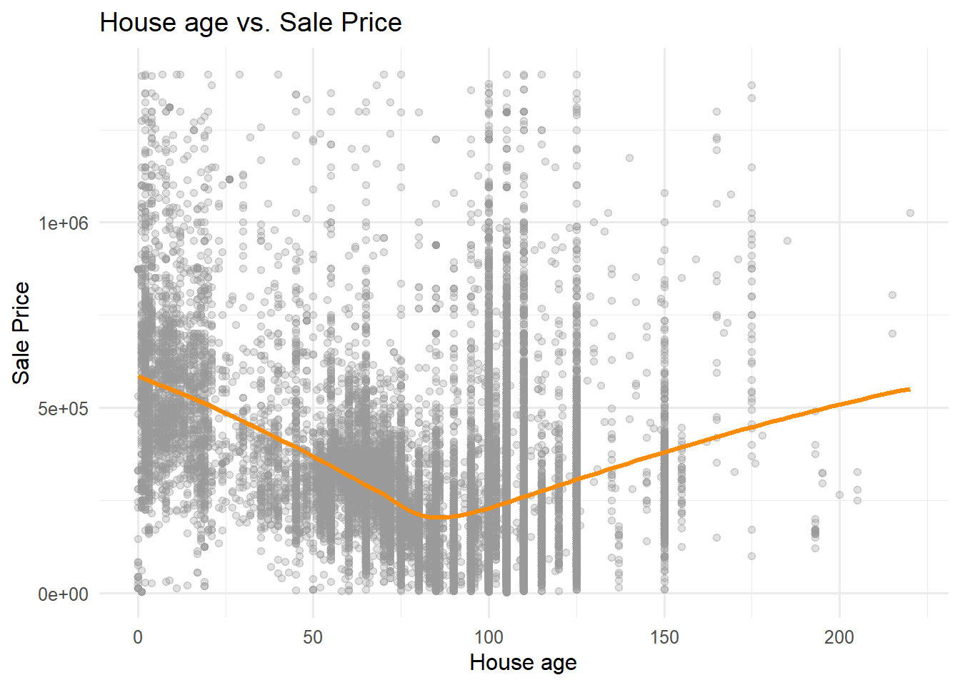
ggplot(opa_census %>%st_drop_geometry(),aes(x = house_age, y = sale_price)) +geom_point(alpha =0.3, color ="grey60") +geom_smooth(method ="loess", color ="darkorange", linewidth =1.2, se =FALSE) +labs(title ="House age vs. Sale Price",x ="House age",y ="Sale Price" ) +theme_minimal(base_size =12)
Interpretation
The chart shows a nonlinear pattern where newer houses sell at higher prices, mid-aged houses experience lower values, and vintage and historical houses regain value due to historic character and prime urban locations.
#add center city as a dummycenter_city <-st_read("data/CCD_BOUNDARY.geojson", quiet =TRUE) %>%st_transform(st_crs(opa_census))opa_census$center_city_dummy <-as.numeric(lengths(st_intersects(opa_census, center_city)) >0)
2. k-Nearest Neighbor features
Code
# find the distance of the nearest hospitalhospital_sf <-st_read("data/hospitals.geojson", quiet =TRUE) %>%st_transform(st_crs(opa_census))nearest_hospital_index <-st_nearest_feature(opa_census, hospital_sf)opa_census$nearest_hospital_m <-st_distance( opa_census, hospital_sf[nearest_hospital_index, ],by_element =TRUE)opa_census$nearest_hospital_m <-as.numeric(opa_census$nearest_hospital_m)
During the feature engineering phase, a series of spatial indicators were developed to capture neighborhood-level conditions relevant to property values across Philadelphia.
Creating buffer-based accessibility features
Transit stops within a 400 m radius were counted for each property to represent public transport accessibility, a key component of urban connectivity. Recreation facilities within 1.2 km were used to approximate walkable access to amenities under the “15-minute city” concept, which reflects daily life convenience and potentially higher demand in middle- and high-income areas. A categorical variable of recreations was created to classify accessibility as None, Low, Medium, or High.
Adding location dummies and urban core identification
A binary indicator identified whether a property lies within Philadelphia’s Center City boundary. This variable captures the premium effect of the city’s dense commercial and employment core, where housing demand remains consistently high.
Incorporating nearest-neighbor proximity features
The shortest distance to hospitals was calculated using the k-nearest neighbor approach to represent healthcare accessibility.
Phase 4: Model Building
1. Structural features only
This baseline model focuses on property-level characteristics to explain price variation. It includes size, number of bedrooms and bathrooms, and building age (with a quadratic term to capture nonlinear aging effects).
Call:
lm(formula = sale_price ~ total_livable_area + number_of_bedrooms +
    number_of_bathrooms + house_age + I(house_age^2), data = opa_census)

Residuals:
     Min       1Q   Median       3Q      Max
-1849632   -93819   -16892    62981  1166739

Coefficients:
                      Estimate Std. Error t value Pr(>|t|)
(Intercept)          2.200e+05  5.906e+03   37.24   <2e-16 ***
total_livable_area   1.598e+02  2.205e+00   72.47   <2e-16 ***
number_of_bedrooms  -3.337e+04  1.200e+03  -27.79   <2e-16 ***
number_of_bathrooms  9.263e+04  1.804e+03   51.34   <2e-16 ***
house_age           -4.486e+03  1.135e+02  -39.52   <2e-16 ***
I(house_age^2)       2.442e+01  7.249e-01   33.69   <2e-16 ***
---
Signif. codes:  0 '***' 0.001 '**' 0.01 '*' 0.05 '.' 0.1 ' ' 1

Residual standard error: 153500 on 24683 degrees of freedom
  (896 observations deleted due to missingness)
Multiple R-squared:  0.4497,    Adjusted R-squared:  0.4496
F-statistic:  4034 on 5 and 24683 DF,  p-value: < 2.2e-16
The model shows that larger homes and those with more bathrooms tend to sell for higher prices, while having more bedrooms (holding size constant) slightly reduces value, likely because it implies smaller rooms. Older houses are generally less expensive, but the positive squared term for house age suggests that this decline slows over time—very old or historic homes may retain or regain value. Overall, the model explains about 45% of the variation in sale prices, indicating a reasonably strong fit.
2.Census variables
This model incorporates neighborhood socioeconomic factors drawn from Census data. Variables such as median income, education level (BA rate), unemployment, and racial composition, which introduce the broader census data context into the housing price model.
Compared with the first model, this version explains more variation in sale prices (R² rises from 0.45 to 0.60). Structural effects remain similar: larger area and more bathrooms increase value, while older homes are cheaper but the decline slows with age. Adding neighborhood factors improves accuracy—homes in areas with higher income and education levels sell for more, while higher unemployment and larger Black population shares correspond to lower prices. This shows that both property traits and local socioeconomic context shape housing values.
3. Spatial features
This step adds spatial variables to capture location effects in prices and to improve prediction. We include crime count as safety, transit stops within 400 m as mobility access, recreation within 1.2 km as amenity access, and hospital distance as service access.
This third model adds spatial accessibility and amenity variables on top of housing and neighborhood characteristics. The explanatory power improves slightly (R² rises from 0.60 to 0.61). Core structural effects remain consistent: larger homes and more bathrooms raise prices, while older homes are cheaper but depreciate more slowly with age.
Among the new variables, transit access and recreation facilities show strong positive effects—areas with better public transport and more recreation sites have higher housing values. Proximity to hospitals also matters: prices fall as distance increases, but the positive squared term suggests diminishing marginal effects once the hospital is very close. Crime count is mostly insignificant, implying limited direct influence after controlling for other neighborhood factors.
4. Interactions and fixed effects
This final model adds interaction and dummy variables to capture more detailed relationships. The interaction term between crime count and unemployment rate examines how the effect of crime varies with local economic conditions. Dummy variables identify categorical differences: has_garage explains the house stucture, center_city_dummy represents the city core premium, and recreation_dummy classifies recreational access levels.
This final model adds categorical variables and an interaction between crime and unemployment to capture contextual effects. The fit improves slightly again (R² ≈ 0.61). Structural patterns remain stable: larger and newer homes with more bathrooms are worth more, and aging reduces value but at a slowing rate.
Neighborhood effects also stay consistent—higher income and education raise prices, while higher unemployment and larger Black population shares lower them. In areas with higher unemployment, housing prices are less sensitive to crime; in contrast, in areas with lower unemployment and stronger economic conditions, crime has a larger negative impact on housing values.
Adding location and amenity dummies refines spatial interpretation. Properties in Center City and those with garages sell for more, while areas with fewer recreation facilities are valued lower. Proximity to hospitals and transit access continue to show positive associations with housing value.
set.seed(42)cv_control <-trainControl(method ="cv", number =10, savePredictions ="final")m1 <-train(fml1, data = model_data, method ="lm", trControl = cv_control)m2 <-train(fml2, data = model_data, method ="lm", trControl = cv_control)m3 <-train(fml3, data = model_data, method ="lm", trControl = cv_control)m4 <-train(fml4, data = model_data, method ="lm", trControl = cv_control)
This section evaluates model performance using 10-fold cross-validation to ensure generalizability. The dataset was split into ten equal subsets: in each iteration, nine folds trained the model while the remaining one tested it. This process repeated ten times so every observation served once as validation data. The caret::train() function handled resampling automatically through trainControl(method = “cv”, number = 10), producing stable estimates of RMSE, MAE, and R² for each model specification.
The 10-fold cross-validation results show steady improvement as more variables are added. The structural model explains about 45% of price variation, while adding census data raises accuracy to 60%. Including spatial features gives small but consistent gains, and the final model with interaction and fixed-effect terms reaches the best overall performance (MAE ≈ $81K; RMSE ≈ $129K; R² = 0.61), showing that it captures most location and neighborhood effects on housing prices.
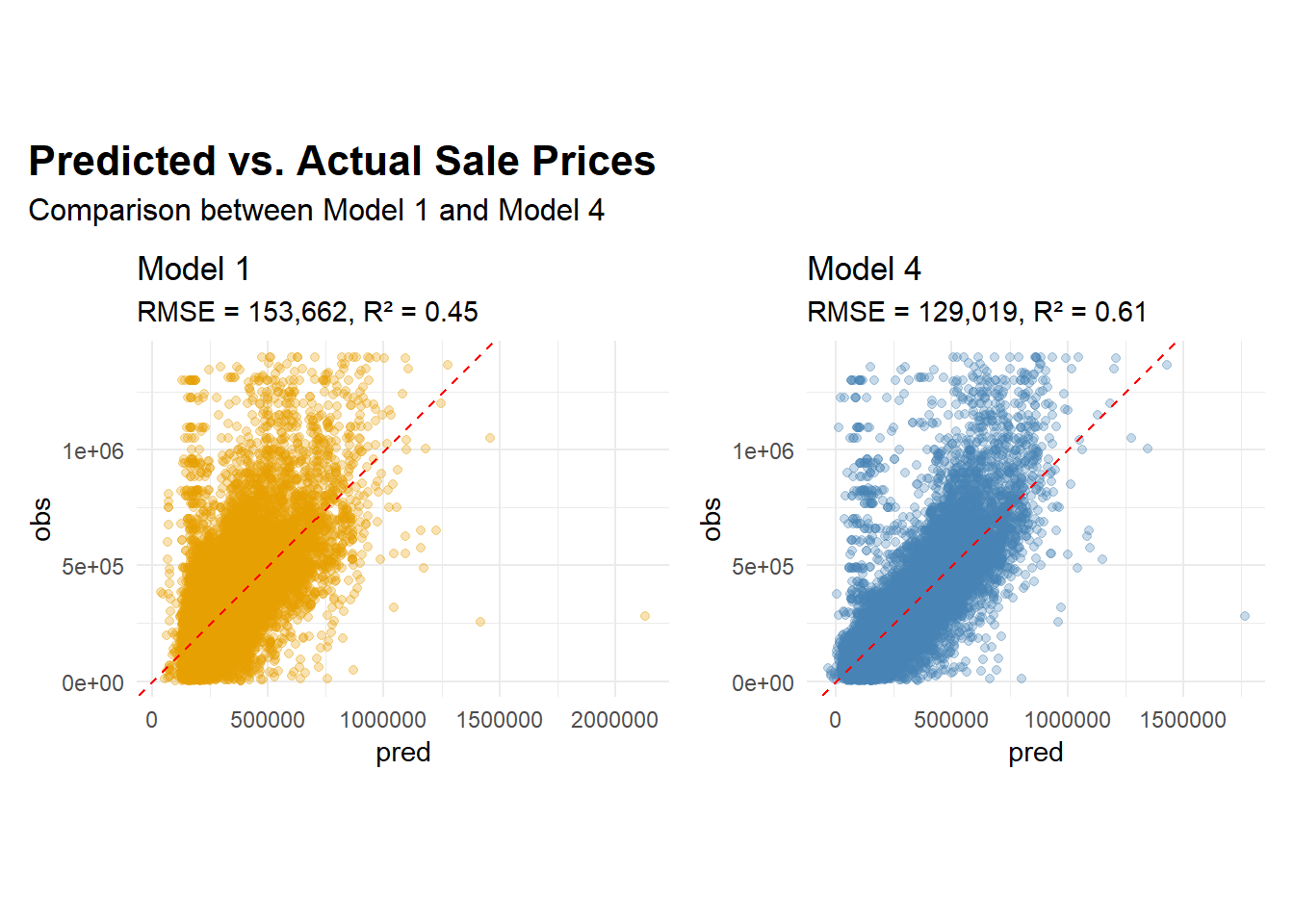
2. Predicted vs. Actual Plot for First Model and Final Model
Code
plot_df1 <- opa_census %>%mutate(pred =predict(model1, newdata = opa_census),obs = sale_price ) %>% dplyr::select(pred, obs)plot_df4 <- opa_census %>%mutate(pred =predict(model4, newdata = opa_census),obs = sale_price ) %>% dplyr::select(pred, obs)rmse1 <-153662# Model 1 RMSEr21 <-0.45# Model 1 R²rmse4 <-129019# Model 4 RMSEr24 <-0.61# Model 4 R²p1 <-ggplot(plot_df1, aes(x = pred, y = obs)) +geom_point(alpha =0.3, color ="#E69F00") +geom_abline(slope =1, intercept =0, linetype ="dashed", color ="red") +labs(title ="Model 1",subtitle =paste0("RMSE = ", scales::comma(rmse1), ", R² = ", round(r21, 2)) ) +theme_minimal() +coord_fixed()p4 <-ggplot(plot_df4, aes(x = pred, y = obs)) +geom_point(alpha =0.3, color ="#4682B4") +geom_abline(slope =1, intercept =0, linetype ="dashed", color ="red") +labs(title ="Model 4",subtitle =paste0("RMSE = ", scales::comma(rmse4), ", R² = ", round(r24, 2)) ) +theme_minimal() +coord_fixed()p1 + p4 +plot_annotation(title ="Predicted vs. Actual Sale Prices",subtitle ="Comparison between Model 1 and Model 4",theme =theme(plot.title =element_text(size =16, face ="bold"),plot.subtitle =element_text(size =12)) )
Model 4 demonstrates a noticeably better fit than Model 1, with predicted values more tightly clustered around the 45-degree line. The improvement reflects how adding census, spatial, and interaction terms enhances the model’s ability to capture neighborhood-level variation in housing prices. Residual dispersion decreases, though some bias persists at the extremes: high-value properties tend to be slightly underestimated, while low-value ones are sometimes overpredicted. These patterns are common in real-world housing data, where non-market transactions, inheritances, or atypical sales fall outside the scope of typical market dynamics.
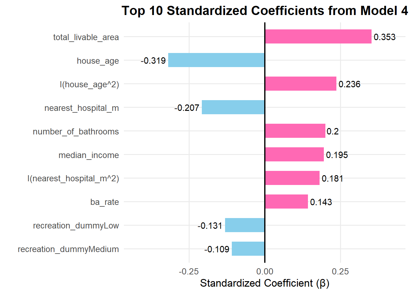
The standardized coefficients show which variables have the strongest relative influence on housing prices after accounting for differences in measurement units. Total livable area has the largest positive effect, meaning larger homes consistently sell for more. House age shows the strongest negative relationship—older properties tend to be less valuable—but the positive squared term indicates that this decline slows with age. Proximity to hospitals also matters: homes closer to medical facilities are priced higher, while distance reduces value. Among neighborhood and amenity factors, higher education levels (BA rate) and income raise prices, whereas limited recreational access slightly lowers them.
Phase 6: Model Diagnostics
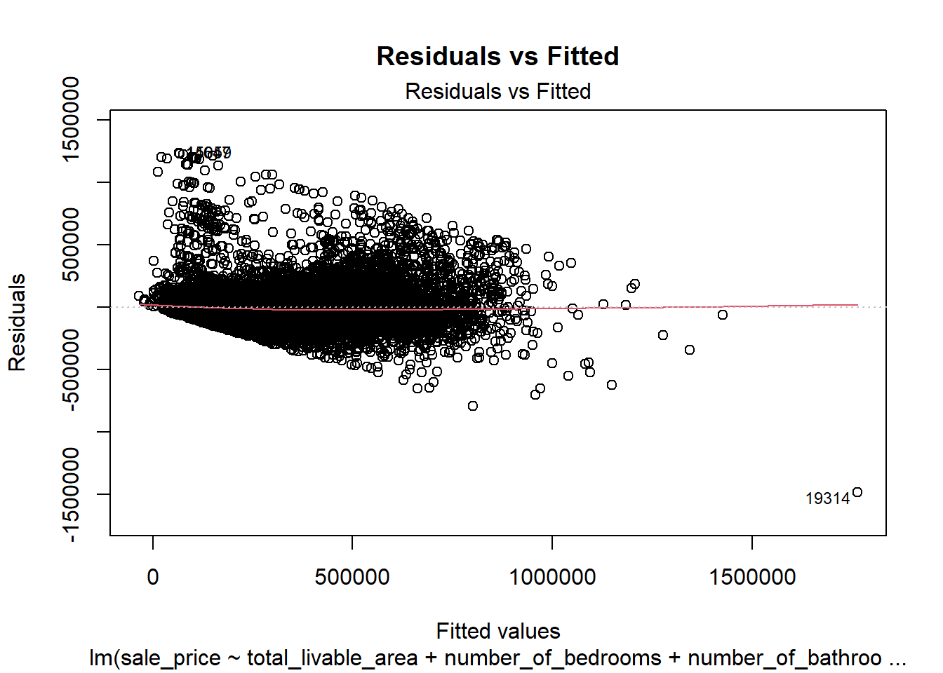
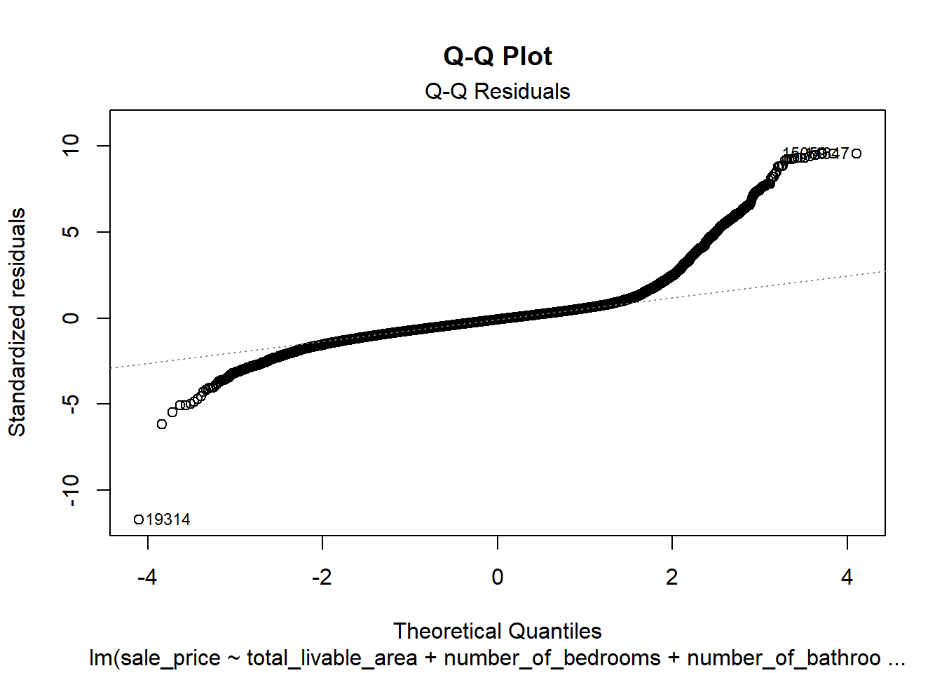
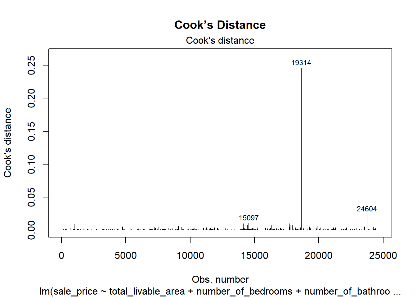
1. residual plot, QQ plot, Cook’s distance
Code
par(mfrow =c(1, 1))# 1. Residuals vs Fittedplot(model4, which =1, main ="Residuals vs Fitted")
Code
# 2. Normal Q-Qplot(model4, which =2, main ="Q-Q Plot")
Code
# 3. Cook’s distanceplot(model4, which =4, main ="Cook’s Distance")
The residuals vs. fitted plot shows a roughly symmetric spread around zero but with noticeable heteroscedasticity—larger variance among high-priced properties, showing that extreme prices remain difficult to predict precisely. The Q–Q plot indicates some heavy tails and outliers. In real-world housing data, perfect normality and constant variance are rarely achievable, so these deviations remain within a reasonable range for practical modeling.
The Cook’s Distance plot further supports this assessment. Most observations exert minimal influence on the fitted model, though a few high-leverage points stand out. These likely correspond to unusually expensive or unique properties that differ substantially from the bulk of the dataset. While such influential cases can slightly affect coefficient estimates, their limited number suggests that the overall model remains stable and reliable.
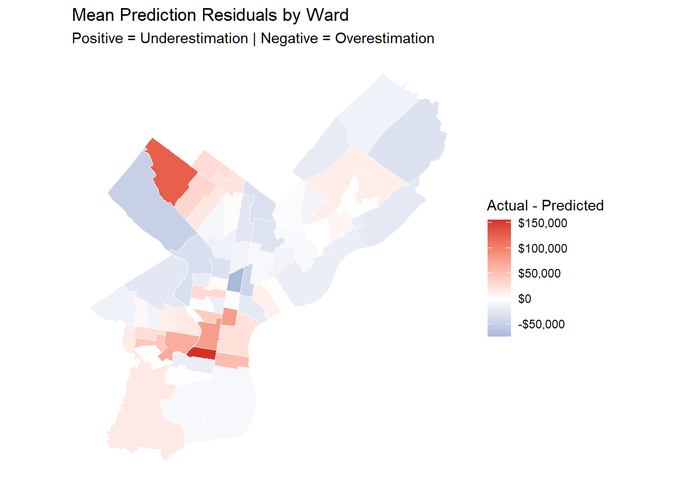
This project predicts housing sale prices in Philadelphia and shows that structural inequality in the city is spatially organized, with high-value neighborhoods concentrated in the central, northeast, and northwestern parts, and lower-value areas clustered in the north and west.
The model shows that actual sale prices in high-value neighborhoods are consistently higher than predicted, while those in lower-income and high-unemployment areas tend to be slightly lower than predicted. This residual pattern indicates a potential bias in the city’s property assessment system, where wealthier neighborhoods may be undertaxed and disadvantaged ones overtaxed.
In neighborhoods with high unemployment and crime, the model shows that housing markets no longer respond to safety improvements. Simply adding policing or security programs does not raise property values because the underlying economic conditions remain weak. For safety investments to be effective, policies should focus on rebuilding the local economic base by expanding job opportunities, supporting small businesses, and improving public infrastructure to make these neighborhoods worth to invest.
The model primarily captures spatial variation but performs less accurately for properties with sale prices above one million dollars. Some public datasets contain missing or inconsistent records, which may introduce minor systematic bias. Future research should integrate temporal dynamics and machine learning methods to better predict properties at both the lower and upper ends of the sale price distribution.
To promote spatial equity, policy should expand affordable and mixed-income housing in high-value districts through inclusionary zoning and other incentives, while improving transit, recreational spaces, and essential urban amenities—such as schools, healthcare facilities, and public services—in underserved neighborhoods, so that opportunity and growth are not confined to a few areas.