library(tidyverse)library(sf)library(tidycensus)library(tigris)options(tigris_use_cache =TRUE, tigris_class ="sf")library(MASS)library(dplyr)library(scales)library(ggplot2)library(caret)library(nngeo)library(car)library(knitr)library(readr)library(patchwork)# Add this near the top of your .qmd after loading librariesoptions(tigris_use_cache =TRUE)options(tigris_progress =FALSE)
1.1.2 Filter to residential properties, 2023-2024 sales
Code
# data in 2022 will be used as predictor, so keep them as well.opa_clean <- opa %>%mutate(sale_date =as.Date(sale_date)) %>%filter(sale_date >="2022-01-01"& sale_date <="2024-12-31", category_code =="1"# 1 indicates single family )# record the amount of data we will focus onopa_clean2 <- opa %>%mutate(sale_date =as.Date(sale_date)) %>%filter(sale_date >="2023-01-01"& sale_date <="2024-12-31", category_code =="1"# 1 indicates single family )# Select relevant variables opa_var <- opa_clean %>% dplyr::select( sale_date, sale_price, market_value, building_code_description, total_livable_area, number_of_bedrooms, number_of_bathrooms, number_stories, garage_spaces, central_air, quality_grade, interior_condition, exterior_condition, year_built, off_street_open, zip_code, census_tract, zoning, owner_1, category_code_description, shape, fireplaces )
# ! check before remove NA valuecat("<small>💡 Data Cleaning Notes:<br>- Remove NA only if missing count is small.<br>- If many are missing, retain them and transform NA into a meaningful category.<br>- Always record how missing values were handled.</small>")
<small>
💡 Data Cleaning Notes:<br>
- Remove NA only if missing count is small.<br>
- If many are missing, retain them and transform NA into a meaningful category.<br>
- Always record how missing values were handled.
</small>
Code
#remove errors and drop rows with small NA counts in specific columnsopa_var <- opa_var %>%distinct() %>%#Remove duplicate linesfilter(!is.na(total_livable_area) & total_livable_area >0,!is.na(year_built) & year_built >0& year_built <2025,!is.na(number_of_bathrooms),!is.na(fireplaces),!is.na(interior_condition), garage_spaces<30 )
1.1.5 Explore structural data biases and identify non-market transactions
Code
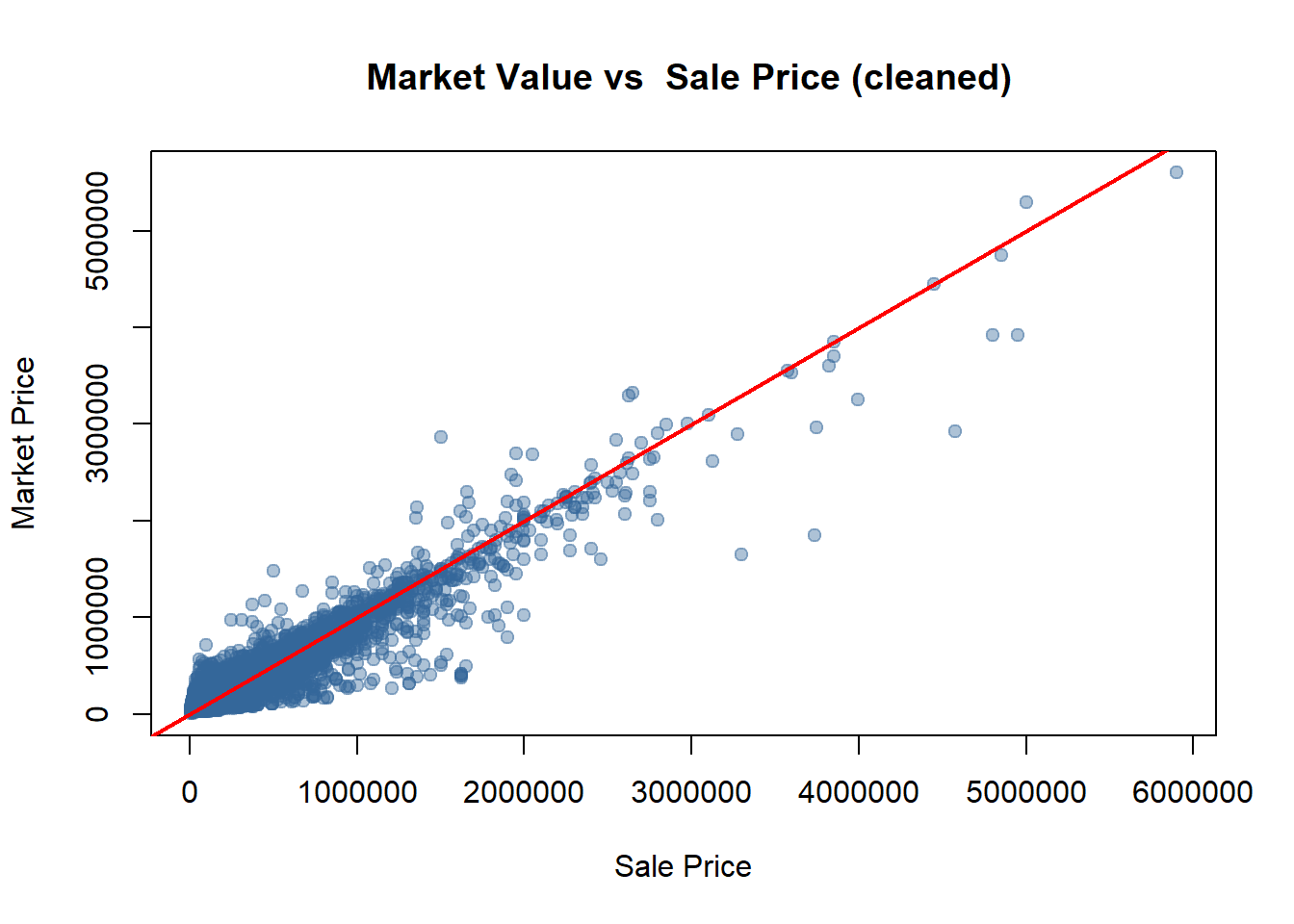
# check the relation of Sale Price ~ Market Valueoptions(scipen =999)plot(opa_var$sale_price, opa_var$market_value,xlab ="Sale Price", ylab ="Market Price",main =" Market Value (Predicted) vs Sale Price (Actual)",pch =19, col =rgb(0.2,0.4,0.6,0.4))abline(0,1,col="red",lwd=2)
Code
# create a new column to record the identified non-market transactionsopa_var <- opa_var %>%mutate(non_market = (((sale_price <0.10*market_value) | sale_price <2000) | (sale_price>5*market_value)) )
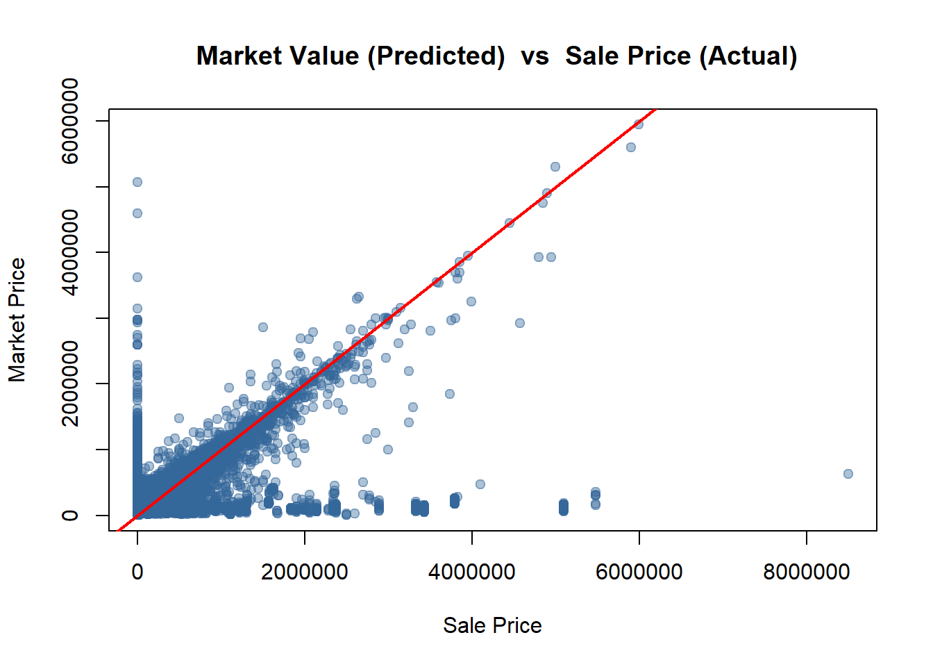
Interpretation:
The goal of this model is to predict typical, market-driven sale prices. The provided scatter plot of Market Value (Predicted) vs. Sale Price (Actual) is an essential diagnostic tool for assessing data quality.
The red line on the plot represents a perfect 1-to-1 relationship (Y=X), where the property’s actual sale price is exactly equal to its predicted market value. While most data points cluster tightly around this line—indicating the “Market Value” is a strong predictor—the plot clearly reveals two distinct types of extreme outliers that do not represent typical market transactions.
1. Removing Non-Market Sales (The Sale Price < 0.05 × Market Value Rule)
There is a dense cluster of points stacked vertically along the y-axis, where Sale Price (X) is near zero, but Market Value (Y) is high (e.g., $1M, $2M, even $4M). These points represent transactions where a property was “sold” for a price that is a tiny fraction of its assessed worth (e.g., a $2,000,000 house sold for $50,000).
These are non-arm’s-length transactions, not true market sales. Examples include sales between family members, inheritance transfers, or other legal transactions where the price does not reflect the market.
2. Removing Anomalous High Sales (The Sale Price > 5 Market Value Rule)*
There are several data points scattered far to the right and bottom of the plot, far below the red Y=X line. These points represent properties where the Sale Price (X) was massively higher than its Market Value (Y). For example, a property with an assessed value of $500,000 (Y) selling for $4,000,000 (X).
These are also not typical sales. They could represent (a) data entry errors, (b) sales where the “Market Value” figure is obsolete (e.g., a run-down property sold for land value/development potential), or (c) properties that underwent major renovations not yet captured in the assessed value.
Retaining these two groups of outliers would severely skew the model’s coefficients and reduce its predictive accuracy for the vast majority of normal, market-based transactions. This filtering rule is a necessary step to clean the data, ensure the model learns from valid transactions, and improve its overall reliability.
1.1.6 enhance the sales data
We have 8000+ non market transactions, that is 1/4 of the total sales data! That’s too big to let go, The model that we want to generate will become much more stable if we can make use of them.
Code
# filter the REAL MARKET data in the time period we needopa_selected <- opa_var %>%filter( non_market==0, sale_date >="2023-01-01"& sale_date <="2024-12-31" ) #filter the NON MARKET data in the time period we needopa_non_market <- opa_var %>%filter( non_market ==1, sale_date >="2023-01-01"& sale_date <="2024-12-31" )opa_selected2 <- opa_varopa_bonus <- opa_var
Code
#try to find the relationship between market_value and sale_priceoptions(scipen =999)plot(opa_selected$sale_price, opa_selected$market_value,xlab ="Sale Price", ylab ="Market Price",main =" Market Value vs Sale Price (cleaned)",pch =19, col =rgb(0.2,0.4,0.6,0.4))abline(0,1,col="red",lwd=2)
Code
# That's quite linear, let's try to build a simple OLS modelopa_mdata <- opa_bonus %>%filter( non_market ==0 )model_non <-lm(sale_price ~ market_value, data = opa_mdata)summary(model_non)
Call:
lm(formula = sale_price ~ market_value, data = opa_mdata)

Residuals:
     Min       1Q   Median       3Q      Max
-1432832   -35207    -1669    30014  1975714

Coefficients:
                 Estimate   Std. Error t value            Pr(>|t|)
(Intercept)  -9189.286424   663.771782  -13.84 <0.0000000000000002 ***
market_value     1.027924     0.001773  579.62 <0.0000000000000002 ***
---
Signif. codes:  0 '***' 0.001 '**' 0.01 '*' 0.05 '.' 0.1 ' ' 1

Residual standard error: 86310 on 40927 degrees of freedom
Multiple R-squared:  0.8914,    Adjusted R-squared:  0.8914
F-statistic: 3.36e+05 on 1 and 40927 DF,  p-value: < 0.00000000000000022
The results demonstrate a very strong linear relationship between sale_price and market_value. The market_value variable in the dataset effectively predicts the sale_price.
Therefore, we can leverage this relationship to estimate the normal market prices for non-market transactions.
We record these estimated values as sale_price_predicted.
By doing this, we enhance our data!
Code
#bring data backopa_non_market$sale_price_predicted <-predict(model_non, newdata = opa_non_market)#join back to the main dataopa_selected <- opa_selected %>%mutate(sale_price_predicted= sale_price)set.seed(123)opa_bind <-bind_rows(opa_selected, opa_non_market) %>%slice_sample(prop =1)
1.2 Load and clean secondary dataset:
1.2.1 Census data (tidycensus):
Code
# Transform to sf object opa_bind <-st_as_sf(opa_bind, wkt ="shape", crs =2272) %>%st_transform(4326)opa_sf<- opa_bind
Code
# Load Census data for Philadelphia tractsphilly_census <-get_acs(geography ="tract",variables =c(total_pop ="B01003_001",ba_degree ="B15003_022",total_edu ="B15003_001",median_income ="B19013_001",labor_force ="B23025_003",unemployed ="B23025_005",total_housing ="B25002_001",vacant_housing ="B25002_003" ),year =2023,state ="PA",county ="Philadelphia",geometry =TRUE) %>% dplyr::select(GEOID, variable, estimate, geometry) %>% tidyr::pivot_wider(names_from = variable, values_from = estimate) %>% dplyr::mutate(ba_rate =100* ba_degree / total_edu,unemployment_rate =100* unemployed / labor_force,vacancy_rate =100* vacant_housing / total_housing ) %>%st_transform(st_crs(opa_sf))# Spatial join of OPA data with Census dataopa_census <-st_join(opa_sf, philly_census, join = st_within) %>%filter(!is.na(median_income))
# Original data dimensionsopa_dims <-tibble(dataset ="raw CSV",rows =nrow(opa),columns =ncol(opa))# cleaned data dimensionsopa_filter_dims <-tibble(dataset ="after fixed criteria",rows =nrow(opa_clean2),columns =ncol(opa_clean2))opa_selected_dims <-tibble(dataset ="after cleaned",rows =nrow(opa_bind),columns =ncol(opa_bind))# data dimensions (within census tracts)opa_census_dims <-tibble(dataset ="after census joined",rows =nrow(opa_census),columns =ncol(opa_census))# create summary tablesummary_table <-bind_rows(opa_dims, opa_filter_dims,opa_selected_dims, opa_census_dims)library(knitr)summary_table %>%kable(caption ="Summary of OPA data before and after cleaning")
Summary of OPA data before and after cleaning
dataset
rows
columns
raw CSV
153267
79
after fixed criteria
34559
79
after cleaned
31968
28
after census joined
31613
40
Principles of Data Processing
opa Data
Filter sale_date between 2023-01-01 and 2024-12-31.
Keep only residential properties (category_code == 1).
Remove records with missing values in total_livable_area, sale_price, or number_of_bathrooms.
Filter records year_built > 0 .
Census data
Load data including total_pop, ba_degree, total_edu, median_income, labor_force, unemployed, total_housing, vacant_housing.
Transform to spatial format and remove records with missing values.
Spatial amenities
Load datasets Transit, crime, POIs, Hospitals.
Transform to spatial format and remove records with missing values.
Interpretation: The selected variables can be grouped into several meaningful categories that are theoretically and empirically linked to housing prices:
Neighborhood Safety:
Crime data: Areas with lower crime rates are generally more desirable, leading to higher property values. Including crime incidents helps capture the effect of public safety on housing prices.
Accessibility and Transportation:
Transit points: Proximity to public transportation (e.g., bus stops, subway stations) increases accessibility and convenience, which is often capitalized into higher home values.
Points of Interest (POIs): Nearby amenities such as shops, restaurants, and parks improve quality of life and can positively influence housing prices.
Healthcare Access:
Hospitals: Easy access to healthcare facilities is a valued neighborhood characteristic, especially for families and older residents, and can contribute to higher property values.
Socioeconomic and Demographic Context (from Census data):
Total population: Indicates population density, which can affect demand for housing.
Educational attainment (e.g., % with BA degree): Higher education levels are often correlated with higher income and neighborhood desirability.
Median income: Directly influences purchasing power and demand for housing in an area.
Employment status (labor force and unemployment): Reflects economic stability and local job market health, which affect housing demand.
Housing market conditions (total and vacant housing): Vacancy rates can signal neighborhood decline or oversupply, both of which impact prices.
Together, these variables provide a multidimensional view of a neighborhood’s appeal, safety, convenience, and economic health—all key determinants of housing prices.
Phase 2: Feature Engineering
2.1 Buffer-based features:
2.1.1 Neighborhood avg sale price in the past year
# add different weights to actual and non market transactionsopa_census_all <- opa_censusnon_market_share<-mean(opa_census_all$non_market ==1, na.rm =TRUE)non_market_share
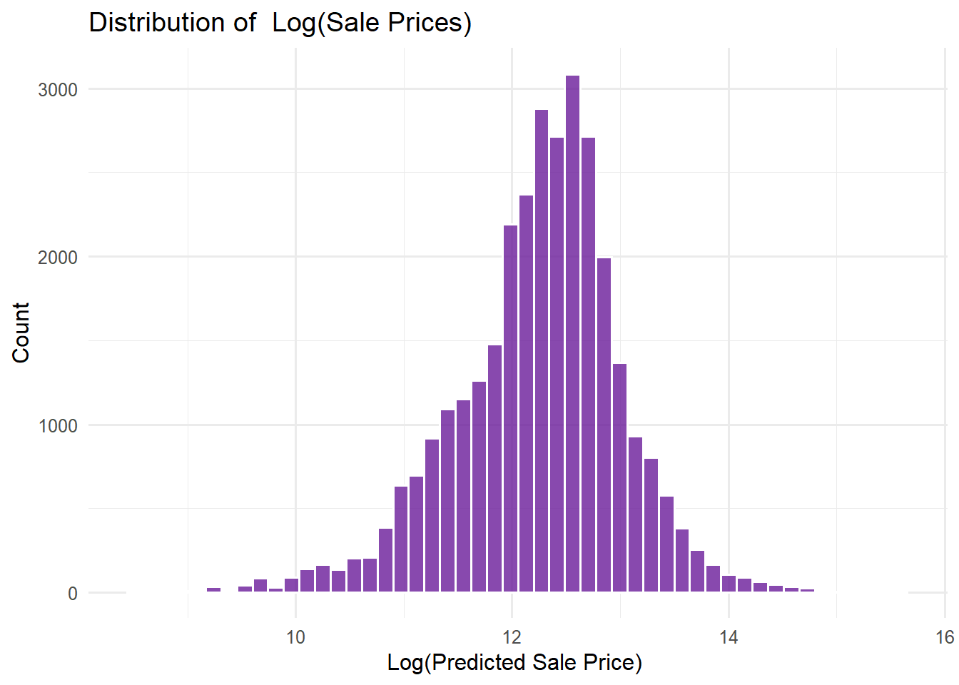
Highly Right-Skewed: The bulk of the distribution is concentrated on the left side (low price range), while the right tail is very long, extending towards higher prices. This means that the majority of houses have lower prices, and very expensive houses are very few in number.
Concentration and Outliers: The count of houses in each bin drops rapidly as the price increases. The number of houses above $2,500,000 is very small, indicating the presence of extreme high-price outliers.
Preprocessing Requirement: This distribution strongly suggests that before building a house price prediction model, the Sale Price variable will need a transformation, most commonly a log transformation, to make the distribution more closely resemble a normal distribution.
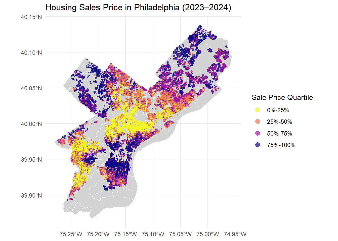
Spatial Concentration of Housing Prices: Highest Prices are clearly concentrated in the Center City/Downtown area of Philadelphia and its immediate surroundings, which indicates that the most expensive property transactions occur in the high-value areas of and around the city center.
Discontinuous Price Transitions: Housing prices do not exhibit smooth gradients across the city; instead, they show abrupt changes between different price quartiles, forming distinct spatial clusters. This suggests that price variations are influenced by fixed boundaries such as neighborhoods, infrastructure, or socio-economic factors, rather than continuous spatial diffusion.
Peripheral Price Patterns: Lower-price quartiles (0%-25% and 25%-50%) are predominantly located in the outer regions of the city, particularly in the northern and southern peripheries, indicating a clear core-periphery divide in housing values.
3.3 Price vs. structural features (scatter plots)
Code
opa_census_plot <- opa_census_all %>%mutate(log_sale_price =log(sale_price_predicted))# 1️⃣ total_livable_areap1 <-ggplot(opa_census_plot, aes(x =log(total_livable_area), y = log_sale_price)) +geom_point(alpha =0.5, color ="#6A1B9A") +geom_smooth(method ="lm", color ="red", se =FALSE) +labs(title ="Log(Sale Price) vs. Log(Livable Area)",x ="Log(Total Livable Area)",y ="Log(Sale Price)" ) +theme_minimal(base_size =10)# 2️⃣ number_of_bathroomsp2 <-ggplot(opa_census_plot, aes(x = number_of_bathrooms, y = log_sale_price)) +geom_point(alpha =0.5, color ="#6A1B9A") +geom_smooth(method ="lm", color ="red", se =FALSE) +labs(title ="Log(Sale Price) vs. Bathrooms",x ="Number of Bathrooms", y ="" ) +theme_minimal(base_size =10)# 3️⃣ interior_conditionp3 <-ggplot(opa_census_plot, aes(x = interior_condition, y = log_sale_price)) +geom_jitter(alpha =0.5, color ="#6A1B9A", width =0.2, height =0) +geom_smooth(method ="lm", color ="red", se =FALSE) +labs(title ="Log(Sale Price) vs. Interior Condition",x ="Interior Condition",y ="Log(Sale Price)" ) +theme_minimal(base_size =10)# 4️⃣ house_agep4 <-ggplot(opa_census_plot, aes(x = house_age^2, y = log_sale_price)) +geom_point(alpha =0.5, color ="#6A1B9A") +geom_smooth(method ="lm", color ="red", se =FALSE) +labs(title ="Log(Sale Price) vs. House Age²",x ="House Age² (2025 - Year Built)²",y ="" ) +theme_minimal(base_size =10)(p1 + p2) / (p3 + p4)
Key Findings:
Strong Positive Correlation with Size and Bathrooms: There is a clear positive linear relationship between the log of sale price and both the log of total livable area and the number of bathrooms. This indicates that larger properties and those with more bathrooms command significantly higher market prices.
Non-Linear Relationship with Interior Condition: While a general positive trend exists, the relationship between log sale price and interior condition rating is not perfectly linear. The data dispersion suggests that the effect of interior condition on price may be subject to diminishing marginal returns or other non-linear dynamics.
Negative Correlation with House Age Squared: A significant negative relationship is observed between log sale price and the squared term of house age. This indicates that property values depreciate as homes get older, and this depreciation effect may accelerate over time, reflecting a non-linear aging effect on housing value.
3.4 Price vs. spatial & Social features (scatter plots)
Code
opa_census_plot <- opa_census_all %>%mutate(log_sale_price =log(sale_price_predicted),sqrt_crime_count =sqrt(crime_count) )p1 <-ggplot(opa_census_plot, aes(x = ba_rate, y = log_sale_price)) +geom_point(alpha =0.5, color ="#6A1B9A") +geom_smooth(method ="lm", color ="red", se =FALSE) +scale_x_continuous(labels =percent_format(accuracy =1)) +labs(title ="Log(Sale Price) vs. BA Rate",x ="Bachelor's Degree Rate", y ="Log(Sale Price)") +theme_minimal(base_size =10)p2 <-ggplot(opa_census_plot, aes(x = unemployment_rate, y = log_sale_price)) +geom_point(alpha =0.5, color ="#6A1B9A") +geom_smooth(method ="lm", color ="red", se =FALSE) +scale_x_continuous(labels =percent_format(accuracy =1)) +labs(title ="Log(Sale Price) vs. Unemployment Rate",x ="Unemployment Rate", y ="") +theme_minimal(base_size =10)p3 <-ggplot(opa_census_plot, aes(x = median_income, y = log_sale_price)) +geom_point(alpha =0.5, color ="#6A1B9A") +geom_smooth(method ="lm", color ="red", se =FALSE) +scale_x_continuous(labels =dollar_format()) +labs(title ="Log(Sale Price) vs. Median Income",x ="Median Household Income (USD)", y ="Log(Sale Price)") +theme_minimal(base_size =10)p4 <-ggplot(opa_census_plot, aes(x = avg_past_price_density, y = log_sale_price)) +geom_point(alpha =0.5, color ="#6A1B9A") +geom_smooth(method ="lm", color ="red", se =FALSE) +labs(title ="Log(Sale Price) vs. Past Price Density",x ="Average Past Price Density", y ="") +theme_minimal(base_size =10)p5 <-ggplot(opa_census_plot, aes(x = sqrt_crime_count, y = log_sale_price)) +geom_point(alpha =0.5, color ="#6A1B9A") +geom_smooth(method ="lm", color ="red", se =FALSE) +labs(title ="Log(Sale Price) vs. √(Crime Count)",x ="Square Root of Crime Count", y ="Log(Sale Price)") +theme_minimal(base_size =10)p6 <-ggplot(opa_census_plot, aes(x = transit_count, y = log_sale_price)) +geom_point(alpha =0.5, color ="#6A1B9A") +geom_smooth(method ="lm", color ="red", se =FALSE) +labs(title ="Log(Sale Price) vs. Transit Count",x ="Number of Transit Stops Nearby", y ="") +theme_minimal(base_size =10)(p1 | p2 | p3) / (p4 | p5 | p6)
Key Findings:
Strong Socioeconomic Influence: Housing prices show clear positive correlations with key socioeconomic indicators. Both bachelor’s degree rate and median household income exhibit strong positive relationships with sale prices, indicating that neighborhoods with higher educational attainment and income levels command substantially higher property values.
Negative Impact of Crime and Unemployment: There are evident negative relationships between housing prices and both crime levels (measured by square root of crime count) and unemployment rates. This demonstrates that public safety and local economic vitality are significant determinants of property values in Philadelphia.
Positive Effects of Historical Prices and Transit Access: Sale prices maintain a positive relationship with both historical price density and accessibility to public transportation. This suggests that areas with established high-value characteristics and better transit infrastructure maintain their premium in the housing market, reflecting path dependence in neighborhood valuation and the value of transportation accessibility.
Other visualization
Code
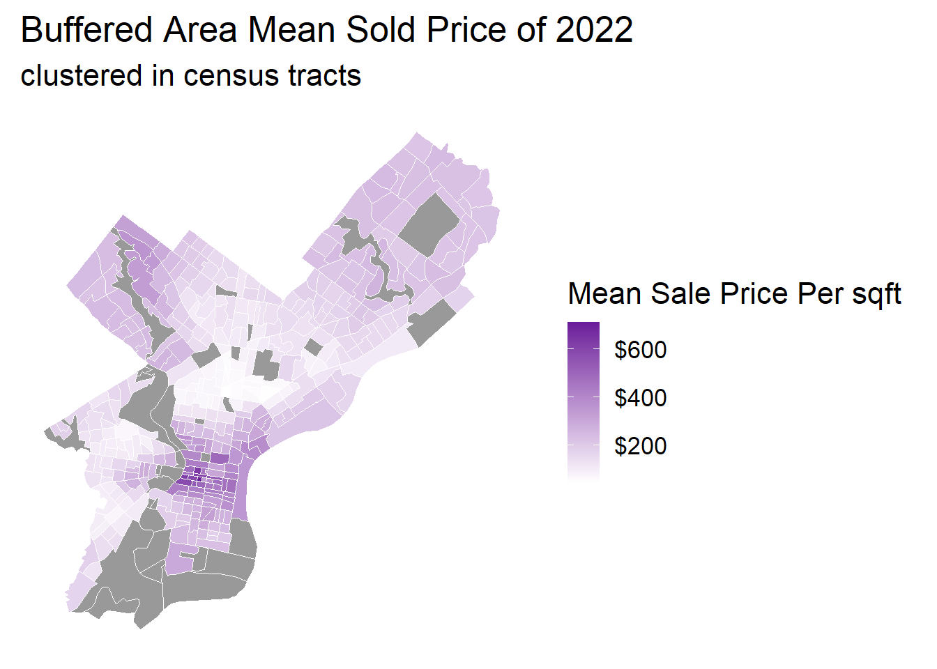
tract_price <- opa_census_all %>%st_drop_geometry() %>%group_by(GEOID) %>%summarise(avg_past_price_density =mean(avg_past_price_density, na.rm =TRUE))tract_map <- philly_census %>%left_join(tract_price, by ="GEOID")ggplot() +geom_sf(data = tract_map, aes(fill = avg_past_price_density), color ="white", size =0.2) +scale_fill_gradient(low ="white", high ="#6A1B9A",name ="Mean Sale Price Per sqft",labels = scales::dollar_format(),na.value ="grey60" ) +scale_alpha(range =c(0.2, 0.8), name ="Interior Condition") +theme_minimal(base_size =16) +labs(title ="Buffered Area Mean Sold Price of 2022",subtitle ="clustered in census tracts" ) +theme(panel.grid =element_blank(),axis.text =element_blank(),legend.position ="right" )
Code
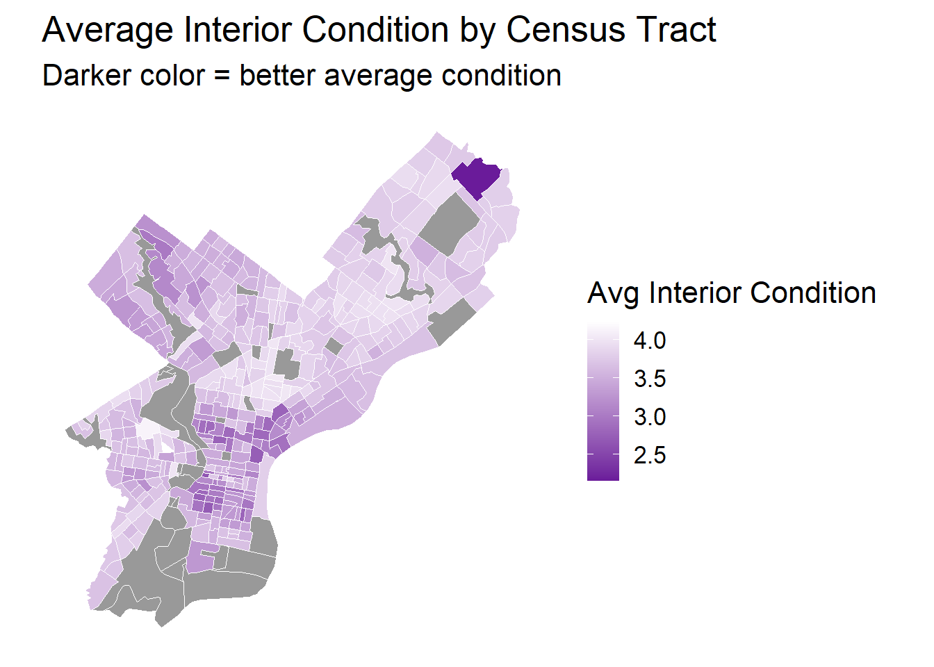
tract_condition <- opa_census_all %>%st_drop_geometry() %>%group_by(GEOID) %>%summarise(mean_interior_condition =mean(interior_condition, na.rm =TRUE))tract_map <- philly_census %>%left_join(tract_condition, by ="GEOID")ggplot() +geom_sf(data = tract_map, aes(fill = mean_interior_condition), color ="white", size =0.2) +scale_fill_gradient(low ="#6A1B9A", high ="white",name ="Avg Interior Condition",na.value ="grey60" ) +theme_minimal(base_size =16) +labs(title ="Average Interior Condition by Census Tract",subtitle ="Darker color = better average condition" ) +theme(panel.grid =element_blank(),axis.text =element_blank(),legend.position ="right" )
Code
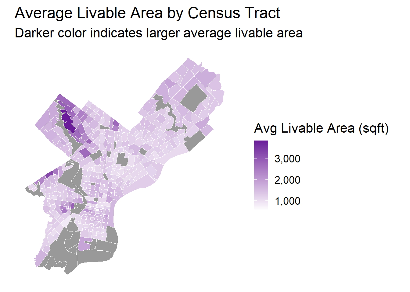
tract_area <- opa_census_all %>%st_drop_geometry() %>%group_by(GEOID) %>%summarise(mean_total_livable_area =mean(total_livable_area, na.rm =TRUE))tract_map <- philly_census %>%left_join(tract_area, by ="GEOID")ggplot() +geom_sf(data = tract_map, aes(fill = mean_total_livable_area), color ="white", size =0.2) +scale_fill_gradient(low ="white", high ="#6A1B9A", name ="Avg Livable Area (sqft)",labels = scales::comma_format(),na.value ="grey60" ) +theme_minimal(base_size =16) +labs(title ="Average Livable Area by Census Tract",subtitle ="Darker color indicates larger average livable area" ) +theme(panel.grid =element_blank(),axis.text =element_blank(),legend.position ="right" )
Key Findings:
Spatial Variation in Property Values: The average sale price per square foot shows significant geographic clustering across census tracts, with distinct high-value areas concentrated in specific neighborhoods. This indicates strong spatial autocorrelation in housing prices, where adjacent tracts tend to have similar price levels.
Correlation Between Property Condition and Location: Better average interior conditions are systematically concentrated in particular geographic areas, suggesting that housing maintenance and quality are not randomly distributed but follow spatial patterns that may correlate with neighborhood characteristics and property values.
Heterogeneous Distribution of Housing Size: The average livable area varies substantially across census tracts, with larger properties clustered in specific regions. This spatial patterning of housing size complements the price distribution, indicating that both property characteristics and location factors contribute to the overall housing market structure in Philadelphia.
log(total_livable_area) (0.752): An elasticity coefficient. A 1% increase in livable area is associated with a 0.752% increase in price. This is a strong positive driver.
number_of_bathrooms (0.046): Each additional bathroom is associated with a 4.6% increase in price.
house_age_c (-0.00001): The linear term for house age is statistically insignificant (p=0.929).
house_age_c2 (0.000047): The squared term for age is positive and significant. Combined with the insignificant linear term, this suggests a slight U-shaped relationship, where new homes and very old homes (perhaps with historical value) command a premium over middle-aged homes.
interior_condition (-0.114): Assuming a higher value means worse condition, each one-unit worsening in condition is associated with an 11.4% decrease in price.
quality_grade_num (0.070): Each one-unit increase in the quality grade is associated with a 7.0% increase in price.
fireplaces (0.117): Each additional fireplace is associated with a 11.7% increase in price.
garage_spaces (0.143): Each additional garage space is associated with a 14.3% increase in price.
central_air_dummy (0.458): Homes with central air are estimated to be 45.8% more expensive than the baseline (e.g., no AC). This is a very significant amenity premium.
central_air_missing (-0.230): Homes where central air data is missing are 23.0% cheaper than the baseline.
log(total_livable_area) (0.710 vs 0.752): The elasticity of area decreased. This suggests Model 1 overestimated the impact of area. Why? Because larger homes are often located in wealthier neighborhoods. Model 1 incorrectly attributed some of the “wealthy neighborhood” premium to “large area.”
quality_grade_num (0.0015 vs 0.070): The coefficient for quality grade became statistically insignificant (p=0.520). This is a key finding: home quality is highly correlated with neighborhood income. Once we directly control for income (income_scaled), the independent effect of quality grade disappears.
central_air_dummy (0.219 vs 0.458): The premium for central air was halved. This also indicates that central air is more common in affluent areas, and Model 1 suffered from significant Omitted Variable Bias (OVB).
New Variable (Census) Interpretation:
income_scaled (0.455): A one-unit increase in standardized census tract income is associated with a 45.5% increase in price. A very strong positive effect.
ba_rate (0.0129): A 1 percentage point increase in the neighborhood’s bachelor’s degree attainment rate is associated with a 1.3% price increase.
unemployment_rate (-0.0066): A 1 percentage point increase in the unemployment rate is associated with a 0.66% decrease in price.
income_scaled (0.146 vs 0.455): The effect of income dropped sharply (by ~2/3). This again reveals OVB in Model 2. The large “income” effect in Model 2 was confounded with “spatial amenities”—high-income individuals tend to live in low-crime, accessible areas.
ba_rate (0.0027 vs 0.0129): The education premium also dropped significantly for the same reason.
garage_spaces (0.095 vs 0.170): The garage premium decreased, likely because spatial variables (like density or transit access) have captured related information.
New Variable (Spatial) Interpretation:
transit_count (0.00029): Each additional nearby public transit stop is associated with a 0.029% increase in price.
avg_past_price_density (0.0032): As a proxy for local market heat or locational value, each unit increase is associated with a 0.32% price increase.
sqrt(crime_count) (-0.040): A one-unit increase in the square root of the crime count is associated with a 4.0% decrease in price.
log(nearest_hospital_knn3) (0.087): A 1% increase in the distance from the nearest hospital is associated with a 0.087% increase in price. This suggests people prefer to live further away from hospitals (perhaps to avoid noise, traffic, or sirens), not closer.
These coefficients represent the price difference for each zip code relative to the “reference zip code” (which is omitted from the list, e.g. 19102).
Example: factor(zip_code)19106 (-0.107): A home in zip code 19106 is, on average, 10.7% less expensive than a home in the reference zip code, holding all other variables constant.
Example: factor(zip_code)19149 (0.183): A home in zip code 19149 is, on average, 18.3% more expensive.
This is one of the most interesting findings. It shows that the impact of interior_condition depends on income_scaled.
The total marginal effect of interior_condition is:\[= -0.1695 + 0.1165 \times \text{income\_scaled}\]
At the baseline income level (income_scaled = 0), each one-unit worsening in condition is associated with a 17.0% price decrease (-0.1695). However, this penalty is mitigated (lessened) in higher-income areas. For each one-unit increase in income_scaled, the negative penalty of poor condition is reduced by 11.7 percentage points. This may imply that in high-income neighborhoods, “fixer-uppers” (homes in poor condition) are seen as investment opportunities with high renovation potential. Therefore, the market penalty for “poor condition” is smaller.
Phase 5: Model Validation
10-fold cross-validation
5.1 Compare all 4 models:
5.1.1 Create predicted vs. actual plot
Code
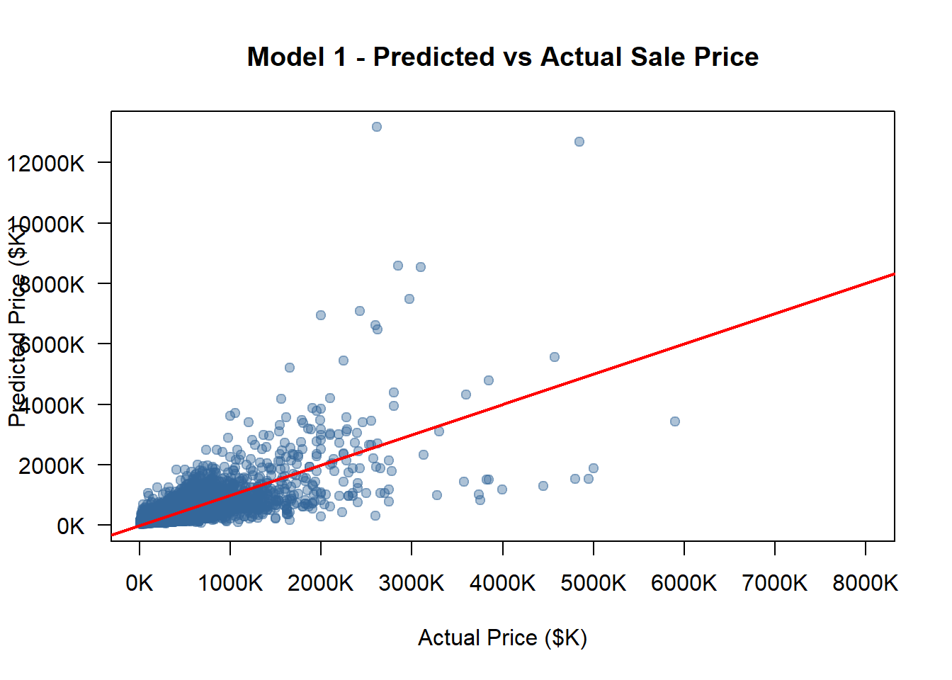
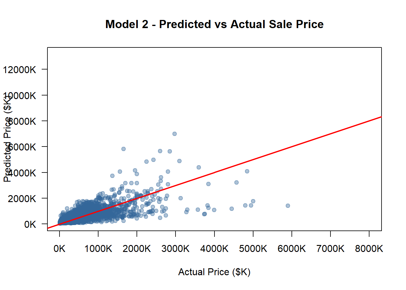
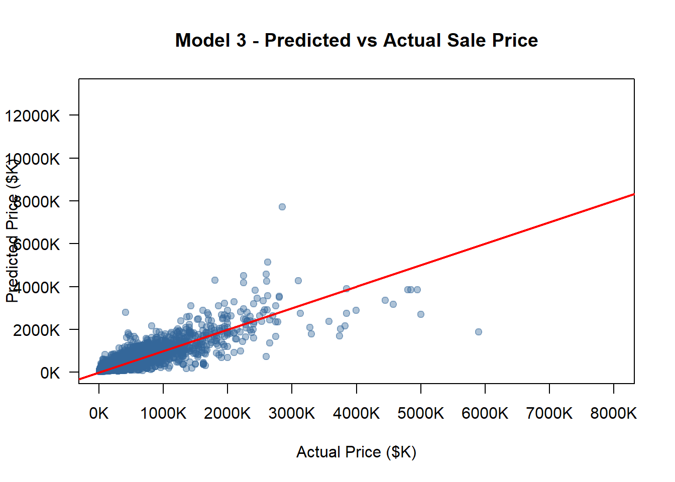
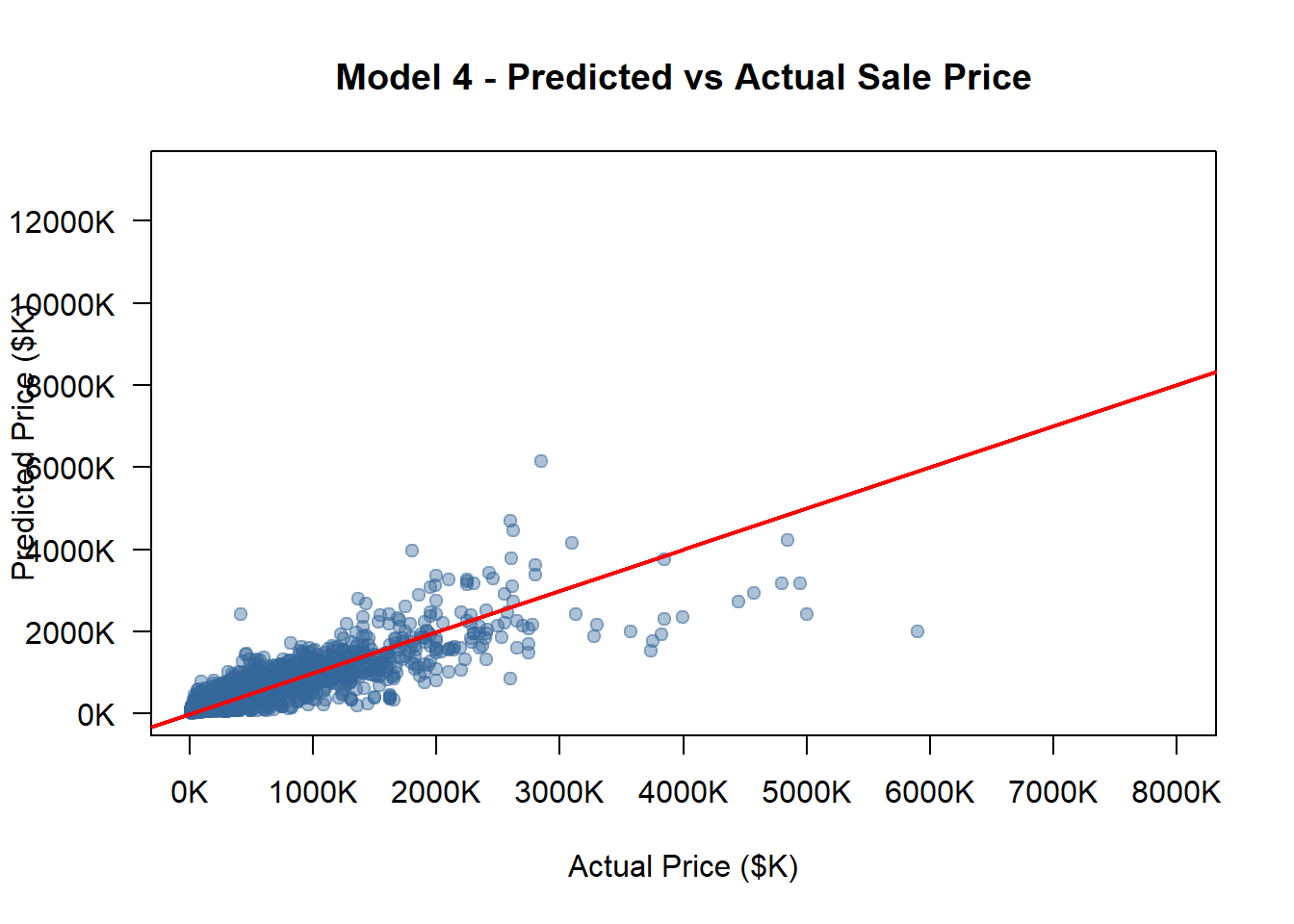
opa_census_2_clean <- opa_census_2models <-list(model_1, model_2, model_3, model_4)model_names <-c("Model 1", "Model 2", "Model 3", "Model 4")options(scipen =999)all_pred_usd <-c()for (m in models) { pred_log_tmp <-predict(m, newdata = opa_census_2_clean) smearing_tmp <-mean(exp(residuals(m)), na.rm =TRUE) pred_usd_tmp <-exp(pred_log_tmp) * smearing_tmp all_pred_usd <-c(all_pred_usd, pred_usd_tmp)}actual_usd <- opa_census_2_clean$sale_price_predictedactual_k <- actual_usd /1000pred_all_k <- all_pred_usd /1000x_min <-min(actual_k, pred_all_k, na.rm =TRUE)x_max <-8000# manually fix max x at 8000Ky_min <-min(actual_k, pred_all_k, na.rm =TRUE)y_max <-max(actual_k, pred_all_k, na.rm =TRUE)x_ticks <-pretty(c(x_min, x_max), n =6)y_ticks <-pretty(c(y_min, y_max), n =6)# Loopfor (i inseq_along(models)) { model <- models[[i]] model_name <- model_names[i]# Predict on the same validation dataset pred_log <-predict(model, newdata = opa_census_2_clean)# Smearing correction (to restore to USD scale) smearing_factor <-mean(exp(residuals(model)), na.rm =TRUE) pred_usd <-exp(pred_log) * smearing_factor pred_k <- pred_usd /1000# Convert to thousand dollars rmse <-sqrt(mean((pred_usd - opa_census_2_clean$sale_price_predicted)^2, na.rm =TRUE)) rmse_norm <- rmse /mean(opa_census_2_clean$sale_price_predicted, na.rm =TRUE)cat("\n============================\n")cat(model_name, "\n")cat("RMSE (USD):", round(rmse, 2), "\n")cat("Normalized RMSE:", round(rmse_norm, 4), "\n")cat("============================\n")plot( actual_k, pred_k,xlab ="Actual Price ($K)",ylab ="Predicted Price ($K)",main =paste(model_name, "- Predicted vs Actual Sale Price"),pch =19,col =rgb(0.2, 0.4, 0.6, 0.4),xlim =c(x_min, x_max),ylim =c(y_min, y_max),axes =FALSE )axis(1, at = x_ticks, labels =paste0(x_ticks, "K"))axis(2, at = y_ticks, labels =paste0(y_ticks, "K"), las =1)box()# Add 45-degree lineabline(0, 1, col ="red", lwd =2)#Save as PNG with same scale png_filename <-paste0("pred_actual_", gsub(" ", "_", tolower(model_name)), ".png")png(png_filename, width =900, height =800)par(mar =c(5, 5, 4, 2))plot( actual_k, pred_k,xlab ="Actual Price ($K)",ylab ="Predicted Price ($K)",main =paste(model_name, "- Predicted vs Actual Sale Price"),pch =19,col =rgb(0.2, 0.4, 0.6, 0.4),xlim =c(x_min, x_max),ylim =c(y_min, y_max),axes =FALSE )axis(1, at = x_ticks, labels =paste0(x_ticks),cex.axis =0.8)axis(2, at = y_ticks, labels =paste0(y_ticks), las =1,cex.axis =0.8)box()abline(0, 1, col ="red", lwd =2)dev.off()}
============================
Model 1
RMSE (USD): 223781.1
Normalized RMSE: 0.7696
============================
============================
Model 2
RMSE (USD): 178923.4
Normalized RMSE: 0.6153
============================
============================
Model 3
RMSE (USD): 136874.5
Normalized RMSE: 0.4707
============================
============================
Model 4
RMSE (USD): 124511.4
Normalized RMSE: 0.4282
============================
5.1.2 Report and Compare RMSE, MAE, R²
Code
#Since data have different weights, we need to define a new 10-fold cross-validation model.set.seed(123) k <-10# Shuffle dataset rowsopa_census_all <- opa_census_all %>%slice_sample(prop =1) %>%# randomly reorder all rowsmutate(fold_id =sample(rep(1:k, length.out =n()))) # randomly assign fold IDs#Initialize result vectorsrmse_usd_vec <-numeric(k)r2_log_vec <-numeric(k)rmse_log_vec <-numeric(k)mae_usd_vec <-numeric(k)#Perform k-fold cross-validationfor (i in1:k) {# Split training / validation sets train <- opa_census_all %>%filter(fold_id != i) test_raw <- opa_census_all %>%filter(fold_id == i)# ✅ Very important! Ensure the 1/10 test data only include real market transactions test <- test_raw %>%filter(non_market !=1) if (nrow(test) <10) {cat("Skipping fold", i, ": too few validation samples after cleaning.\n")next }# Weighted linear regression model_i <-lm(log(sale_price_predicted) ~log(total_livable_area) + number_of_bathrooms + house_age_c + house_age_c2 + interior_condition + quality_grade_num + fireplaces + garage_spaces + central_air_dummy + central_air_missing, data = train,weights = train$weight_mix )# Predict in log scale test$pred_log <-predict(model_i, newdata = test)# Compute R² actual_log <-log(test$sale_price_predicted) ss_res <-sum((actual_log - test$pred_log)^2, na.rm =TRUE) ss_tot <-sum((actual_log -mean(actual_log, na.rm =TRUE))^2, na.rm =TRUE) r2_log_vec[i] <-1- ss_res / ss_tot# RMSE (log) rmse_log_vec[i] <-sqrt(mean((actual_log - test$pred_log)^2, na.rm =TRUE))# Compute RMSE in USD (Duan smearing correction) smearing_factor <-mean(exp(residuals(model_i)), na.rm =TRUE) test$pred_usd <-exp(test$pred_log) * smearing_factor rmse_usd_vec[i] <-sqrt(mean((test$sale_price_predicted - test$pred_usd)^2, na.rm =TRUE)) mae_usd_vec[i] <-mean(abs(test$sale_price_predicted - test$pred_usd), na.rm =TRUE)}
Among all traditional structural housing characteristics, the total livable area demonstrates the strongest and most consistent positive relationship with sale price. This finding robustly confirms that the physical scale of a property remains a primary determinant of its market value. A larger livable space directly provides more utility and functionality, which homebuyers are consistently willing to pay a premium for. Its strength as a predictor underscores that, despite the importance of location and market trends, the core structure and size of a house still fundamentally matter.
Comparable Sales – Capturing Appraiser Logic and Micro-Market Dynamics:
The historical sale prices of nearby properties (modeled as average past price density) serve as a powerful predictive feature. This variable effectively allows the model to “think like a real appraiser” by incorporating the most relevant and recent market transactions as references. It captures hyperlocal, block-by-block market momentum and the value influence that comparable homes exert on a subject property. By leveraging this spatial and temporal proximity, the feature helps to correct for the inherent time lag in other census-based data and anchors the price prediction in real-time, micro-level market activity.
Zip Code Fixed Effects – The Ultimate Location Premium:
The inclusion of Zip Code Fixed Effects proves to be the most consequential “game-changer” in the model. While other variables capture specific, quantifiable aspects of a property, this feature holistically encapsulates the unobserved, intangible value associated with a specific location. It quantifies the true “location value” premium, capturing a wide array of factors that are difficult to measure directly but are capitalized into housing prices, such as school district quality, neighborhood prestige, long-term desirability, and overall “market mood.” Its dominant role confirms that in the Philadelphia housing market, the answer to “Where is it?” often carries more weight than “What is it?”, as the zip code effectively bundles the net effect of all locational advantages and community characteristics.
Phase 6: Model Diagnostics
Check assumptions for best model:
6.1 Residual plot:
Code
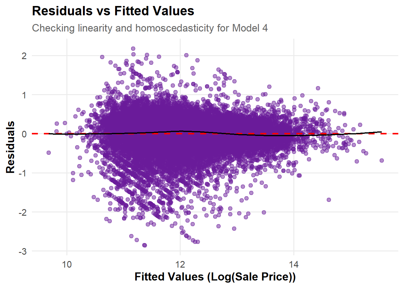
model_data <-data.frame(Fitted =fitted(model_4),Residuals =resid(model_4))p_resid_fitted <-ggplot(model_data, aes(x = Fitted, y = Residuals)) +geom_point(alpha =0.5, color ="#6A1B9A", size =2) +geom_hline(yintercept =0, linetype ="dashed", color ="red", linewidth =1) +geom_smooth(method ="loess", color ="black", se =FALSE, linewidth =0.8) +labs(title ="Residuals vs Fitted Values",subtitle ="Checking linearity and homoscedasticity for Model 4",x ="Fitted Values (Log(Sale Price))",y ="Residuals" ) +theme_minimal(base_size =14) +theme(plot.title =element_text(face ="bold", size =16),plot.subtitle =element_text(size =13, color ="gray40"),axis.title =element_text(face ="bold"),panel.grid.minor =element_blank() )p_resid_fitted
Central Tendency of Residuals: The residuals are generally centered around the zero line, showing no systematic deviation. This indicates that the model captures the overall linear relationship between predictors and the response variable effectively.
Homoscedasticity: The residuals show greater variability and dispersion in the lower fitted value range (approximately 10–12), while they appear more stable at higher fitted values. This suggests that the model performs less effectively for observations with lower predicted values.
Model Assumption Assessment: Overall, the assumptions of linearity and homoscedasticity are largely satisfied, indicating a sound model fit, with only slight deviations to monitor at higher fitted values.
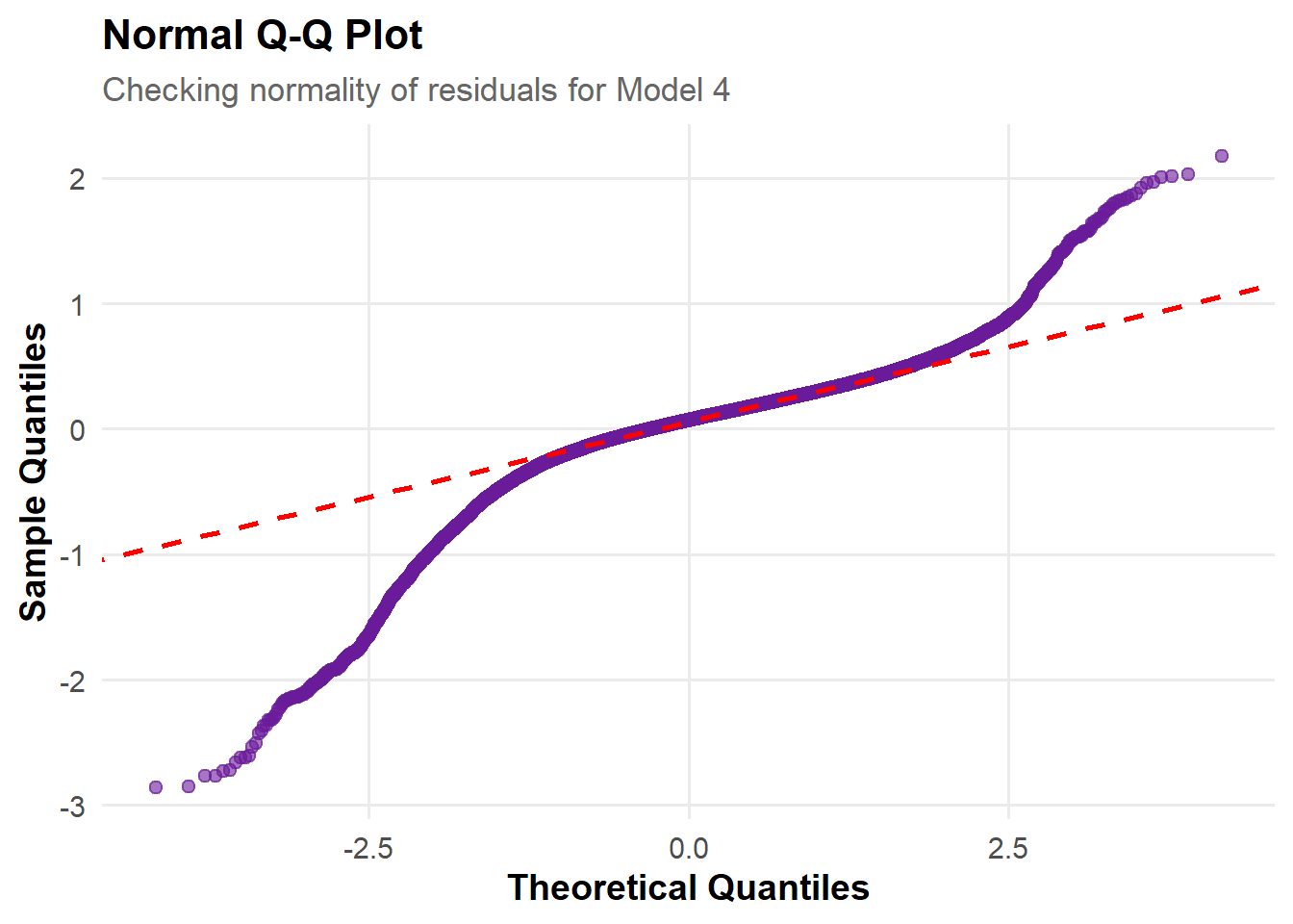
Overall Shape of the Plot: The residual points generally follow the diagonal line, indicating that the overall distribution of residuals is roughly consistent with a normal distribution.
Good Fit in the Central Range: In the central range (around -1 to 1 quantiles), the sample quantiles align closely with the theoretical quantiles, suggesting that most residuals conform well to the assumption of normality.
Deviation in the Tails: At both tails—especially the upper quantiles—the points deviate noticeably from the red dashed line, indicating that the residuals have heavier tails than a normal distribution, suggesting slight non-normality.
Assessment of Normality Assumption: Although deviations appear in the tails, the overall alignment with the reference line is strong, indicating that the normality assumption largely holds, with only minor deviations for extreme residuals.
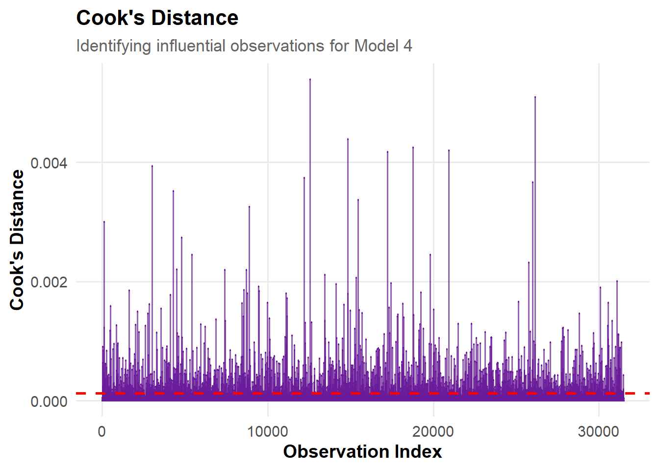
Overall Distribution Pattern: Most observations have Cook’s Distance values close to zero, indicating that the dataset’s overall influence on the model is balanced, with no widespread undue impact.
Presence of Influential Points: A few vertical spikes rise noticeably above the rest, indicating the presence of some influential observations that may affect the estimated model coefficients.
Model Robustness Conclusion: Overall, the model appears robust, with no single observation exerting excessive influence.
Phase 7: Conclusions & Recommendations
Conclusion:
Our final model’s R² is 0.84, indicating that the model explains 84% of the variance in log sale prices. The RMSE is 124437.8USD, showing that the model’s predictions are reasonably close to the observed values.
Livable Area of the House matters most for Philadelphia prices.
Recommendations:
Equity concerns
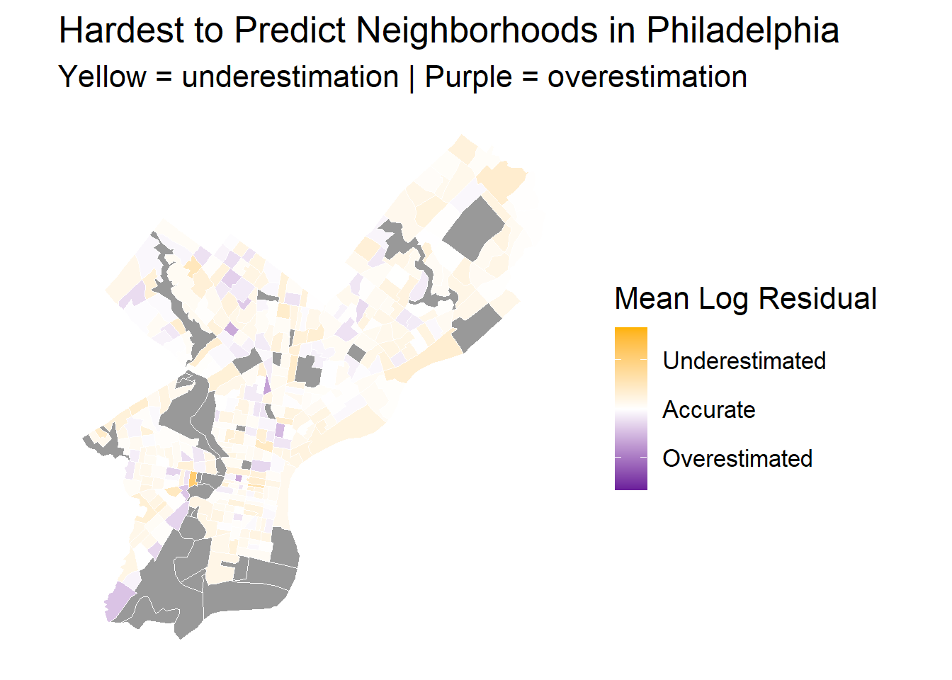
Which neighborhoods are hardest to predict?
The largest prediction errors occur primarily in central Philadelphia, where both overestimation and underestimation coexist within close proximity. This pattern indicates that the model struggles most in areas with high housing heterogeneity- neighborhoods that contain a mix of old row houses, newly renovated apartments, and varying property types within short distances.
In contrast, outer neighborhoods such as those in the northwest and northeast tend to have more consistent housing characteristics, leading to smaller residuals. The central tracts’ larger residuals suggest that cultural or historical features have introduced variability that the model’s current features (mainly physical characteristics) cannot fully explain.
Any data bias?
The observed spatial pattern of prediction errors reflects inherent data bias. The dataset likely overrepresents mid-range housing conditions and underrepresents both luxury and low-income housing. As shown in the livable area and interior condition maps, data coverage in wealthier areas (especially the northwest) is limited, and these tracts often contain more unique, high-value properties that the model cannot generalize well.
Wealthier tracts are more likely to be well-documented, while poorer areas lack records, creating spatial imbalance in model performance.
High-priced homes typically have larger negotiation margins, meaning their final sale prices are often lower than the listed prices. In contrast, low-priced homes sell closer to their listing prices. As a result, model tends to overestimate expensive homes and underestimate affordable ones, introducing systematic bias.
Recommendations to government
Immediate System Calibration: We recommend utilizing our model’s findings to immediately adjust property assessments in systematically overvalued low-income communities. This action will ensure a fair distribution of the tax burden and address current inequities.
Integrate Advanced Spatial Features: We advise the Office of Property Assessment (OPA) to permanently integrate the effective spatial characteristics identified by our study—specifically Comparable Sales Proxies (surrounding transaction prices) and Neighborhood Fixed Effects—into the next-generation AVM. This will significantly enhance the model’s responsiveness to rapidly changing market dynamics.
Extreme high values almost exclusively stem from corporate transactions and require manual review for outliers.
Limitations and next steps
Limitations: Inherent Data Biases
Our predictive accuracy is constrained by inherent data biases which affect equity. We find a dual challenge in data coverage: in affluent areas, high-value, unique properties suffer from data sparsity, making generalization difficult. Conversely, lower-income areas often show data incompleteness, leading to less reliable predictions and higher residual errors. Critically, we observed a price-tier bias: high-priced homes tend to sell below their list price, while low-priced homes transact closer to it. This systemic pattern means the model is prone to over-assessing expensive properties and under-assessing affordable ones, creating a structural risk for vertical inequity in the tax system.
Next Steps: Enhancing Data Quality and Fairness
To address these limitations, our next steps focus on data enrichment and equitable optimization. The City should partner with us to integrate non-public data, such as detailed appraisal records and permit data, which can account for unobserved renovation quality and close the data gap. Furthermore, to combat the systematic price-tier bias, we recommend integrating fairness metrics directly into the AVM’s optimization process. This will shift the model’s objective beyond simple average accuracy (RMSE) to ensure that prediction errors are uniformly low across all price tiers and all Philadelphia neighborhoods, securing both accuracy and equity.
 vs total_livable_area-1.png)
 vs crime_count-1.png)