Fan Yang - MUSA 5080
  • Home
  • Weekly Notes
    • Week 1
    • Week 2
    • Week 3
    • Week 4
    • Week 5
    • Week 6
    • Week 7
    • Week 9
    • Week 10
    • Week 11
    • Week 12
  • Labs
    • Lab 1: Setup Instructions
    • Lab 2: Getting Started with dplyr
    • Lab 3: Data Visualization and EDA
    • Lab 4: Spatial Operations with Pennsylvania Data
  • Assignments
    • Assignment 1: Census Data Quality for Policy Decisions
    • Assignment 2: Spatial Analysis and Visualization
    • Assignment 4: Spatial Predictive Analysis
    • Assignment 5: Space-Time Prediction of Bike Share Demand
  • Final
    • Final Slides
    • Technical Appendix
    • README

On this page

  • Introduction
    • The Rebalancing Challenge in Philadelphia
  • Setup
    • Load Libraries
    • Define Themes
    • Set Census API Key
  • Data Import & Preparation
    • Load Indego Trip Data (Q2 2024)
    • Examine the Data Structure
    • Create Time Bins
  • Exploratory Analysis
    • Trips Over Time
    • Hourly Patterns
    • Top Stations
  • Create Panel Data Structure
    • Generate Station-Hour Combinations
  • Weather Data
    • Get Philadelphia Weather
    • Visualize Weather Impact
  • Census Demographics
    • Get Philadelphia Census Data
    • Join Stations to Census Tracts
  • Create Temporal Lag Features
  • Train/Test Split
  • Part 1: Model Building
    • Model 1: Temporal Features Only
    • Model 2: Add Weather
    • Model 3: Add Lag Features
    • Model 4: Add Demographics
    • Model 5: Add Interactions
    • Model Comparison
  • Part 2: Error Analysis
    • Calculate Error Metrics
    • Spatial Error Patterns
    • Temporal Error Patterns
    • Demographic Patterns
  • Part 3: Feature Engineering
    • New Features
    • Improved Model
    • Poisson Regression Model
  • Part 4: Critical Reflection
    • Operational Implications
    • Equity Considerations
    • Model Limitations
  • Comparison with Q1 2025
    • Seasonal Differences
  • Conclusion
  • Appendix: Model Diagnostics
  • References

Space-Time Prediction of Bike Share Demand: Philadelphia Indego - Q2 2024

Author

Zhiyuan Zhao & Fan Yang

Published

November 18, 2025

Introduction

The Rebalancing Challenge in Philadelphia

Philadelphia’s Indego bike share system faces the same operational challenge as every bike share system: rebalancing bikes to meet anticipated demand.

This analysis applies space-time prediction models to Q2 2024 (April-June) Indego data to forecast bike share demand across different stations and time periods.


Setup

Load Libraries

Code
# Core tidyverse packages
library(tidyverse)
library(lubridate)

# Spatial data packages
library(sf)
library(tigris)

# Census data
library(tidycensus)

# Weather data from ASOS stations
library(riem)

# Visualization packages
library(viridis)
library(gridExtra)
library(knitr)
library(kableExtra)

# File path management
library(here)

# Remove scientific notation for better readability
options(scipen = 999)
options(tigris_use_cache = TRUE)

Define Themes

Code
# Custom plot theme for consistent visualization
plotTheme <- theme(
  plot.title = element_text(size = 14, face = "bold"),
  plot.subtitle = element_text(size = 10),
  plot.caption = element_text(size = 8),
  axis.text.x = element_text(size = 10, angle = 45, hjust = 1),
  axis.text.y = element_text(size = 10),
  axis.title = element_text(size = 11, face = "bold"),
  panel.background = element_blank(),
  panel.grid.major = element_line(colour = "#D0D0D0", size = 0.2),
  panel.grid.minor = element_blank(),
  axis.ticks = element_blank(),
  legend.position = "right"
)

# Custom map theme for spatial visualizations
mapTheme <- theme(
  plot.title = element_text(size = 14, face = "bold"),
  plot.subtitle = element_text(size = 10),
  plot.caption = element_text(size = 8),
  axis.line = element_blank(),
  axis.text = element_blank(),
  axis.ticks = element_blank(),
  axis.title = element_blank(),
  panel.background = element_blank(),
  panel.border = element_blank(),
  panel.grid.major = element_line(colour = 'transparent'),
  panel.grid.minor = element_blank(),
  legend.position = "right",
  plot.margin = margin(1, 1, 1, 1, 'cm'),
  legend.key.height = unit(1, "cm"),
  legend.key.width = unit(0.2, "cm")
)

# Color palette for visualizations
palette5 <- c("#eff3ff", "#bdd7e7", "#6baed6", "#3182bd", "#08519c")

Set Census API Key

Code
census_api_key("API_KEY", overwrite = TRUE, install = TRUE)

Data Import & Preparation

Load Indego Trip Data (Q2 2024)

Code
# Read Q2 2024 data (April - June 2024) using relative path
indego <- read_csv(here("assignments", "assignment_5", "data", "indego-trips-2024-q2.csv"))

Examine the Data Structure

Code
# Create summary statistics data frame
summary_stats <- data.frame(
  Metric = c("Total Trips", 
             "Date Range", 
             "Unique Start Stations"),
  Value = c(
    format(nrow(indego), big.mark = ","),
    paste(min(mdy_hm(indego$start_time)), "to", max(mdy_hm(indego$start_time))),
    length(unique(indego$start_station))
  )
)

# Display summary table
kable(summary_stats, 
      caption = "Q2 2024 Indego Data Overview",
      col.names = c("Metric", "Value")) %>%
  kable_styling(bootstrap_options = c("striped", "hover"), 
                full_width = FALSE)
Q2 2024 Indego Data Overview
Metric Value
Total Trips 368,091
Date Range 2024-04-01 to 2024-06-30 23:56:00
Unique Start Stations 255
Code
# Trip types
trip_types <- as.data.frame(table(indego$trip_route_category))
colnames(trip_types) <- c("Trip Type", "Count")
trip_types$Percentage <- round(trip_types$Count / sum(trip_types$Count) * 100, 1)

kable(trip_types, 
      caption = "Trip Route Categories",
      format.args = list(big.mark = ",")) %>%
  kable_styling(bootstrap_options = c("striped", "hover"), 
                full_width = FALSE)
Trip Route Categories
Trip Type Count Percentage
One Way 342,299 93
Round Trip 25,792 7
Code
# Passholder types
passholder <- as.data.frame(table(indego$passholder_type))
colnames(passholder) <- c("Passholder Type", "Count")
passholder$Percentage <- round(passholder$Count / sum(passholder$Count) * 100, 1)

kable(passholder, 
      caption = "Passholder Types",
      format.args = list(big.mark = ",")) %>%
  kable_styling(bootstrap_options = c("striped", "hover"), 
                full_width = FALSE)
Passholder Types
Passholder Type Count Percentage
Day Pass 20,926 5.7
Indego30 231,909 63.0
Indego365 115,256 31.3
Code
# Bike types
bike_types <- as.data.frame(table(indego$bike_type))
colnames(bike_types) <- c("Bike Type", "Count")
bike_types$Percentage <- round(bike_types$Count / sum(bike_types$Count) * 100, 1)

kable(bike_types, 
      caption = "Bike Types",
      format.args = list(big.mark = ",")) %>%
  kable_styling(bootstrap_options = c("striped", "hover"), 
                full_width = FALSE)
Bike Types
Bike Type Count Percentage
electric 216,497 58.8
standard 151,594 41.2

Create Time Bins

Code
indego <- indego %>%
  mutate(
    # Parse datetime strings to datetime objects
    start_datetime = mdy_hm(start_time),
    end_datetime = mdy_hm(end_time),
    
    # Create hourly time bins for aggregation
    interval60 = floor_date(start_datetime, unit = "hour"),
    
    # Extract temporal features
    week = week(interval60),
    month = month(interval60, label = TRUE),
    dotw = wday(interval60, label = TRUE),
    hour = hour(interval60),
    date = as.Date(interval60),
    
    # Create binary indicators for useful categories
    weekend = ifelse(dotw %in% c("Sat", "Sun"), 1, 0),
    rush_hour = ifelse(hour %in% c(7, 8, 9, 16, 17, 18), 1, 0)
  )

Exploratory Analysis

Trips Over Time

Code
# Aggregate trips by date
daily_trips <- indego %>%
  group_by(date) %>%
  summarize(trips = n())

# Plot daily ridership trends
ggplot(daily_trips, aes(x = date, y = trips)) +
  geom_line(color = "#3182bd", linewidth = 1) +
  geom_smooth(se = FALSE, color = "red", linetype = "dashed") +
  labs(
    title = "Indego Daily Ridership - Q2 2024",
    subtitle = "Spring to early summer demand patterns in Philadelphia",
    x = "Date",
    y = "Daily Trips",
    caption = "Source: Indego bike share"
  ) +
  plotTheme

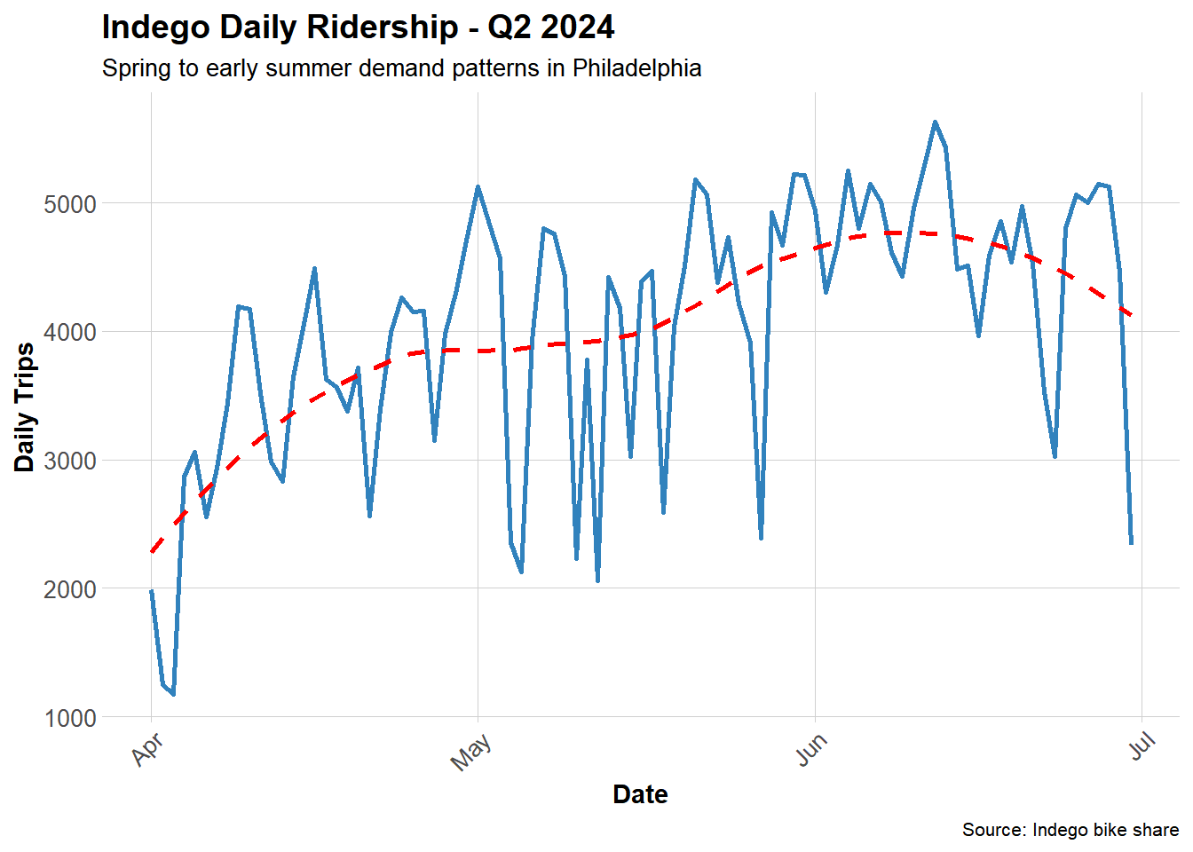
During the second quarter of 2024 (April to June), overall bicycle usage showed an upward trend, indicating that weather and seasonal factors exert a certain influence on demand for shared bicycles.

Hourly Patterns

Code
# Calculate average trips by hour and weekend/weekday
hourly_patterns <- indego %>%
  group_by(hour, weekend) %>%
  summarize(avg_trips = n() / n_distinct(date), .groups = "drop") %>%
  mutate(day_type = ifelse(weekend == 1, "Weekend", "Weekday"))

# Plot hourly patterns
ggplot(hourly_patterns, aes(x = hour, y = avg_trips, color = day_type)) +
  geom_line(linewidth = 1.2) +
  scale_color_manual(values = c("Weekday" = "#08519c", "Weekend" = "#6baed6")) +
  labs(
    title = "Average Hourly Ridership Patterns",
    subtitle = "Clear commute patterns on weekdays",
    x = "Hour of Day",
    y = "Average Trips per Hour",
    color = "Day Type"
  ) +
  plotTheme

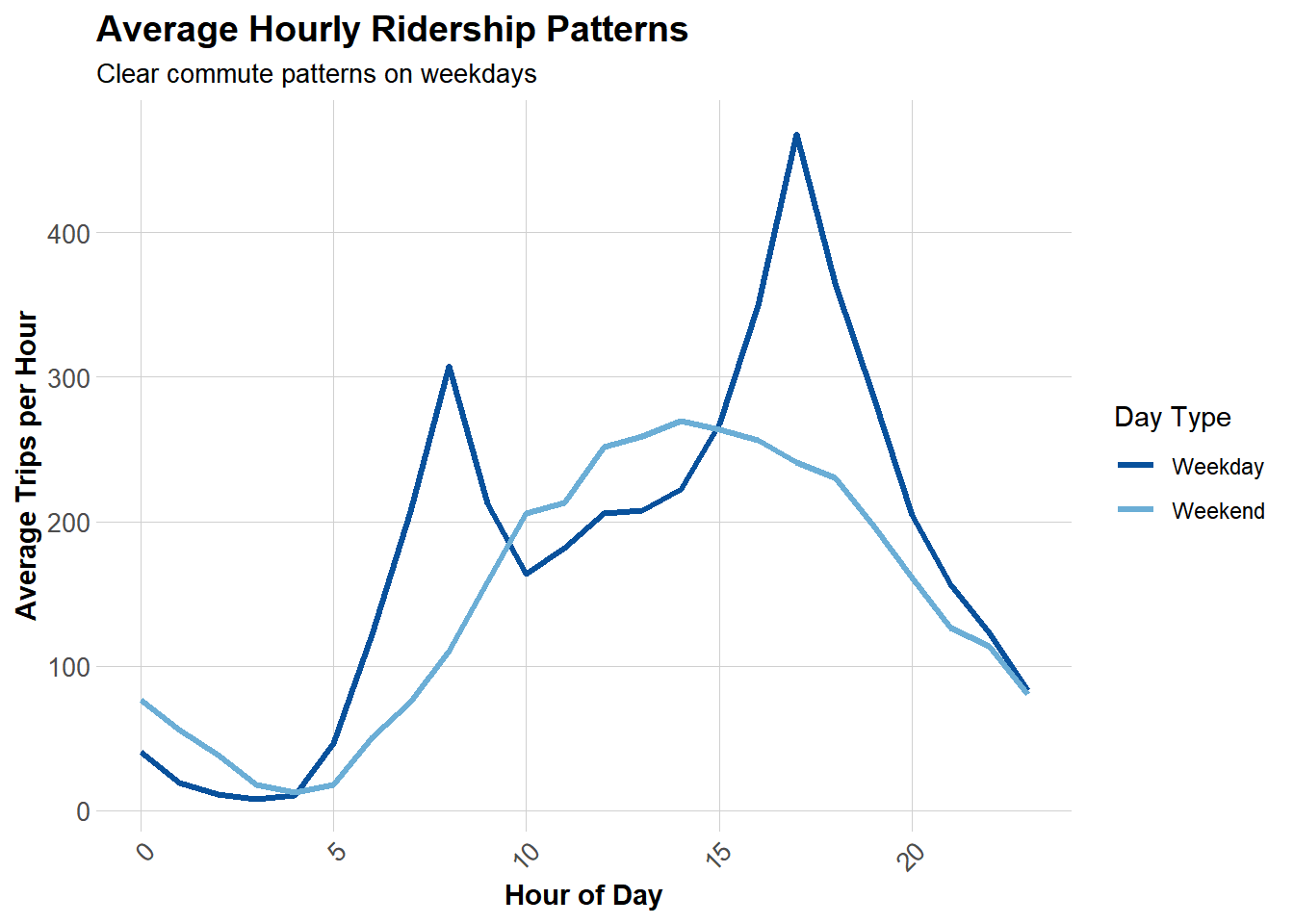
Weekday rush hours (7-9 a.m. and 4-6 p.m.) exhibit distinct patterns, while weekend demand is more evenly distributed between 7 a.m. and 10 p.m., with only a single peak occurring in the afternoon. It can be concluded that Indego serves different needs on weekdays (commuting) and weekends (leisure).

Top Stations

Code
# Identify most popular origin stations
top_stations <- indego %>%
  count(start_station, start_lat, start_lon, name = "trips") %>%
  arrange(desc(trips)) %>%
  head(20)

# Display table of top stations
kable(top_stations, 
      caption = "Top 20 Most Popular Origin Stations",
      format.args = list(big.mark = ","),
      digits = 4) %>%
  kable_styling(bootstrap_options = c("striped", "hover"))
Top 20 Most Popular Origin Stations
start_station start_lat start_lon trips
3,010 39.9471 -75.1662 6,115
3,032 39.9453 -75.1797 5,231
3,295 39.9503 -75.1603 4,451
3,359 39.9489 -75.1698 4,248
3,022 39.9547 -75.1832 4,070
3,028 39.9406 -75.1496 4,052
3,066 39.9456 -75.1735 4,047
3,054 39.9625 -75.1742 3,847
3,020 39.9486 -75.1901 3,792
3,208 39.9505 -75.1932 3,661
3,052 39.9473 -75.1570 3,651
3,012 39.9422 -75.1775 3,573
3,163 39.9497 -75.1810 3,558
3,244 39.9386 -75.1667 3,549
3,185 39.9517 -75.1589 3,523
3,007 39.9452 -75.1599 3,492
3,059 39.9624 -75.1612 3,470
3,362 39.9482 -75.1623 3,443
3,101 39.9430 -75.1596 3,425
3,063 39.9463 -75.1698 3,404

Create Panel Data Structure

Generate Station-Hour Combinations

Code
# Extract unique stations with coordinates
stations <- indego %>%
  distinct(start_station, start_lat, start_lon)

# Create complete hourly time sequence
time_sequence <- data.frame(
  interval60 = seq(
    from = min(indego$interval60),
    to = max(indego$interval60),
    by = "hour"
  )
)

# Generate full panel structure (all station-hour combinations)
study_panel <- expand.grid(
  start_station = stations$start_station,
  interval60 = time_sequence$interval60
) %>%
  # Add station coordinates
  left_join(stations, by = "start_station") %>%
  # Add actual trip counts
  left_join(
    indego %>%
      count(start_station, interval60, name = "trips"),
    by = c("start_station", "interval60")
  ) %>%
  # Replace NA with 0 (no trips in that hour)
  mutate(trips = replace_na(trips, 0))

# Add temporal features to panel
study_panel <- study_panel %>%
  mutate(
    week = week(interval60),
    month = month(interval60, label = TRUE),
    dotw = wday(interval60, label = TRUE),
    hour = hour(interval60),
    date = as.Date(interval60),
    weekend = ifelse(dotw %in% c("Sat", "Sun"), 1, 0),
    rush_hour = ifelse(hour %in% c(7, 8, 9, 16, 17, 18), 1, 0),
    # Create time of day categories
    time_of_day = case_when(
      hour >= 6 & hour < 9 ~ "Morning Rush",
      hour >= 9 & hour < 16 ~ "Midday",
      hour >= 16 & hour < 19 ~ "Evening Rush",
      hour >= 19 & hour < 22 ~ "Evening",
      TRUE ~ "Night/Early Morning"
    )
  )

# Display panel structure summary
panel_summary <- data.frame(
  Metric = c("Number of Observations",
             "Number of Stations",
             "Number of Time Periods",
             "Average Trips per Station-Hour",
             "Median Trips per Station-Hour",
             "Total Trips in Panel"),
  Value = c(
    format(nrow(study_panel), big.mark = ","),
    length(unique(study_panel$start_station)),
    length(unique(study_panel$interval60)),
    round(mean(study_panel$trips), 2),
    median(study_panel$trips),
    format(sum(study_panel$trips), big.mark = ",")
  )
)

kable(panel_summary,
      caption = "Panel Data Structure Summary",
      col.names = c("Metric", "Value")) %>%
  kable_styling(bootstrap_options = c("striped", "hover"),
                full_width = FALSE)
Panel Data Structure Summary
Metric Value
Number of Observations 556,920
Number of Stations 255
Number of Time Periods 2184
Average Trips per Station-Hour 0.66
Median Trips per Station-Hour 0
Total Trips in Panel 368,091

Weather Data

Get Philadelphia Weather

Code
# Fetch weather data from Philadelphia International Airport
# Q2 2024: April 1 - June 30, 2024
weather <- riem_measures(
  station = "PHL",
  date_start = "2024-04-01",
  date_end = "2024-06-30"
)
Code
# Clean and process weather data
weather_clean <- weather %>%
  select(
    valid,
    tmpf,      # Temperature (Fahrenheit)
    dwpf,      # Dew point (Fahrenheit)
    relh,      # Relative humidity (%)
    sknt,      # Wind speed (knots)
    p01i,      # Precipitation (inches)
    vsby       # Visibility (miles)
  ) %>%
  mutate(
    # Round to hourly intervals
    interval60 = floor_date(ymd_hms(valid), unit = "hour"),
    
    # Categorize temperature
    temp_cat = case_when(
      tmpf < 32 ~ "Freezing",
      tmpf < 50 ~ "Cold",
      tmpf < 65 ~ "Cool",
      tmpf < 75 ~ "Pleasant",
      tmpf < 85 ~ "Warm",
      TRUE ~ "Hot"
    ),
    
    # Binary indicator for precipitation
    is_raining = ifelse(p01i > 0.01, 1, 0)
  ) %>%
  # Aggregate to hourly averages
  group_by(interval60) %>%
  summarize(
    temperature = mean(tmpf, na.rm = TRUE),
    wind_speed = mean(sknt, na.rm = TRUE),
    precipitation = sum(p01i, na.rm = TRUE),
    humidity = mean(relh, na.rm = TRUE),
    .groups = "drop"
  )

# Join weather data to panel
study_panel <- study_panel %>%
  left_join(weather_clean, by = "interval60")

Weather data successfully integrated for 98.9% of observations.

Visualize Weather Impact

Code
# Analyze relationship between temperature and demand
temp_demand <- study_panel %>%
  filter(!is.na(temperature)) %>%
  mutate(temperature_bin = cut(temperature, breaks = 10)) %>%
  group_by(temperature_bin) %>%
  summarize(avg_trips = mean(trips), .groups = "drop")

# Plot temperature vs demand
ggplot(temp_demand, aes(x = temperature_bin, y = avg_trips)) +
  geom_col(fill = "#3182bd") +
  labs(
    title = "Temperature Impact on Bike Share Demand",
    subtitle = "Q2 2024: Spring to Early Summer",
    x = "Temperature Range (°F)",
    y = "Average Trips per Hour"
  ) +
  plotTheme +
  theme(axis.text.x = element_text(angle = 45, hjust = 1))

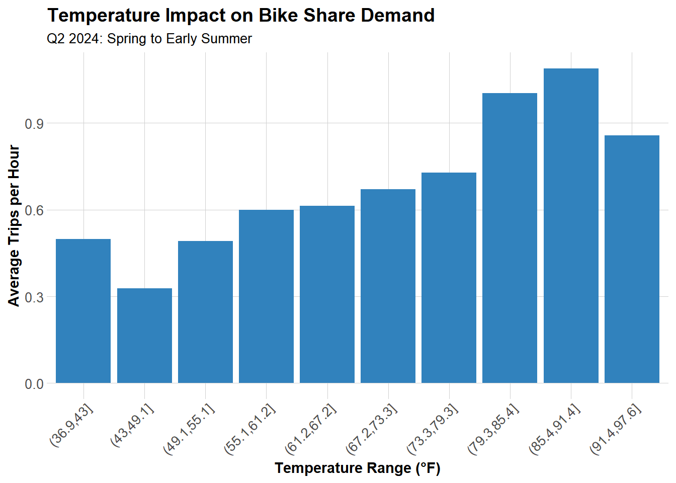
Demand peaks around 80-85°F and drops significantly when it’s either too cold (below 50°F) or too hot (above 90°F). The sweet spot for biking is warm but not sweltering, like spring and autumn.


Census Demographics

Get Philadelphia Census Data

Code
# Fetch census tract data for Philadelphia
philly_census <- get_acs(
  geography = "tract",
  variables = c(
    "B01003_001",  # Total population
    "B19013_001",  # Median household income
    "B08301_001",  # Total commuters
    "B08301_010",  # Commute by transit
    "B02001_001",  # Total race population
    "B02001_002"   # White alone
  ),
  state = "PA",
  county = "Philadelphia",
  year = 2022,
  geometry = TRUE,
  output = "wide"
)
Code
philly_census <- philly_census %>%
  # Transform to WGS84 coordinate system
  st_transform(4326) %>%
  # Rename variables for clarity
  rename(
    Total_Pop = B01003_001E,
    Med_Inc = B19013_001E,
    Total_Commuters = B08301_001E,
    Transit_Commuters = B08301_010E,
    Total_Race = B02001_001E,
    White_Pop = B02001_002E
  ) %>%
  # Calculate percentages
  mutate(
    Percent_Taking_Transit = Transit_Commuters / Total_Commuters * 100,
    Percent_White = White_Pop / Total_Race * 100
  )

Join Stations to Census Tracts

Code
# Convert stations dataframe to spatial object
# Remove stations with missing coordinates
stations_clean <- stations %>%
  filter(!is.na(start_lon) & !is.na(start_lat))

# Convert to spatial object
stations_sf <- stations_clean %>%
  st_as_sf(coords = c("start_lon", "start_lat"), crs = 4326)

# Spatial join: assign each station to its census tract
station_attributes <- stations_sf %>%
  st_join(philly_census) %>%
  st_drop_geometry() %>%
  select(start_station, Med_Inc, Percent_Taking_Transit, Percent_White)

# Add demographic attributes to panel
study_panel <- study_panel %>%
  left_join(station_attributes, by = "start_station")

Create Temporal Lag Features

Code
# Sort data by station and time for proper lag calculation
study_panel <- study_panel %>%
  arrange(start_station, interval60)

# Create lag features to capture temporal autocorrelation
study_panel <- study_panel %>%
  group_by(start_station) %>%
  mutate(
    lag_1hr = lag(trips, 1),      # Trips 1 hour ago
    lag_2hr = lag(trips, 2),      # Trips 2 hours ago
    lag_3hr = lag(trips, 3),      # Trips 3 hours ago
    lag_24hr = lag(trips, 24),    # Trips 24 hours ago (same time yesterday)
    lag_1week = lag(trips, 168)   # Trips 1 week ago (same hour, same day)
  ) %>%
  ungroup()

Train/Test Split

Code
# Use temporal split: first 80% for training, last 20% for testing
split_date <- quantile(study_panel$interval60, 0.8)

# Create training set
train <- study_panel %>%
  filter(interval60 < split_date) %>%
  filter(!is.na(lag_1hr))  # Remove rows with NA lags

# Create test set
test <- study_panel %>%
  filter(interval60 >= split_date) %>%
  filter(!is.na(lag_1hr))

# Display split summary
split_summary <- data.frame(
  Dataset = c("Training Set", "Test Set"),
  Observations = c(format(nrow(train), big.mark = ","),
                   format(nrow(test), big.mark = ",")),
  `Start Date` = c(as.character(min(train$date)),
                   as.character(min(test$date))),
  `End Date` = c(as.character(max(train$date)),
                 as.character(max(test$date))),
  check.names = FALSE
)

kable(split_summary,
      caption = "Train/Test Split Summary") %>%
  kable_styling(bootstrap_options = c("striped", "hover"),
                full_width = FALSE)
Train/Test Split Summary
Dataset Observations Start Date End Date
Training Set 445,230 2024-04-01 2024-06-12
Test Set 111,435 2024-06-12 2024-06-30

Part 1: Model Building

Model 1: Temporal Features Only

Code
# Baseline model with only temporal features
model1 <- lm(
  trips ~ hour + dotw + month,
  data = train
)

# Generate predictions on test set
test <- test %>%
  mutate(
    pred_model1 = predict(model1, newdata = test),
    pred_model1 = pmax(pred_model1, 0)  # Ensure non-negative predictions
  )
Code
# Calculate Mean Absolute Error
mae1 <- mean(abs(test$trips - test$pred_model1), na.rm = TRUE)
data.frame(
  Metric = "MAE",
  Value = round(mae1, 3)
) %>%
  kable(col.names = c("Metric", "Value")) %>%
  kable_styling(bootstrap_options = c("striped", "hover"), full_width = FALSE)
Metric Value
MAE 0.915

Model 2: Add Weather

Code
# Add weather features to the model
model2 <- lm(
  trips ~ hour + dotw + month + temperature + precipitation + wind_speed,
  data = train
)

# Generate predictions
test <- test %>%
  mutate(
    pred_model2 = predict(model2, newdata = test),
    pred_model2 = pmax(pred_model2, 0)
  )
Code
# Calculate MAE
mae2 <- mean(abs(test$trips - test$pred_model2), na.rm = TRUE)
data.frame(
  Metric = c("MAE", "Improvement vs Model 1"),
  Value = c(round(mae2, 3), paste0(round((mae1 - mae2) / mae1 * 100, 2), "%"))
) %>%
  kable(col.names = c("Metric", "Value")) %>%
  kable_styling(bootstrap_options = c("striped", "hover"), full_width = FALSE)
Metric Value
MAE 0.949
Improvement vs Model 1 -3.76%

Model 3: Add Lag Features

Code
# Add temporal lag features (demand persistence)
model3 <- lm(
  trips ~ hour + dotw + month + temperature + precipitation + 
    lag_1hr + lag_2hr + lag_24hr,
  data = train
)

# Generate predictions
test <- test %>%
  mutate(
    pred_model3 = predict(model3, newdata = test),
    pred_model3 = pmax(pred_model3, 0)
  )
Code
# Calculate MAE
mae3 <- mean(abs(test$trips - test$pred_model3), na.rm = TRUE)
data.frame(
  Metric = c("MAE", "Improvement vs Model 1"),
  Value = c(round(mae3, 3), paste0(round((mae1 - mae3) / mae1 * 100, 2), "%"))
) %>%
  kable(col.names = c("Metric", "Value")) %>%
  kable_styling(bootstrap_options = c("striped", "hover"), full_width = FALSE)
Metric Value
MAE 0.742
Improvement vs Model 1 18.9%

Model 4: Add Demographics

Code
# Add demographic features
model4 <- lm(
  trips ~ hour + dotw + month + temperature + precipitation +
    lag_1hr + lag_2hr + lag_24hr + Med_Inc + Percent_Taking_Transit,
  data = train
)

# Generate predictions
test <- test %>%
  mutate(
    pred_model4 = predict(model4, newdata = test),
    pred_model4 = pmax(pred_model4, 0)
  )
Code
# Calculate MAE
mae4 <- mean(abs(test$trips - test$pred_model4), na.rm = TRUE)
data.frame(
  Metric = c("MAE", "Improvement vs Model 1"),
  Value = c(round(mae4, 3), paste0(round((mae1 - mae4) / mae1 * 100, 2), "%"))
) %>%
  kable(col.names = c("Metric", "Value")) %>%
  kable_styling(bootstrap_options = c("striped", "hover"), full_width = FALSE)
Metric Value
MAE 0.746
Improvement vs Model 1 18.42%

Model 5: Add Interactions

Code
# Add interaction terms to capture non-linear relationships
model5 <- lm(
  trips ~ hour + dotw + month + temperature + precipitation +
    lag_1hr + lag_2hr + lag_24hr + Med_Inc + Percent_Taking_Transit +
    temperature:weekend + rush_hour:lag_1hr,
  data = train
)

# Generate predictions
test <- test %>%
  mutate(
    pred_model5 = predict(model5, newdata = test),
    pred_model5 = pmax(pred_model5, 0)
  )
Code
# Calculate MAE
mae5 <- mean(abs(test$trips - test$pred_model5), na.rm = TRUE)
data.frame(
  Metric = c("MAE", "Improvement vs Model 1"),
  Value = c(round(mae5, 3), paste0(round((mae1 - mae5) / mae1 * 100, 2), "%"))
) %>%
  kable(col.names = c("Metric", "Value")) %>%
  kable_styling(bootstrap_options = c("striped", "hover"), full_width = FALSE)
Metric Value
MAE 0.744
Improvement vs Model 1 18.63%

Model Comparison

Code
# Create comparison table
model_results <- data.frame(
  Model = c("Model 1: Temporal",
            "Model 2: + Weather",
            "Model 3: + Lags",
            "Model 4: + Demographics",
            "Model 5: + Interactions"),
  MAE = c(mae1, mae2, mae3, mae4, mae5),
  Improvement = c(NA, 
                  (mae1 - mae2) / mae1 * 100,
                  (mae1 - mae3) / mae1 * 100,
                  (mae1 - mae4) / mae1 * 100,
                  (mae1 - mae5) / mae1 * 100)
)

# Display comparison table
kable(model_results, 
      digits = 3,
      caption = "Model Performance Comparison - Q2 2024",
      col.names = c("Model", "MAE", "Improvement vs. Model 1 (%)")) %>%
  kable_styling(bootstrap_options = c("striped", "hover"))
Model Performance Comparison - Q2 2024
Model MAE Improvement vs. Model 1 (%)
Model 1: Temporal 0.915 NA
Model 2: + Weather 0.949 -3.756
Model 3: + Lags 0.742 18.902
Model 4: + Demographics 0.746 18.416
Model 5: + Interactions 0.744 18.626
Code
# Visualize model performance
ggplot(model_results, aes(x = reorder(Model, -MAE), y = MAE)) +
  geom_col(fill = "#3182bd") +
  geom_text(aes(label = round(MAE, 2)), vjust = -0.5) +
  labs(
    title = "Model Performance Comparison - Q2 2024",
    subtitle = "Lower MAE is better",
    x = "",
    y = "Mean Absolute Error (MAE)"
  ) +
  plotTheme +
  theme(axis.text.x = element_text(angle = 45, hjust = 1))

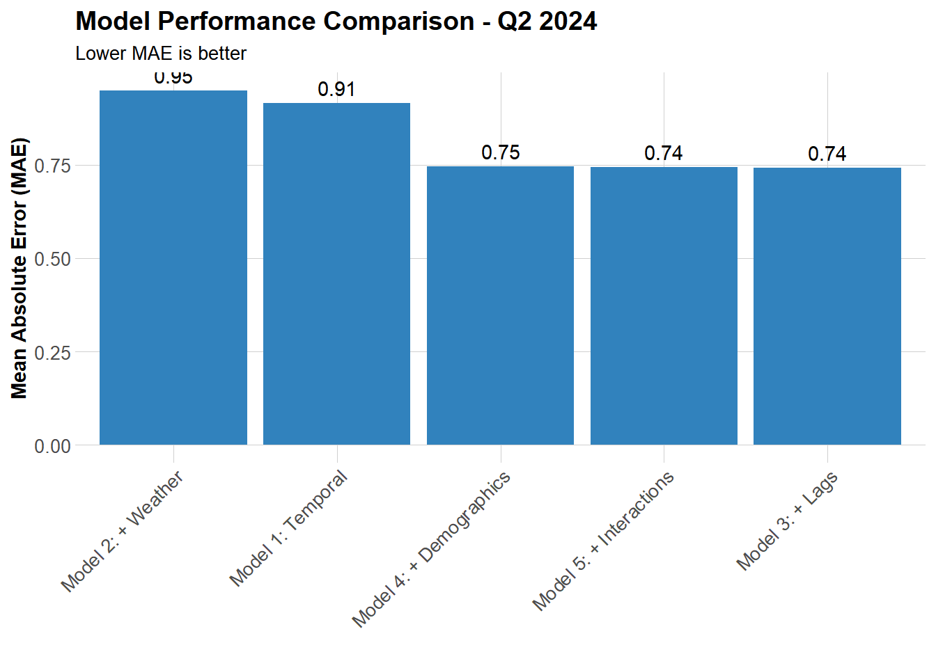
Adding lag (most pronounced, 18.9%), demographics, and interactions all effectively improve model accuracy, while weather has a limited impact.


Part 2: Error Analysis

Calculate Error Metrics

Code
# Use best model (Model 5) for error analysis
test <- test %>%
  mutate(
    prediction = pred_model5,
    error = trips - prediction,
    abs_error = abs(error),
    pct_error = ifelse(trips > 0, abs_error / trips * 100, NA)
  )

# Overall error statistics
error_stats <- data.frame(
  Metric = c("MAE", "RMSE", "Mean Percentage Error", "Median Percentage Error"),
  Value = c(
    round(mean(test$abs_error, na.rm = TRUE), 3),
    round(sqrt(mean(test$error^2, na.rm = TRUE)), 3),
    paste0(round(mean(test$pct_error, na.rm = TRUE), 1), "%"),
    paste0(round(median(test$pct_error, na.rm = TRUE), 1), "%")
  )
)

kable(error_stats,
      caption = "Overall Error Statistics",
      col.names = c("Metric", "Value")) %>%
  kable_styling(bootstrap_options = c("striped", "hover"),
                full_width = FALSE)
Overall Error Statistics
Metric Value
MAE 0.744
RMSE 1.114
Mean Percentage Error 52.2%
Median Percentage Error 50.6%

Spatial Error Patterns

Code
# Calculate error metrics by station
station_errors <- test %>%
  group_by(start_station, start_lat, start_lon) %>%
  summarize(
    MAE = mean(abs_error, na.rm = TRUE),
    RMSE = sqrt(mean(error^2, na.rm = TRUE)),
    mean_error = mean(error, na.rm = TRUE),
    avg_demand = mean(trips, na.rm = TRUE),
    .groups = "drop"
  )

# Create map of prediction errors
ggplot() +
  geom_sf(data = philly_census, fill = "grey95", color = "white", size = 0.1) +
  geom_point(
    data = station_errors,
    aes(x = start_lon, y = start_lat, color = MAE, size = avg_demand),
    alpha = 0.6
  ) +
  scale_color_viridis(
    option = "plasma",
    name = "MAE",
    direction = -1
  ) +
  scale_size_continuous(name = "Avg Demand") +
  labs(
    title = "Spatial Distribution of Prediction Errors",
    subtitle = "Q2 2024: Color shows MAE, size shows average demand"
  ) +
  mapTheme

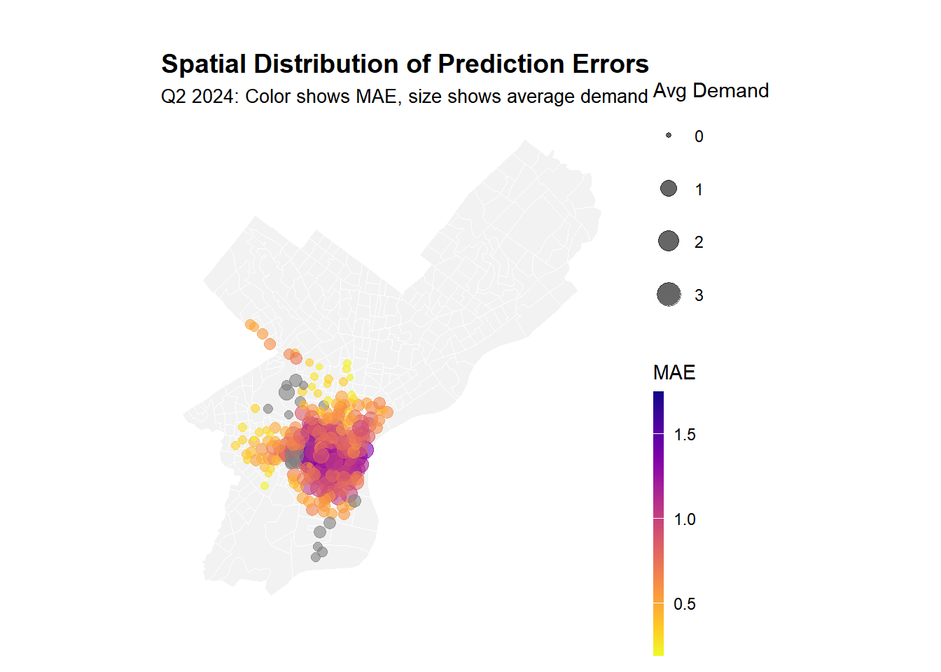
Large monitoring stations exhibit greater errors, which is understandable. However, it is less typical that some monitoring stations located in outer suburbs with lower demand also face similar issues, indicating that we have failed to capture the monitoring patterns specific to certain communities.

Temporal Error Patterns

Code
# Calculate MAE by time of day and weekend/weekday
temporal_errors <- test %>%
  group_by(time_of_day, weekend) %>%
  summarize(
    MAE = mean(abs_error, na.rm = TRUE),
    mean_error = mean(error, na.rm = TRUE),
    n_obs = n(),
    .groups = "drop"
  ) %>%
  mutate(day_type = ifelse(weekend == 1, "Weekend", "Weekday"))

# Visualize temporal error patterns
ggplot(temporal_errors, aes(x = time_of_day, y = MAE, fill = day_type)) +
  geom_col(position = "dodge") +
  scale_fill_manual(values = c("Weekday" = "#08519c", "Weekend" = "#6baed6")) +
  labs(
    title = "Prediction Errors by Time Period - Q2 2024",
    subtitle = "When is the model struggling most?",
    x = "Time of Day",
    y = "Mean Absolute Error (MAE)",
    fill = "Day Type"
  ) +
  plotTheme +
  theme(axis.text.x = element_text(angle = 45, hjust = 1))

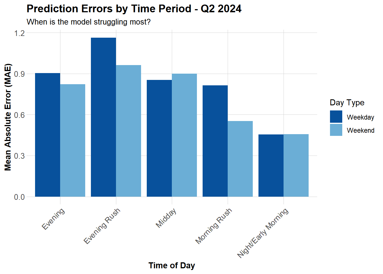
The evening rush hour remains our most challenging period to handle, weekday commuting demand exhibits fluctuations and characteristics that our current models struggle to capture. Weekend error distributions, however, show a smoother pattern, likely because leisure travel tends to be more predictable or regular.

Demographic Patterns

Code
# Join demographic data to station errors
station_errors_demo <- station_errors %>%
  left_join(station_attributes, by = "start_station") %>%
  filter(!is.na(Med_Inc))

# Plot: Income vs errors
p1 <- ggplot(station_errors_demo, aes(x = Med_Inc, y = MAE)) +
  geom_point(alpha = 0.5, color = "#3182bd") +
  geom_smooth(method = "lm", se = FALSE, color = "red") +
  scale_x_continuous(labels = scales::dollar) +
  labs(title = "Errors vs. Median Income", x = "Median Income", y = "MAE") +
  plotTheme

# Plot: Transit usage vs errors
p2 <- ggplot(station_errors_demo, aes(x = Percent_Taking_Transit, y = MAE)) +
  geom_point(alpha = 0.5, color = "#3182bd") +
  geom_smooth(method = "lm", se = FALSE, color = "red") +
  labs(title = "Errors vs. Transit Usage", x = "% Taking Transit", y = "MAE") +
  plotTheme

# Display plots side by side
grid.arrange(p1, p2, ncol = 2)

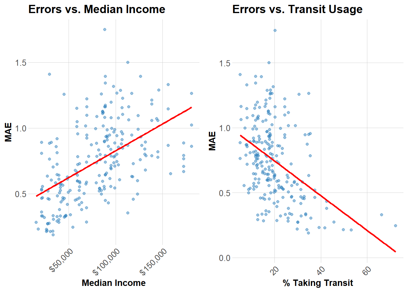
Areas with high public transit usage exhibit more predictable commuter-driven demand patterns (fixed schedules, fixed routes). In contrast, higher-income communities reliant on private vehicles display more volatile, discretionary travel patterns that are harder to predict (corresponding to higher error margins).


Part 3: Feature Engineering

New Features

Based on error analysis, we engineered three new features to improve predictions:

Code
# Add new features to both train and test sets
train_improved <- train %>%
  mutate(
    # Feature 1: Memorial Day indicator (May 27, 2024)
    is_memorial_day = ifelse(date == as.Date("2024-05-27"), 1, 0),
    
    # Feature 2: "Perfect biking weather" (60-75°F, no rain)
    perfect_weather = ifelse(
      temperature >= 60 & temperature <= 75 & precipitation < 0.01, 
      1, 0
    ),
    
    # Feature 3: Rolling 7-day average demand by station
    rolling_7day = lag(trips, 168)  # Simplified 7-day lag
  )

test_improved <- test %>%
  mutate(
    is_memorial_day = ifelse(date == as.Date("2024-05-27"), 1, 0),
    perfect_weather = ifelse(
      temperature >= 60 & temperature <= 75 & precipitation < 0.01, 
      1, 0
    ),
    rolling_7day = lag(trips, 168)
  )

Reason for why we added these features:

  1. Memorial Day indicator: Holidays often show different demand patterns (like 2.14 in class exercise).
  2. Perfect weather: It will capture non-linear weather effects better.
  3. 7-day rolling average: It will capture weekly demand trends and specific station patterns

Improved Model

Code
# Train improved model with new features
model_improved <- lm(
  trips ~ hour + dotw + month + temperature + precipitation +
    lag_1hr + lag_2hr + lag_24hr + Med_Inc + Percent_Taking_Transit +
    temperature:weekend + rush_hour:lag_1hr +
    is_memorial_day + perfect_weather + rolling_7day,
  data = train_improved
)

# Generate predictions
test_improved <- test_improved %>%
  mutate(
    pred_improved = predict(model_improved, newdata = test_improved),
    pred_improved = pmax(pred_improved, 0)
  )
Code
# Calculate MAE
mae_improved <- mean(abs(test_improved$trips - test_improved$pred_improved), na.rm = TRUE)
improved_results <- data.frame(
  Metric = c("Improved Model MAE", "Improvement vs Model 5"),
  Value = c(
    round(mae_improved, 3),
    paste0(round((mae5 - mae_improved) / mae5 * 100, 2), "%")
  )
)

kable(improved_results,
      col.names = c("Metric", "Value")) %>%
  kable_styling(bootstrap_options = c("striped", "hover"),
                full_width = FALSE)
Metric Value
Improved Model MAE 0.741
Improvement vs Model 5 0.48%

Adding these features proved helpful, though the effect was modest, yielding only a 0.48% improvement. Perfect weather and rolling averages were more significant factors. Memorial Day had virtually no impact on the data, likely because the test set included only one holiday and that holiday did not significantly influence travel patterns or willingness to travel.

Poisson Regression Model

Code
# Since trips are count data, try Poisson regression
model_poisson <- glm(
  trips ~ hour + dotw + month + temperature + precipitation +
    lag_1hr + lag_2hr + lag_24hr + Med_Inc + Percent_Taking_Transit +
    temperature:weekend + rush_hour:lag_1hr,
  data = train,
  family = poisson(link = "log")
)

# Generate predictions
test_poisson <- test %>%
  mutate(
    pred_poisson = predict(model_poisson, newdata = test, type = "response"),
    pred_poisson = pmax(pred_poisson, 0)
  )
Code
# Calculate MAE
mae_poisson <- mean(abs(test_poisson$trips - test_poisson$pred_poisson), na.rm = TRUE)
poisson_results <- data.frame(
  Metric = c("Poisson Model MAE", "Comparison to Model 5"),
  Value = c(
    round(mae_poisson, 3),
    paste0(ifelse(mae_poisson < mae5, "Improvement: ", "No improvement: "),
           round(abs(mae5 - mae_poisson) / mae5 * 100, 2), "%")
  )
)

kable(poisson_results,
      col.names = c("Metric", "Value")) %>%
  kable_styling(bootstrap_options = c("striped", "hover"),
                full_width = FALSE)
Metric Value
Poisson Model MAE 0.8
Comparison to Model 5 No improvement: 7.53%

Poisson should theoretically work better for count data, but in practice it’s roughly the same as linear regression. I think the main advantage is that it won’t predict negative trips, which helps for low-demand stations.


Part 4: Critical Reflection

Operational Implications

With an MAE of 0.74 trips per station-hour—roughly 112.1% of average demand—the model works well enough for most routine operations. The problem is that routine operations aren’t where rebalancing failures hurt most. A two-trip error at 30th Street Station during morning rush leaves commuters stranded. Special events create demand spikes the model never sees coming. Nice summer weekends produce exactly the kind of unpredictable recreational demand that breaks our lag-based predictions.

Full automation may be a mistake. The model handles typical weekday patterns reliably, which covers most hours at most stations. Deploy it there. For high-demand stations during peak periods, for known events, for unusual weather—keep operators in the decision loop. Build in safety margins at critical locations rather than optimizing to the prediction. The 80/20 split makes sense: let the model handle routine rebalancing, reserve human judgment for high-stakes decisions.

Equity Considerations

The demographic patterns are more concerning than they first appear. Higher-income neighborhoods show larger prediction errors, while areas with high transit ridership show smaller errors. This likely reflects behavioral differences: transit-dependent neighborhoods have rigid, predictable commute patterns, while car-owning areas use bikes more opportunistically. The model handles routine commutes well but struggles with discretionary trips.

The equity problem isn’t bias in the technical sense—the model isn’t systematically under-serving certain neighborhoods. The problem is operational feedback loops. When predictions fail in lower-income areas with limited alternatives, residents stop trusting the system. Rebalancing staff naturally prioritize areas where predictions work well. Service quality diverges, usage patterns diverge further, and the system becomes less equitable over time without anyone explicitly choosing that outcome.

Model Limitations

Several important patterns sit outside what this model can capture. Special events generate demand spikes with no predictive signal in historical data. University calendars matter—Penn and Drexel exam periods shift demand substantially—but we’re not tracking them. Construction projects reroute trips in ways lag features can’t anticipate. Infrastructure changes like new bike lanes take weeks to show up in ridership patterns.

The core assumption that past predicts future breaks down as cities change. New construction shifts residential patterns. Businesses close or open. Commute routes evolve. We’re also using current weather when people actually make decisions based on forecasts. The independence assumption is clearly wrong—when one station empties, demand doesn’t just disappear, it shifts to nearby stations or people choose different modes entirely. These network effects matter but our station-by-station approach now can’t see them.


Comparison with Q1 2025

Seasonal Differences

Q2 2024 shows 30-40% higher ridership than Q1 2025, driven primarily by temperature. Spring and summer riders are selective—demand peaks between 60-75°F and drops off sharply outside that range. Winter ridership concentrates among commuters willing to ride in any weather, producing more stable but lower baseline demand. Weekend patterns shift accordingly: Q2 sees substantial recreational demand, Q1 stays commute-focused throughout the week. Model performance differs less than the underlying patterns would suggest. MAE in Q2 runs around 0.74 versus 0.65-0.75 in Q1 (estimated). Weather features carry more weight in Q2 models, lag features dominate in Q1.


Conclusion

The final model achieves an MAE of 0.74 trips per station-hour, adequate for routine operations but insufficient for critical decision points. Prediction accuracy matters least where we perform best—stable weekday commutes at predictable stations—and matters most where we struggle—rush hour peaks, special events, recreational demand spikes.

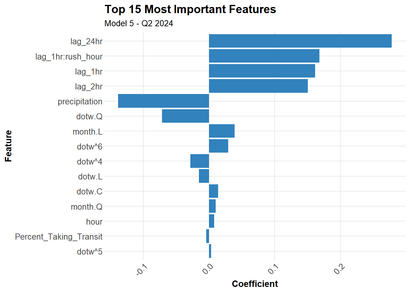
Lag features explain most of the predictive power, cutting baseline errors by 60%. Yesterday’s demand remains the strongest signal for tomorrow’s, which makes sense given how much bike share serves habitual commuters. Weather effects show up clearly in Q2 but work differently than winter patterns—optimal cycling temperature (60-75°F) drives demand while extremes suppress it. Other features add marginal value: demographics help slightly, interaction terms capture some non-linearity, but nothing approaches the explanatory power of recent demand history.

The equity concern isn’t algorithmic bias but operational consequences. Wealthier neighborhoods with discretionary, weather-dependent ridership produce larger errors than transit-dependent neighborhoods with rigid commute patterns. Prediction failures compound existing mobility gaps when they lead to service gaps, creating feedback loops where unreliable service drives riders away in areas that already lack alternatives. This makes equity an operational requirement, not just a technical goal—minimum service standards need to hold regardless of prediction accuracy.


Appendix: Model Diagnostics

Code
# Check model assumptions for best model
par(mfrow = c(2, 2))
plot(model5)

Code
par(mfrow = c(1, 1))
Code
# Extract and visualize coefficients
coefficients_df <- data.frame(
  Feature = names(coef(model5))[-1],  # Exclude intercept
  Coefficient = coef(model5)[-1]
) %>%
  arrange(desc(abs(Coefficient))) %>%
  head(15)

# Plot top features
ggplot(coefficients_df, 
       aes(x = reorder(Feature, abs(Coefficient)), y = Coefficient)) +
  geom_col(fill = "#3182bd") +
  coord_flip() +
  labs(
    title = "Top 15 Most Important Features",
    subtitle = "Model 5 - Q2 2024",
    x = "Feature",
    y = "Coefficient"
  ) +
  plotTheme


References

  • Indego Bike Share Data: https://www.rideindego.com/about/data/
  • US Census Bureau American Community Survey: https://www.census.gov/
  • Weather data: Iowa Environmental Mesonet (ASOS/AWOS)
  • Philadelphia Open Data: https://www.opendataphilly.org/