# Calculate MAE by station
station_errors <- test %>%
group_by(start_station, start_lat.x, start_lon.y) %>%
summarize(
MAE = mean(abs_error, na.rm = TRUE),
avg_demand = mean(Trip_Count, na.rm = TRUE),
.groups = "drop"
) %>%
filter(!is.na(start_lat.x), !is.na(start_lon.y))
## Create Two Maps Side-by-Side with Proper Legends (sorry these maps are ugly)
# Calculate station errors
station_errors <- test %>%
filter(!is.na(pred2)) %>%
group_by(start_station, start_lat.x, start_lon.y) %>%
summarize(
MAE = mean(abs(Trip_Count - pred2), na.rm = TRUE),
avg_demand = mean(Trip_Count, na.rm = TRUE),
.groups = "drop"
) %>%
filter(!is.na(start_lat.x), !is.na(start_lon.y))
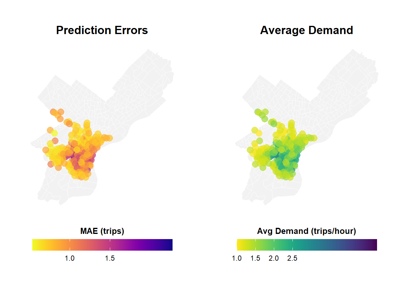
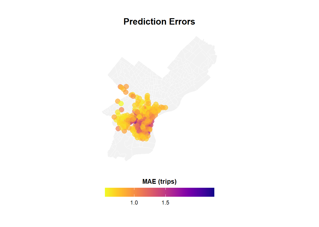
# Map 1: Prediction Errors
p1 <- ggplot() +
geom_sf(data = philly_census, fill = "grey95", color = "white", size = 0.2) +
geom_point(
data = station_errors,
aes(x = start_lon, y = start_lat, color = MAE),
size = 3.5,
alpha = 0.7
) +
scale_color_viridis(
option = "plasma",
name = "MAE\n(trips)",
direction = -1,
breaks = c(0.5, 1.0, 1.5), # Fewer, cleaner breaks
labels = c("0.5", "1.0", "1.5")
) +
labs(title = "Prediction Errors",
subtitle = "Higher in Center City") +
mapTheme +
theme(
legend.position = "right",
legend.title = element_text(size = 10, face = "bold"),
legend.text = element_text(size = 9),
plot.title = element_text(size = 14, face = "bold"),
plot.subtitle = element_text(size = 10)
) +
guides(color = guide_colorbar(
barwidth = 1.5,
barheight = 12,
title.position = "top",
title.hjust = 0.5
))
# Map 2: Average Demand
p2 <- ggplot() +
geom_sf(data = philly_census, fill = "grey95", color = "white", size = 0.2) +
geom_point(
data = station_errors,
aes(x = start_lon.y, y = start_lat.x, color = avg_demand),
size = 3.5,
alpha = 0.7
) +
scale_color_viridis(
option = "viridis",
name = "Avg\nDemand",
direction = -1,
breaks = c(0.5, 1.0, 1.5, 2.0, 2.5), # Clear breaks
labels = c("0.5", "1.0", "1.5", "2.0", "2.5")
) +
labs(title = "Average Demand",
subtitle = "Trips per station-hour") +
mapTheme +
theme(
legend.position = "right",
legend.title = element_text(size = 10, face = "bold"),
legend.text = element_text(size = 9),
plot.title = element_text(size = 14, face = "bold"),
plot.subtitle = element_text(size = 10)
) +
guides(color = guide_colorbar(
barwidth = 1.5,
barheight = 12,
title.position = "top",
title.hjust = 0.5
))
# Map 1: Prediction Errors
p1 <- ggplot() +
geom_sf(data = philly_census, fill = "grey95", color = "white", size = 0.1) +
geom_point(
data = station_errors,
aes(x = start_lon.y, y = start_lat.x, color = MAE),
size = 3.5,
alpha = 0.7
) +
scale_color_viridis(
option = "plasma",
name = "MAE (trips)",
direction = -1,
breaks = c(0.5, 1.0, 1.5),
labels = c("0.5", "1.0", "1.5")
) +
labs(title = "Prediction Errors") +
mapTheme +
theme(
legend.position = "bottom",
legend.title = element_text(size = 10, face = "bold"),
legend.text = element_text(size = 9),
plot.title = element_text(size = 14, face = "bold", hjust = 0.5)
) +
guides(color = guide_colorbar(
barwidth = 12,
barheight = 1,
title.position = "top",
title.hjust = 0.5
))
# Map 2: Average Demand
p2 <- ggplot() +
geom_sf(data = philly_census, fill = "grey95", color = "white", size = 0.1) +
geom_point(
data = station_errors,
aes(x = start_lon.y, y = start_lat.x, color = avg_demand),
size = 3.5,
alpha = 0.7
) +
scale_color_viridis(
option = "viridis",
name = "Avg Demand (trips/hour)",
direction = -1,
breaks = c(0.5, 1.0, 1.5, 2.0, 2.5),
labels = c("0.5", "1.0", "1.5", "2.0", "2.5")
) +
labs(title = "Average Demand") +
mapTheme +
theme(
legend.position = "bottom",
legend.title = element_text(size = 10, face = "bold"),
legend.text = element_text(size = 9),
plot.title = element_text(size = 14, face = "bold", hjust = 0.5)
) +
guides(color = guide_colorbar(
barwidth = 12,
barheight = 1,
title.position = "top",
title.hjust = 0.5
))
# Combine
grid.arrange(
p1, p2,
ncol = 2
)